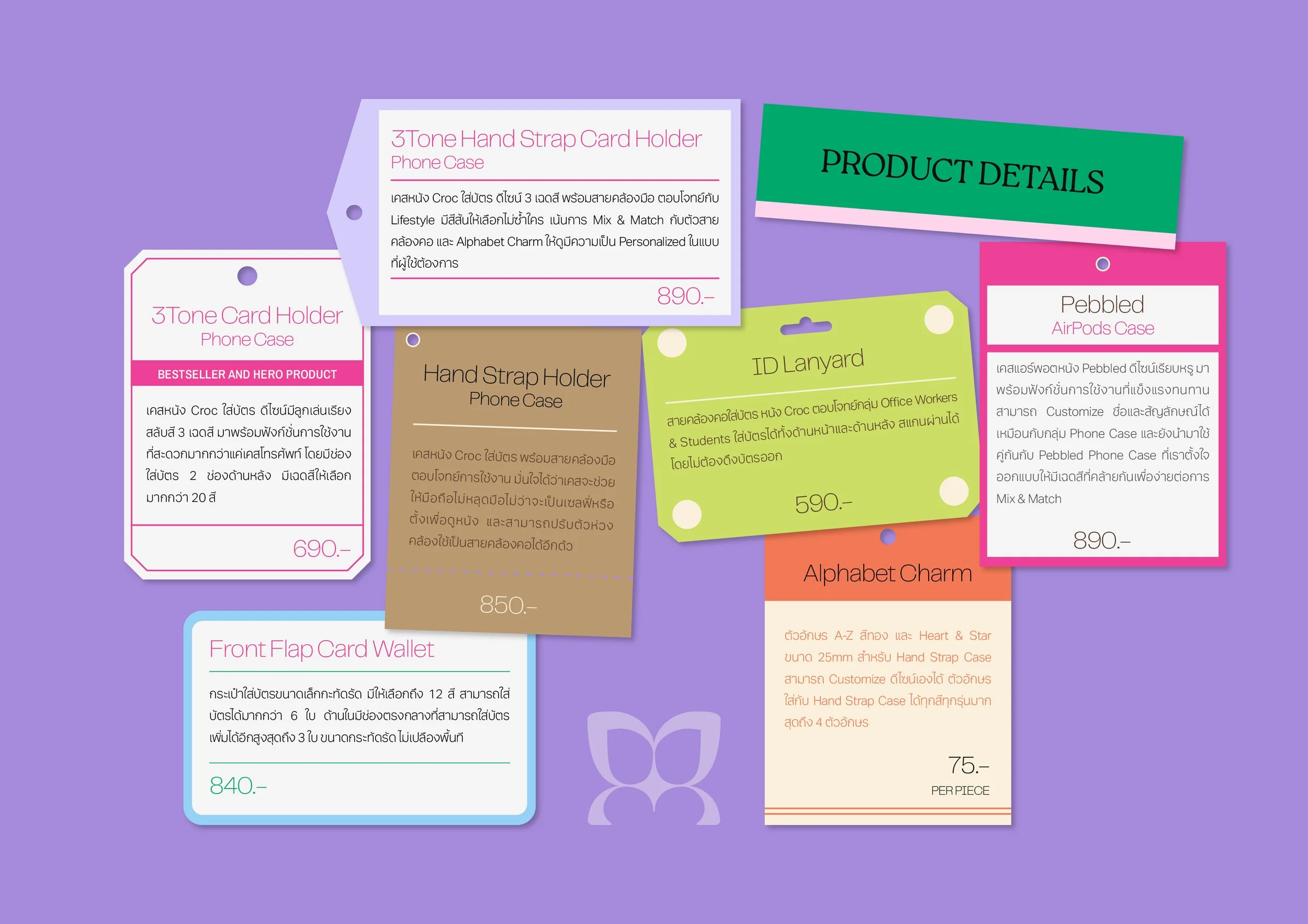
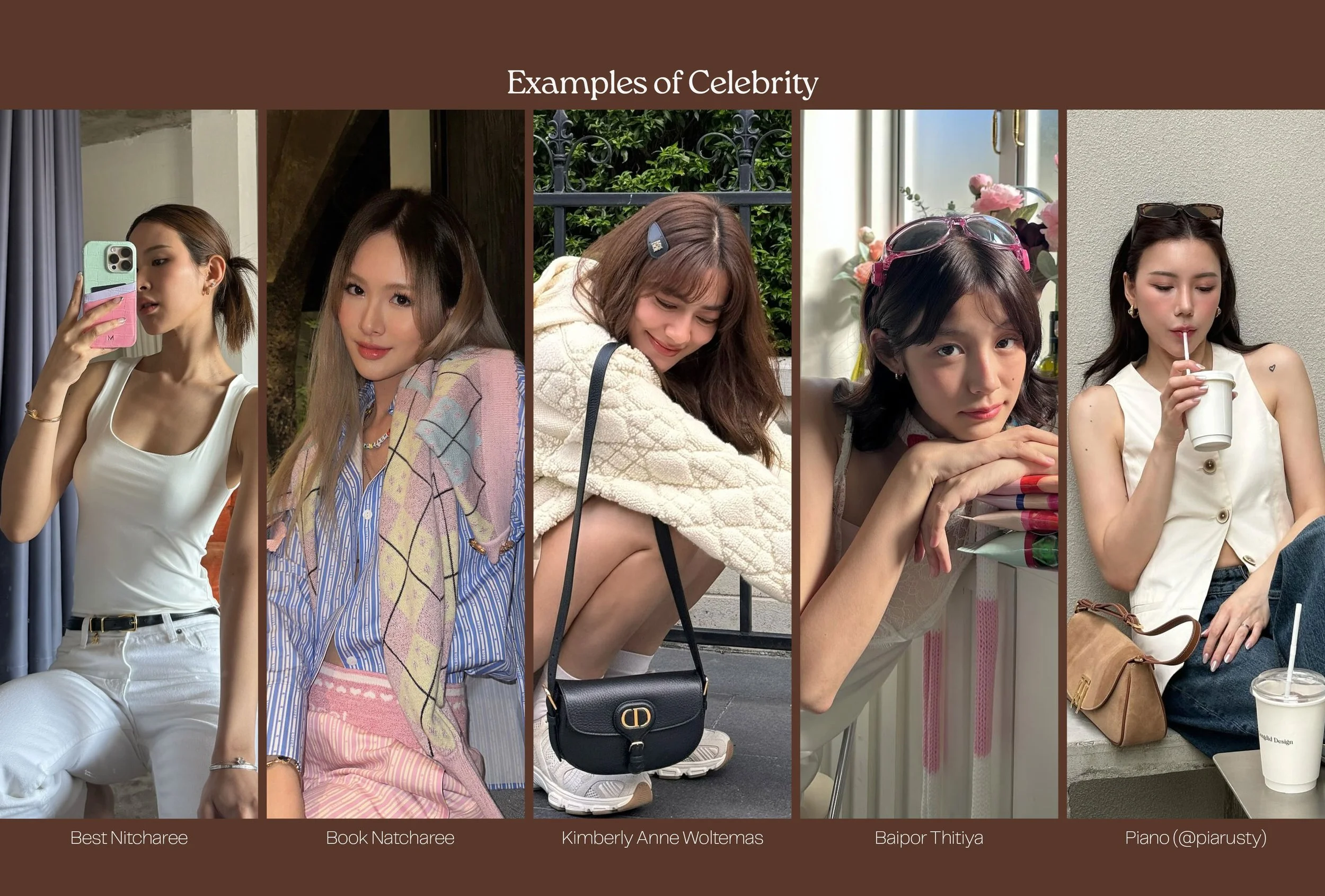
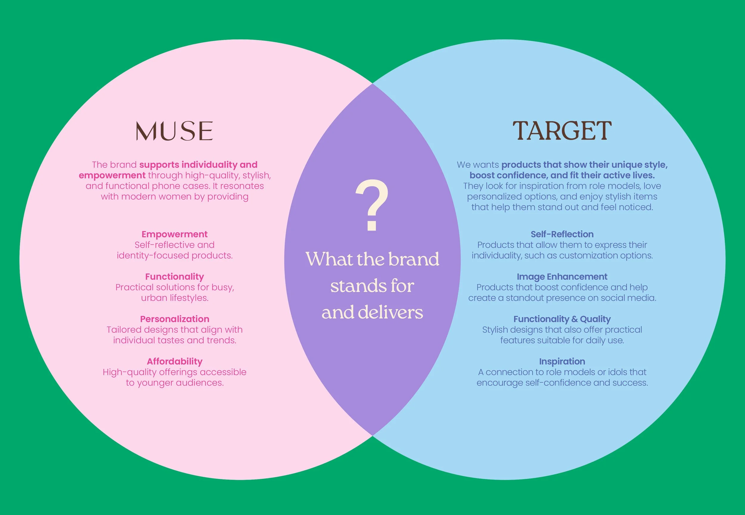
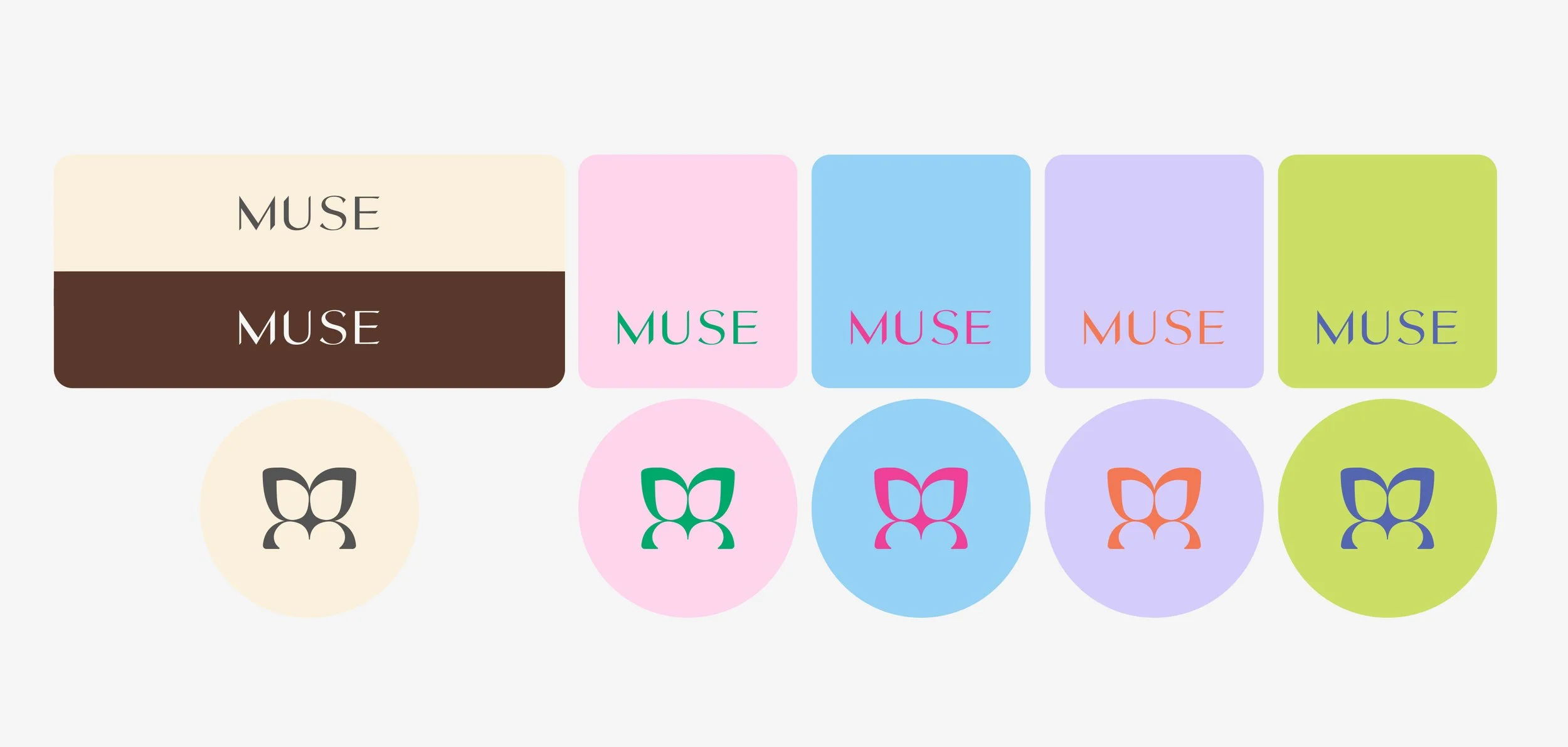
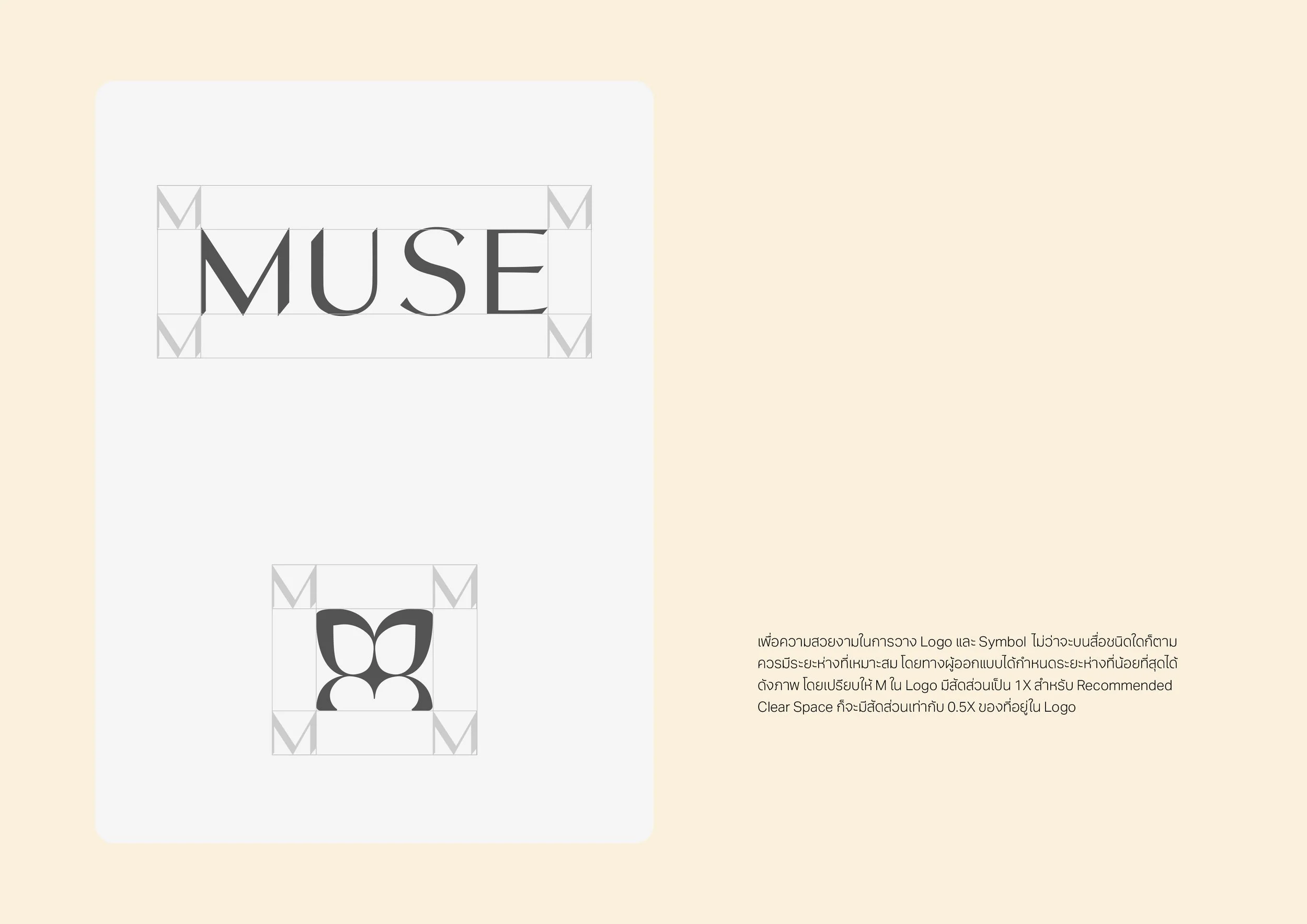
We refined MUSE’s identity without losing its original charm. The new logo and symbol became the anchor, while we built a complete branding deck covering tagline, philosophy, mood and tone, characters, color and typography guides, photography direction, and poster ad examples. To make the brand more dynamic, we added playful but balanced graphic patterns and color strategies that can adapt across content, product, and marketing.

