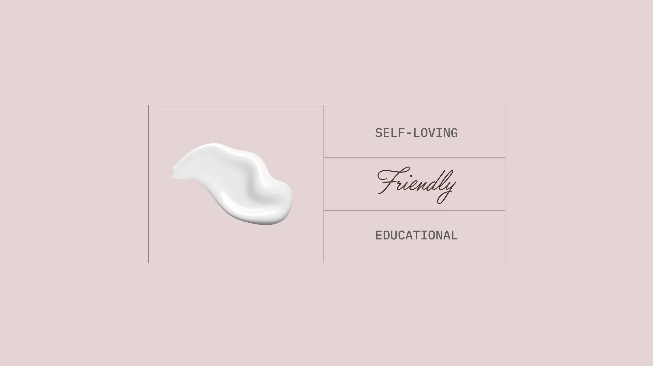
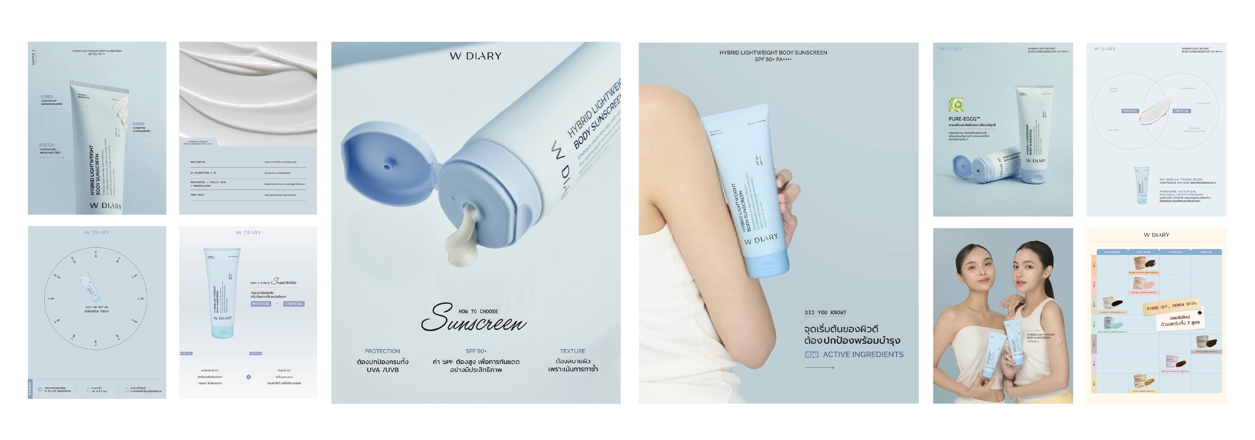
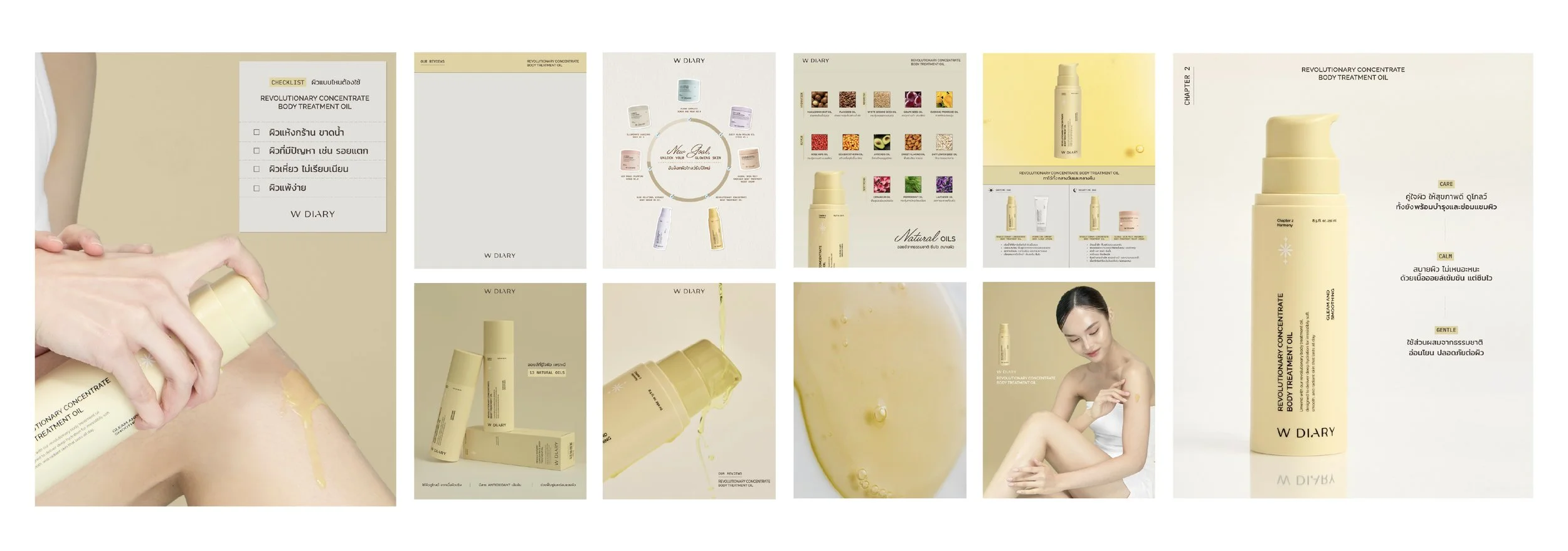
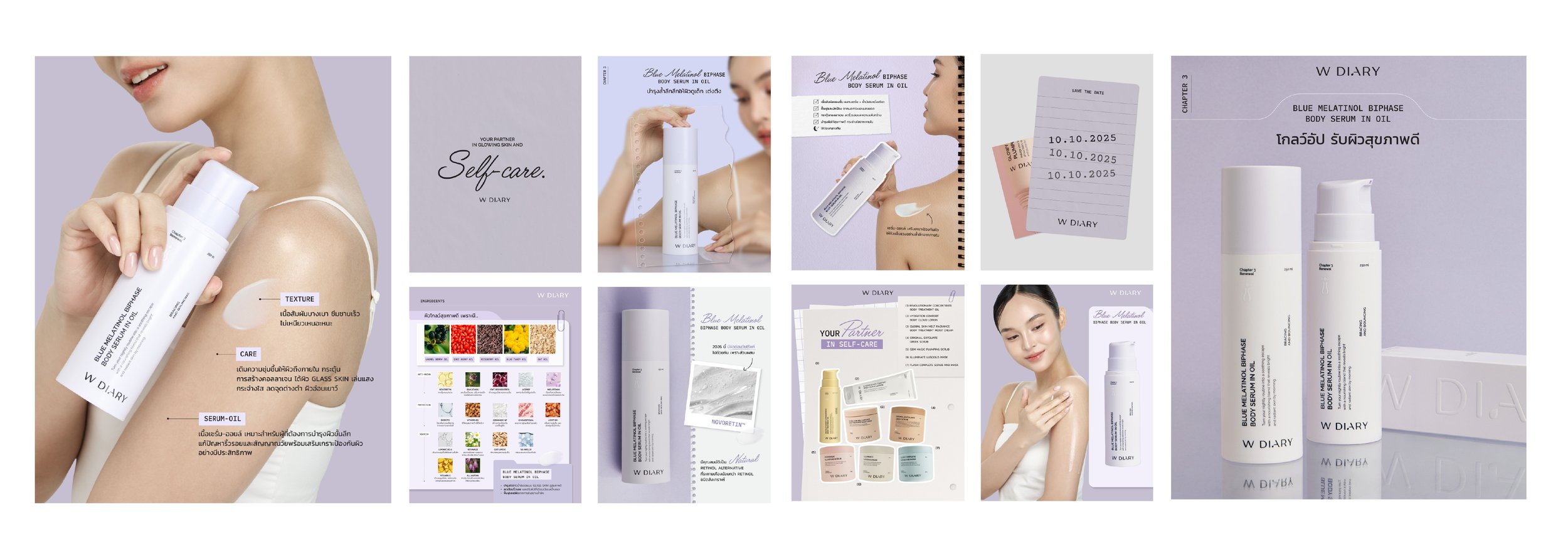
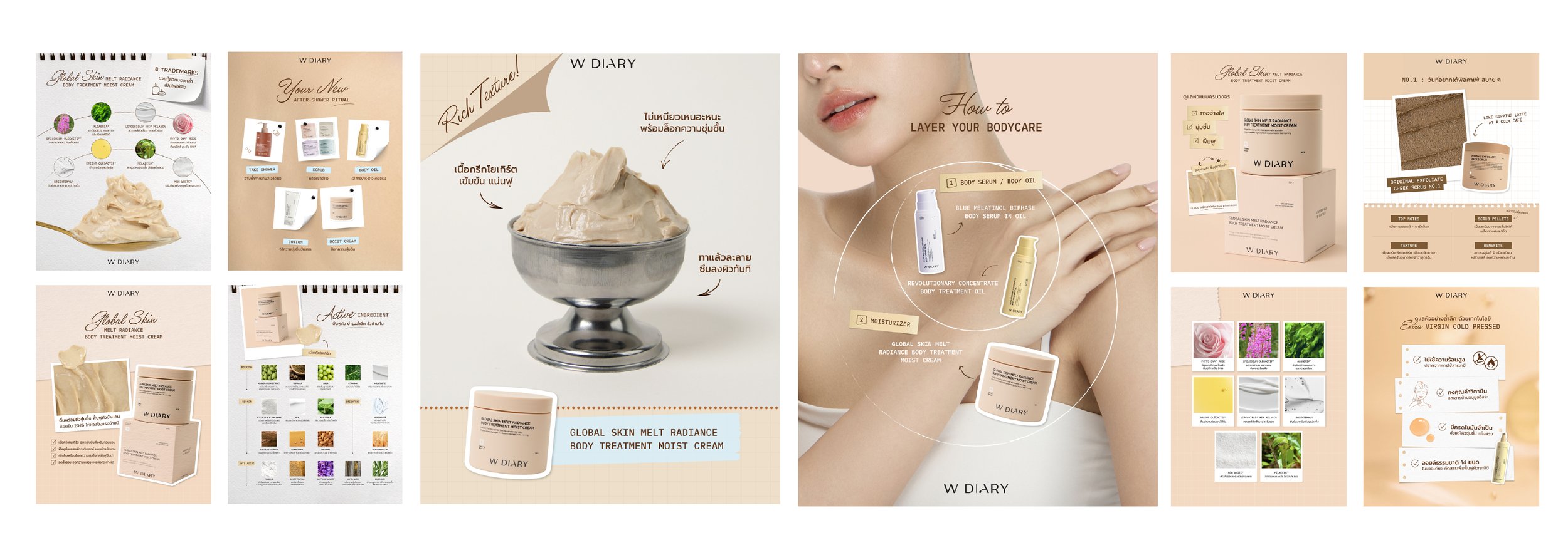
W Diary wanted to completely refresh their brand. Their product range was strong, but lacked cohesive packaging, emotional product names, and a distinctive social media presence. Their Instagram didn’t reflect the self-loving, friendly, and educational tone they aimed for.

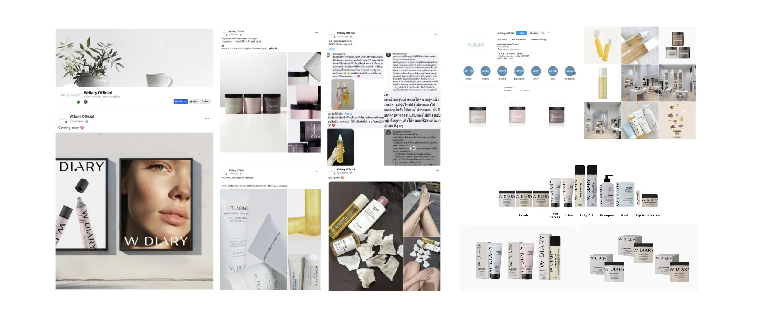
Challenge

The Directon

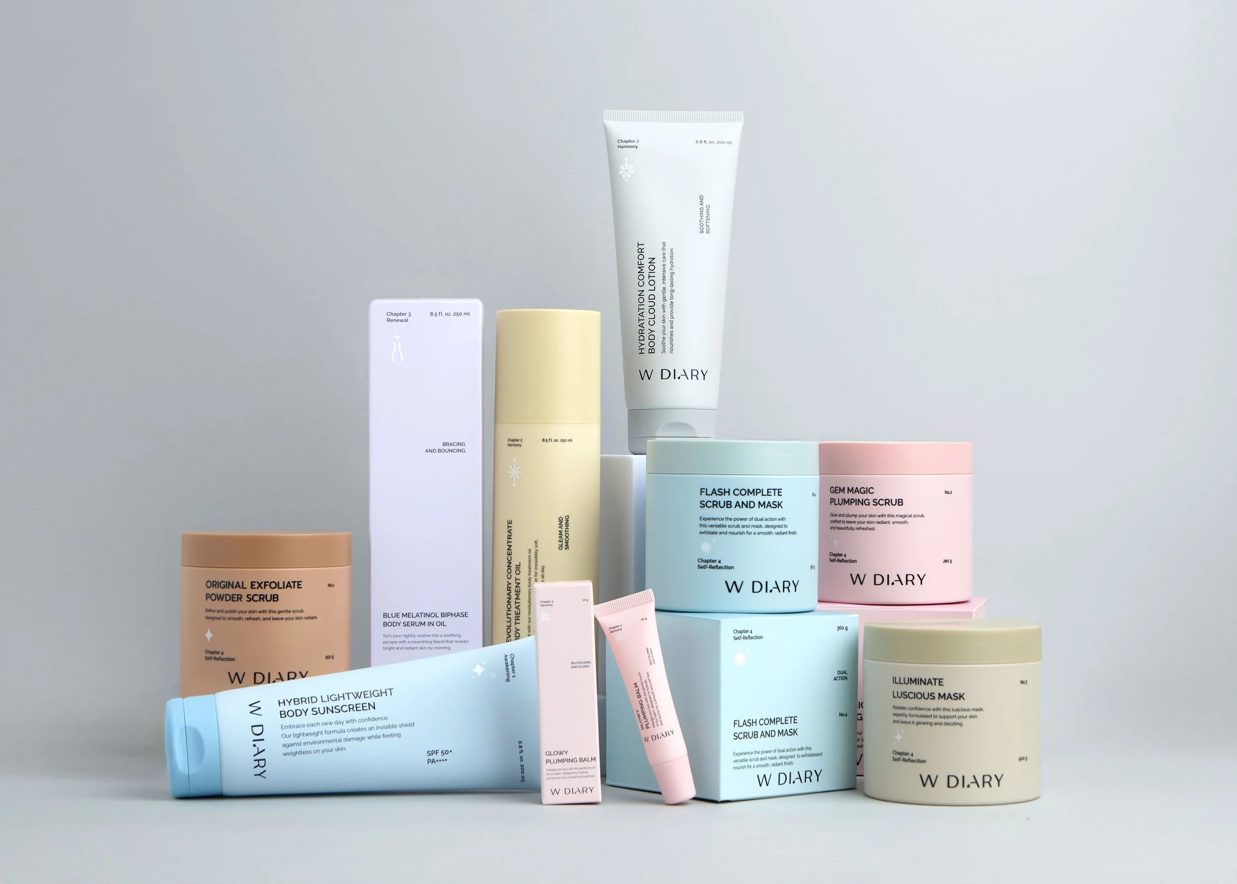
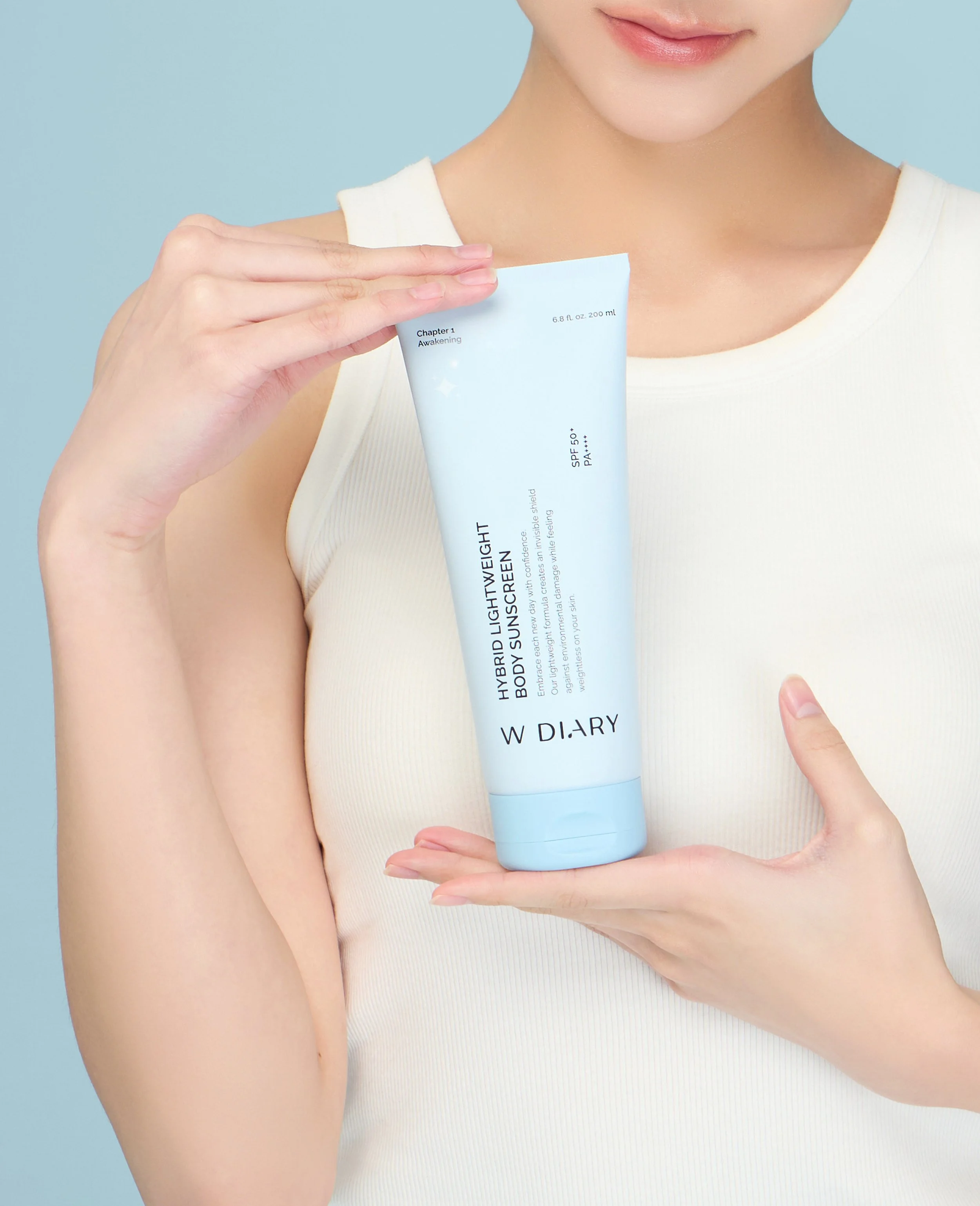
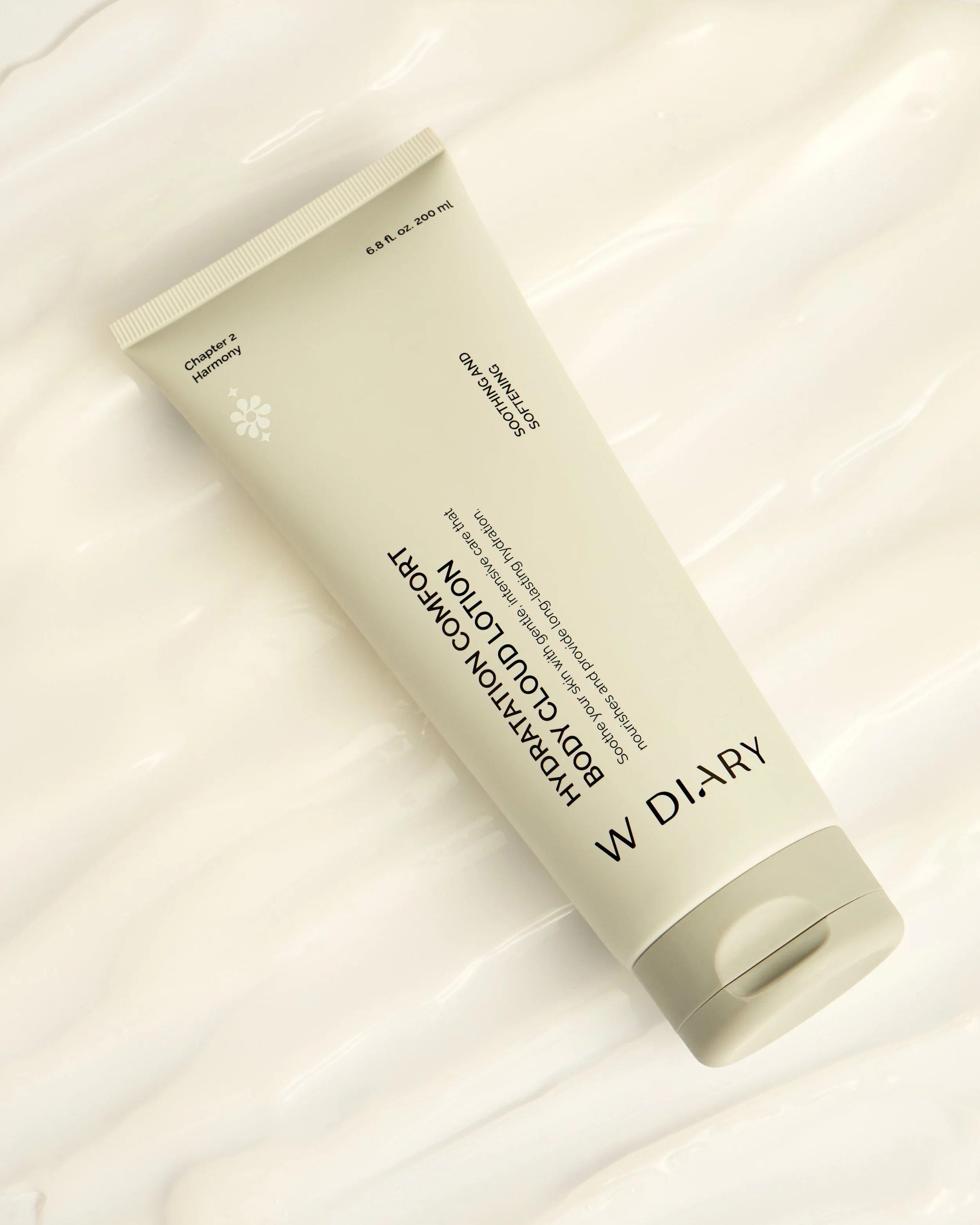
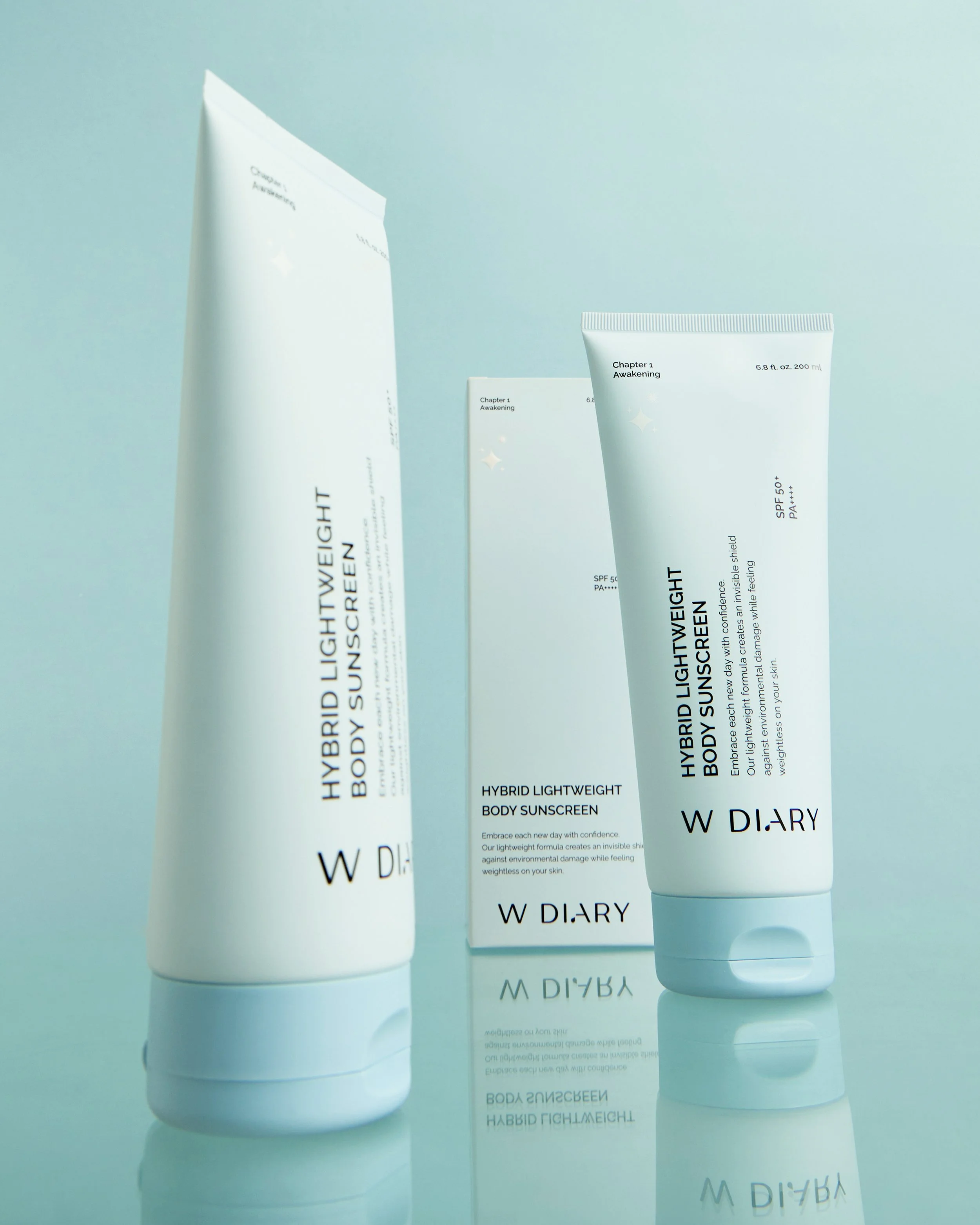
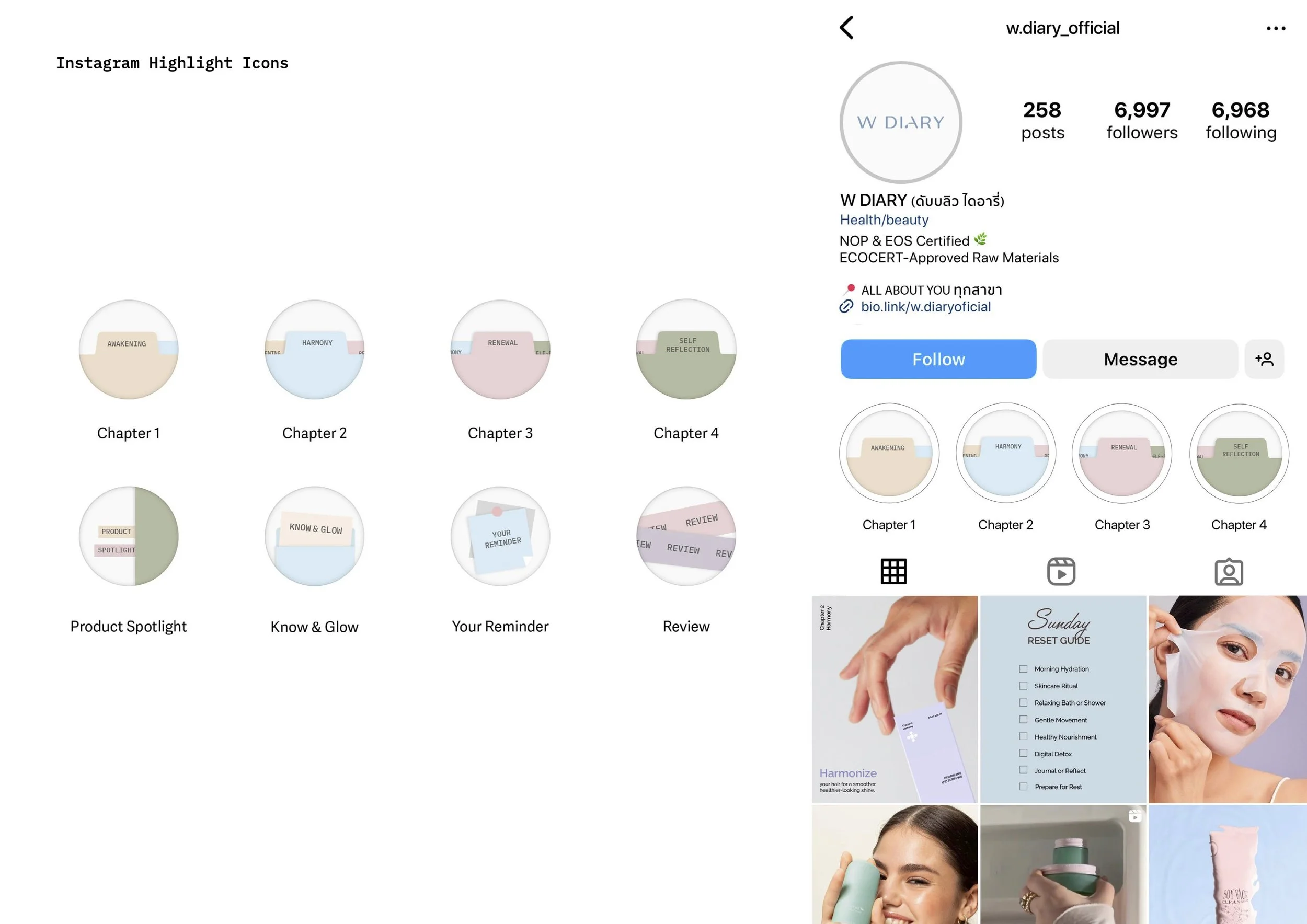
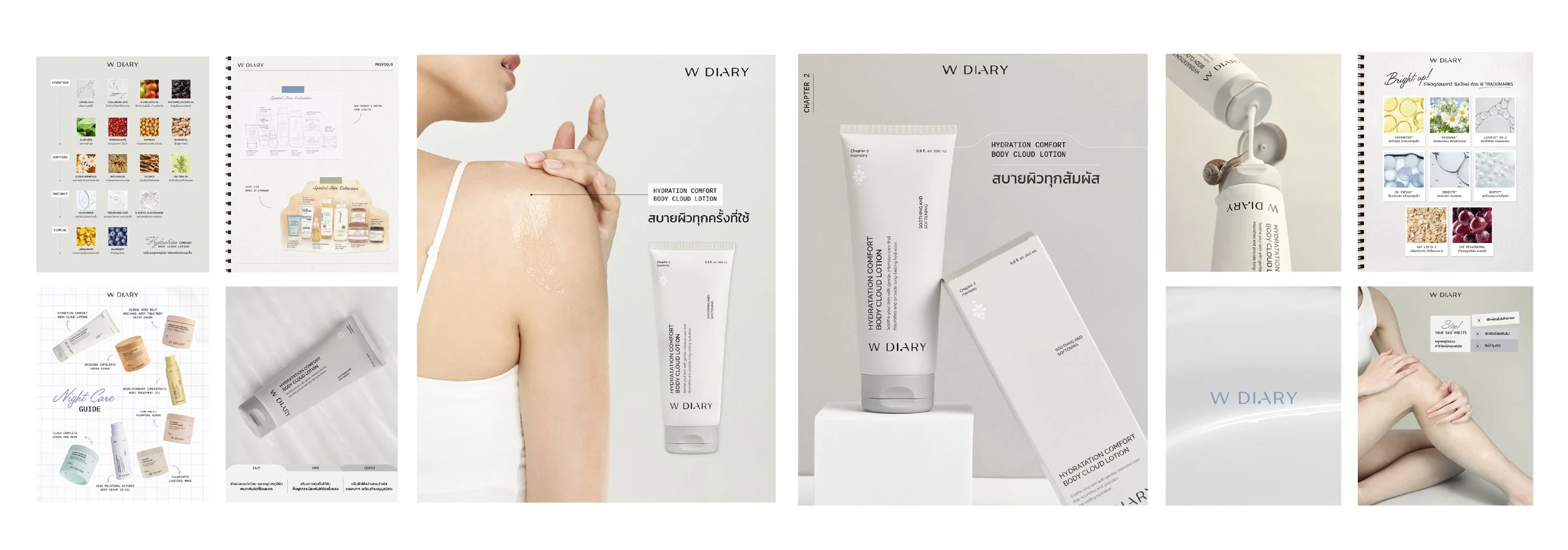
We organised the product portfolio into four clear chapters: Awakening, Harmony, Renewal and Self-Reflection. This structure created a more meaningful way to navigate the range while supporting future product development.

Key SKUs were renamed using a system that balances emotional storytelling with functional clarity. The creative direction positioned W DIARY as a friendly beauty companion: encouraging everyday self-care through communication that feels warm, informative and easy to understand.

This gave the brand a clearer tone of voice and a stronger narrative beyond individual product benefits.

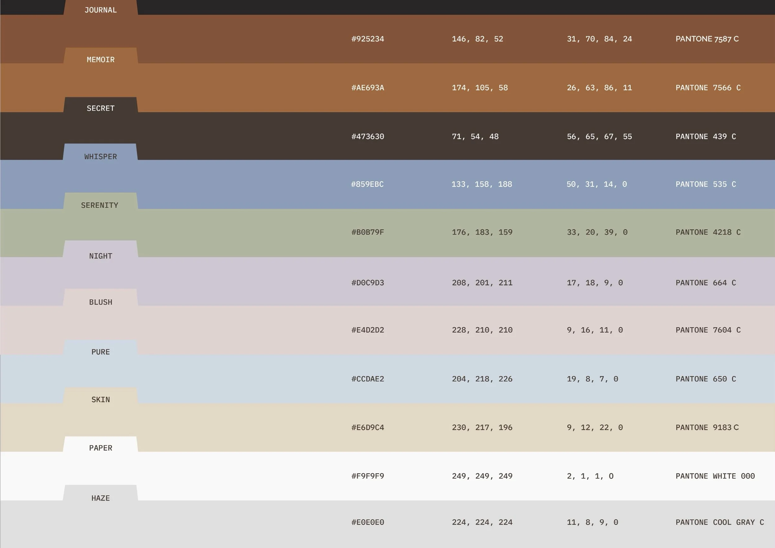
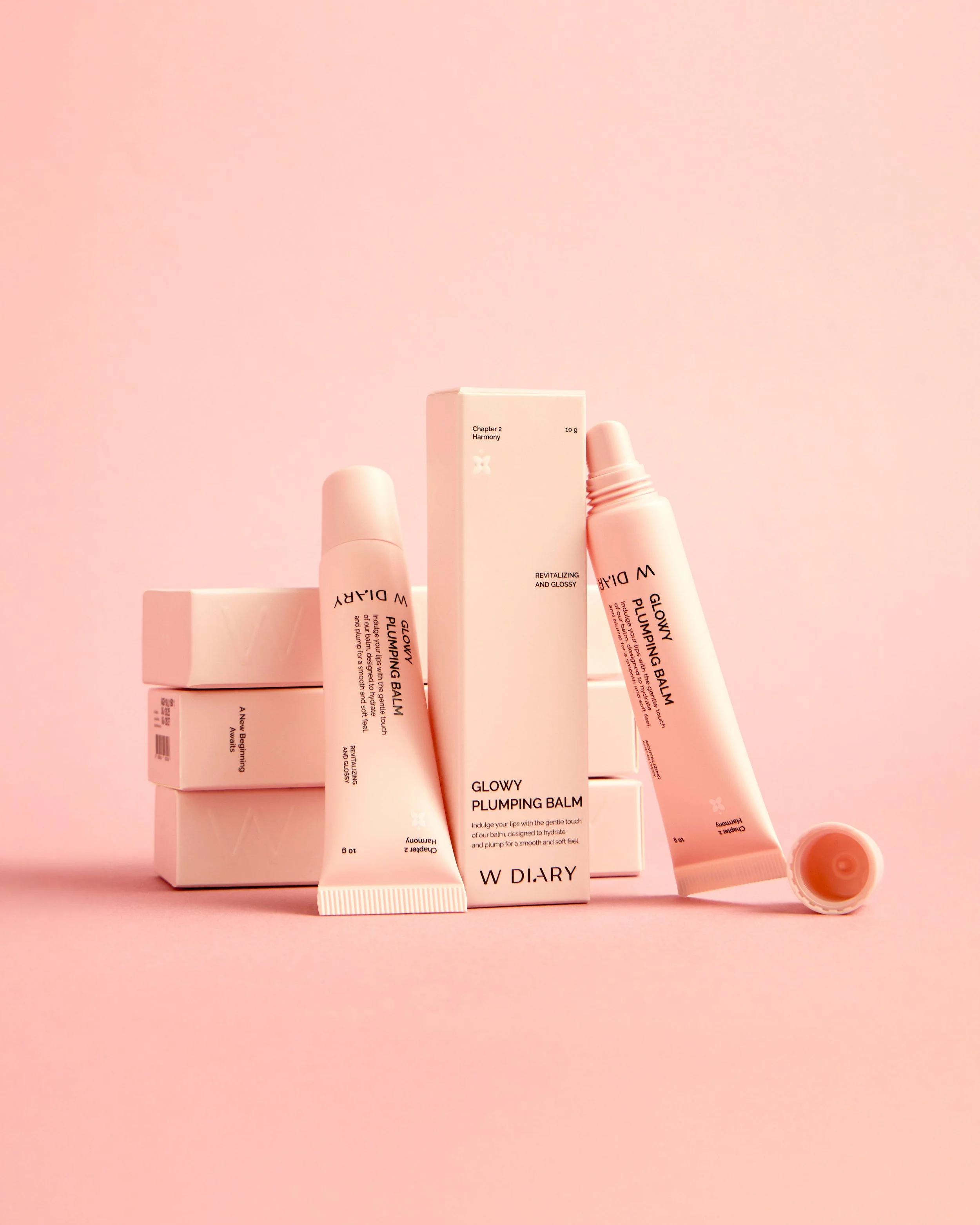
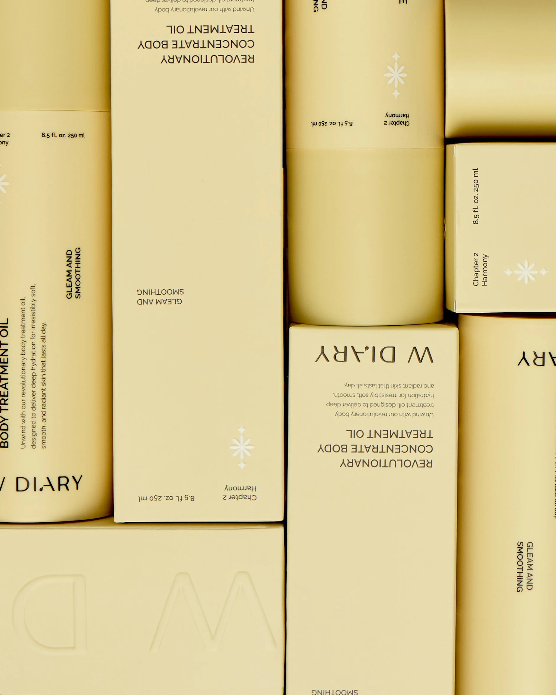
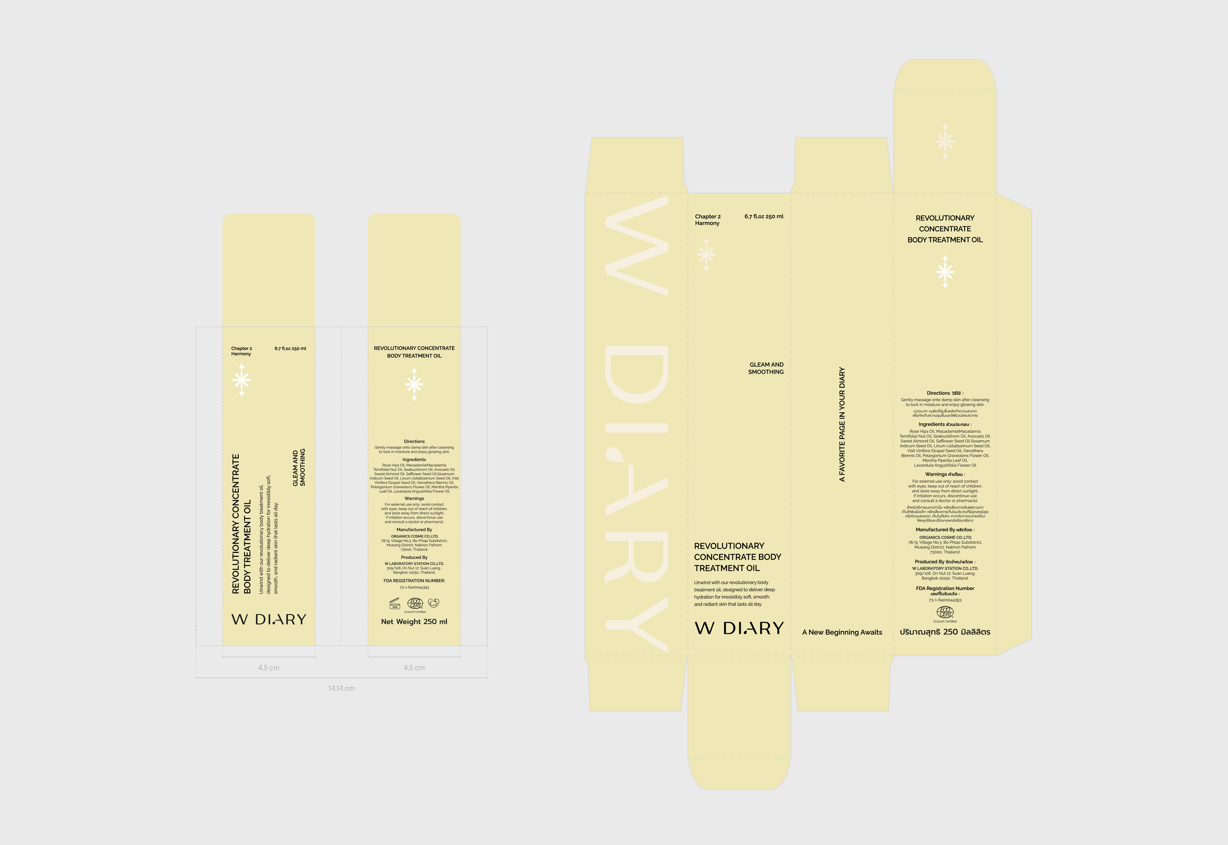
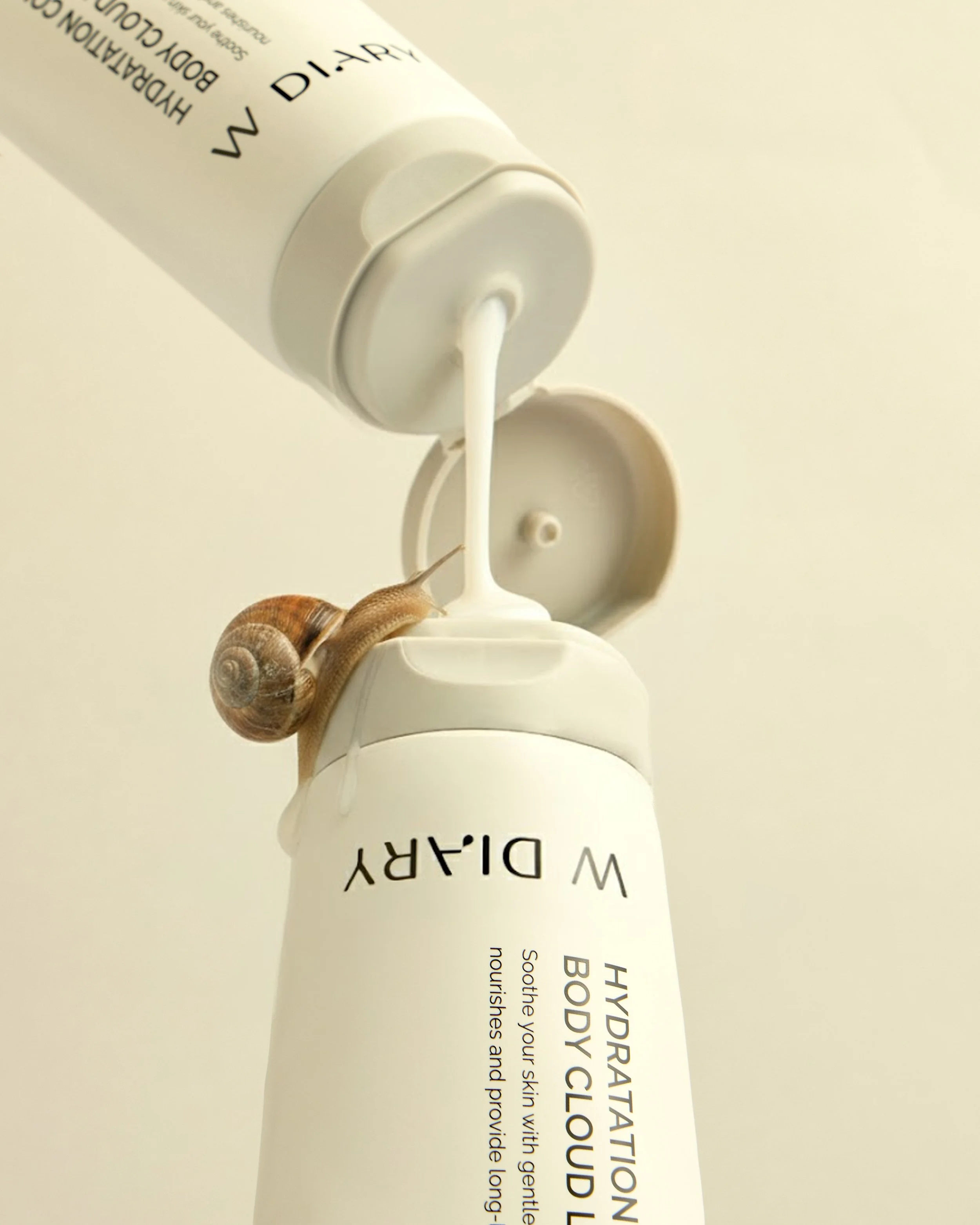
A refined colour system and category-led packaging direction helped each product feel distinct while remaining visibly connected to the wider W DIARY family.

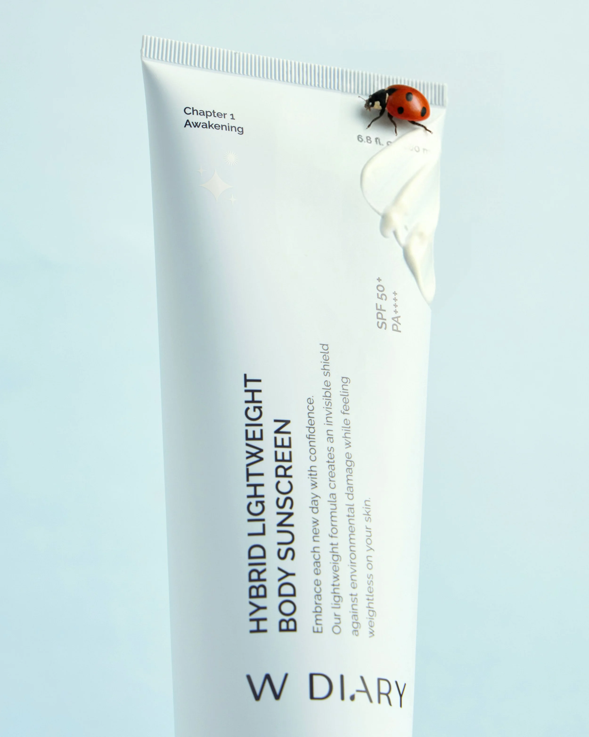
The design approach was extended into photography and a four-month social media plan built around five content categories: product showcase, education, reviews, lifestyle and engagement. Templates and visual rules created consistency without making the feed repetitive, while the new tone of voice made complex information easier to digest.

The result is an integrated beauty brand packaging and social media system that improves navigation, strengthens recognition and turns W DIARY’s product range into a more organised and emotionally engaging brand experience.

Previous
Previous

BIOTIFIC

Next
Next

MUSE