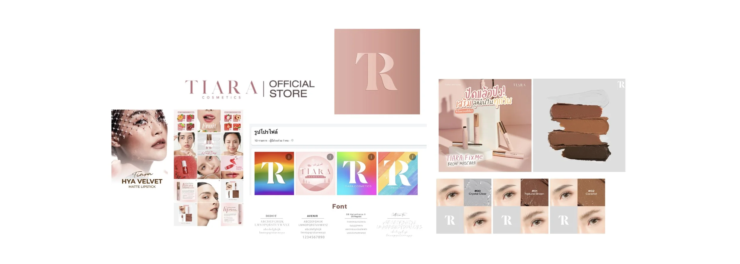
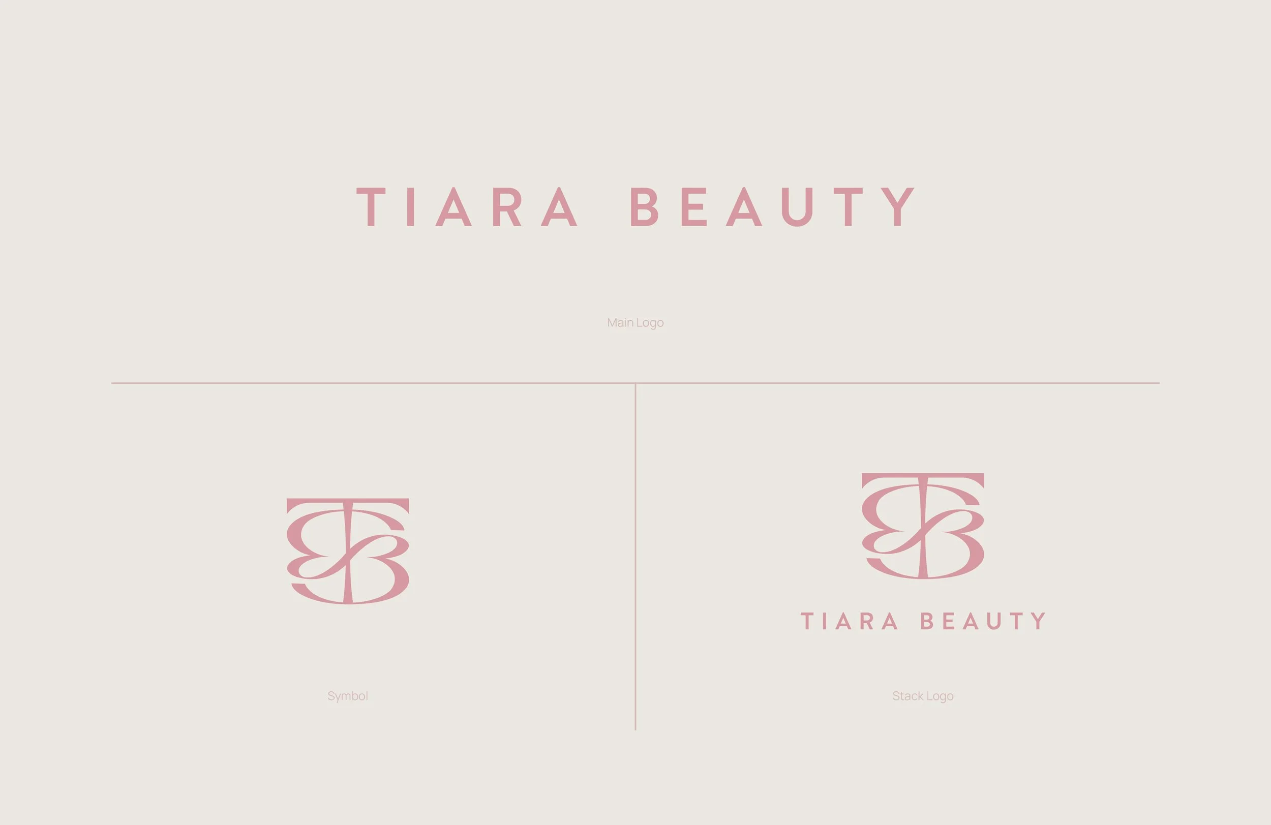
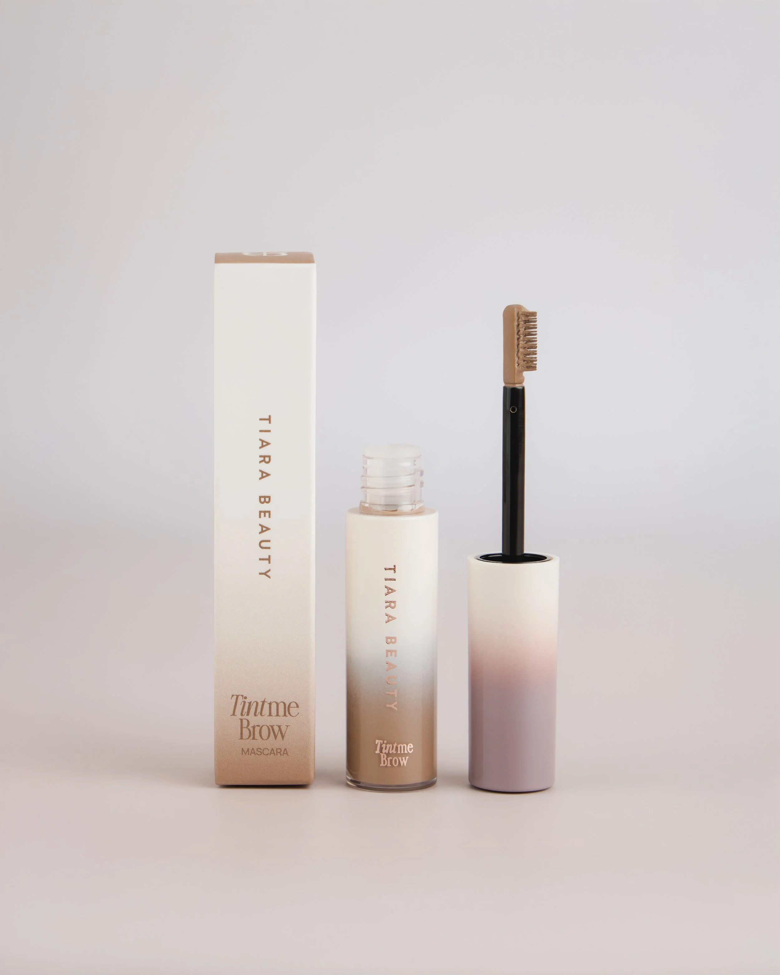
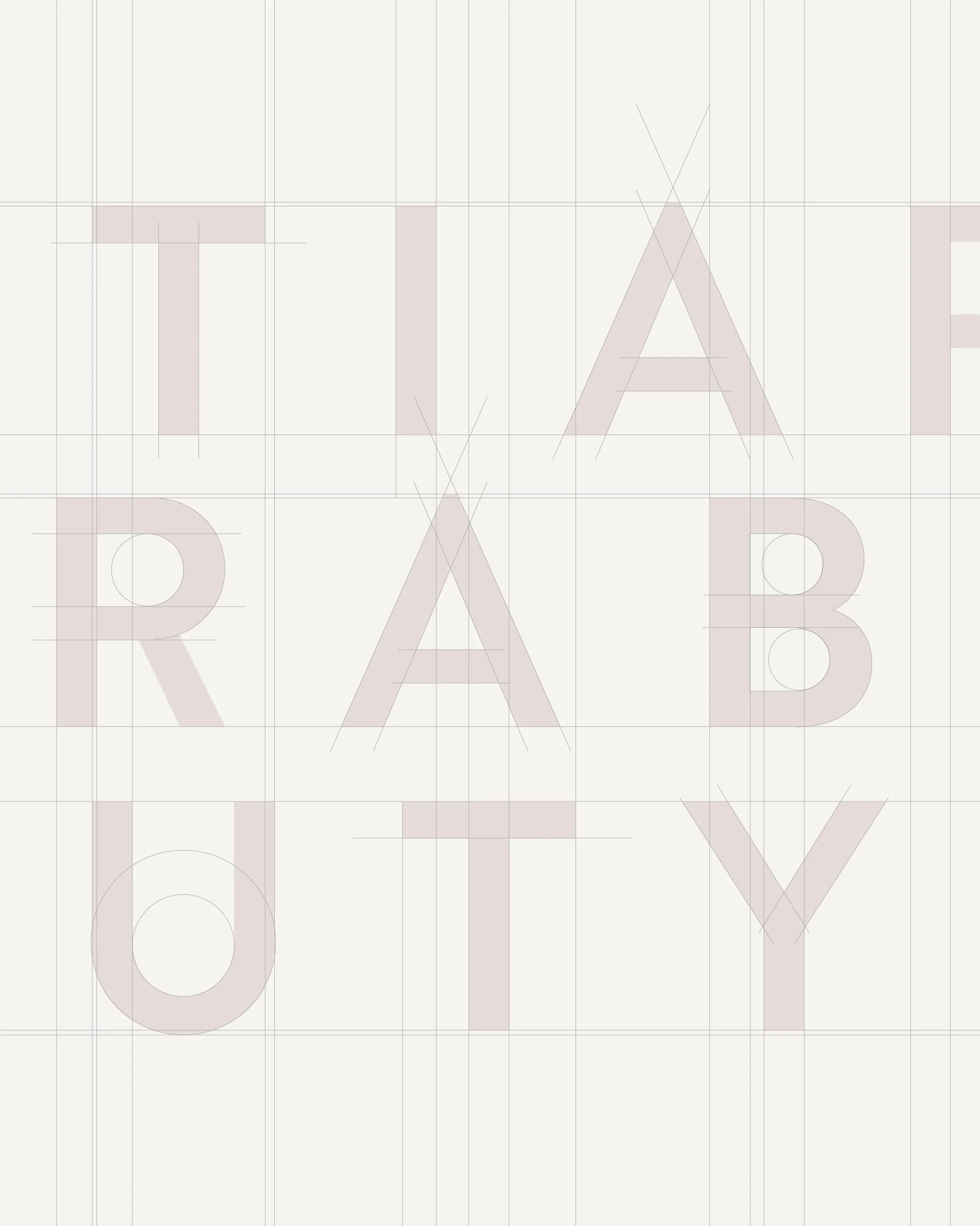
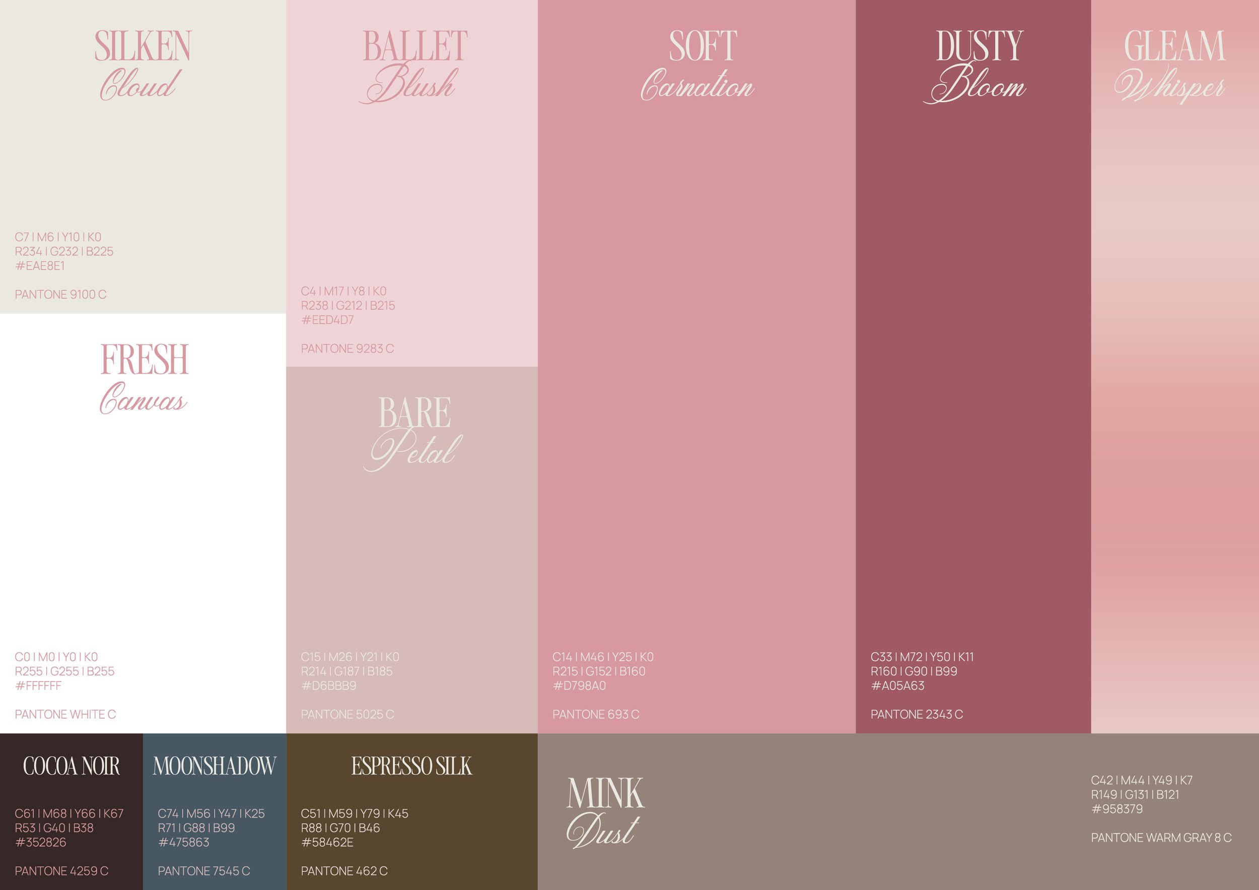
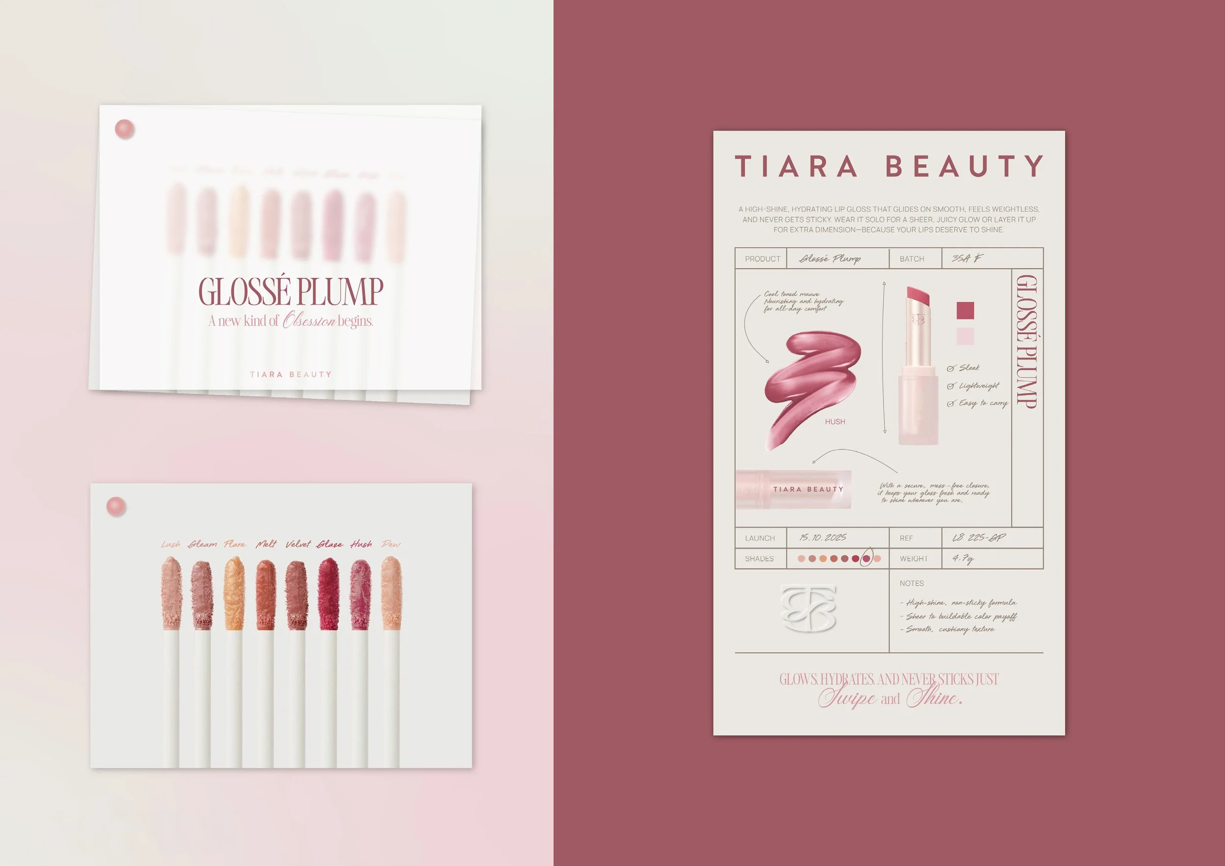
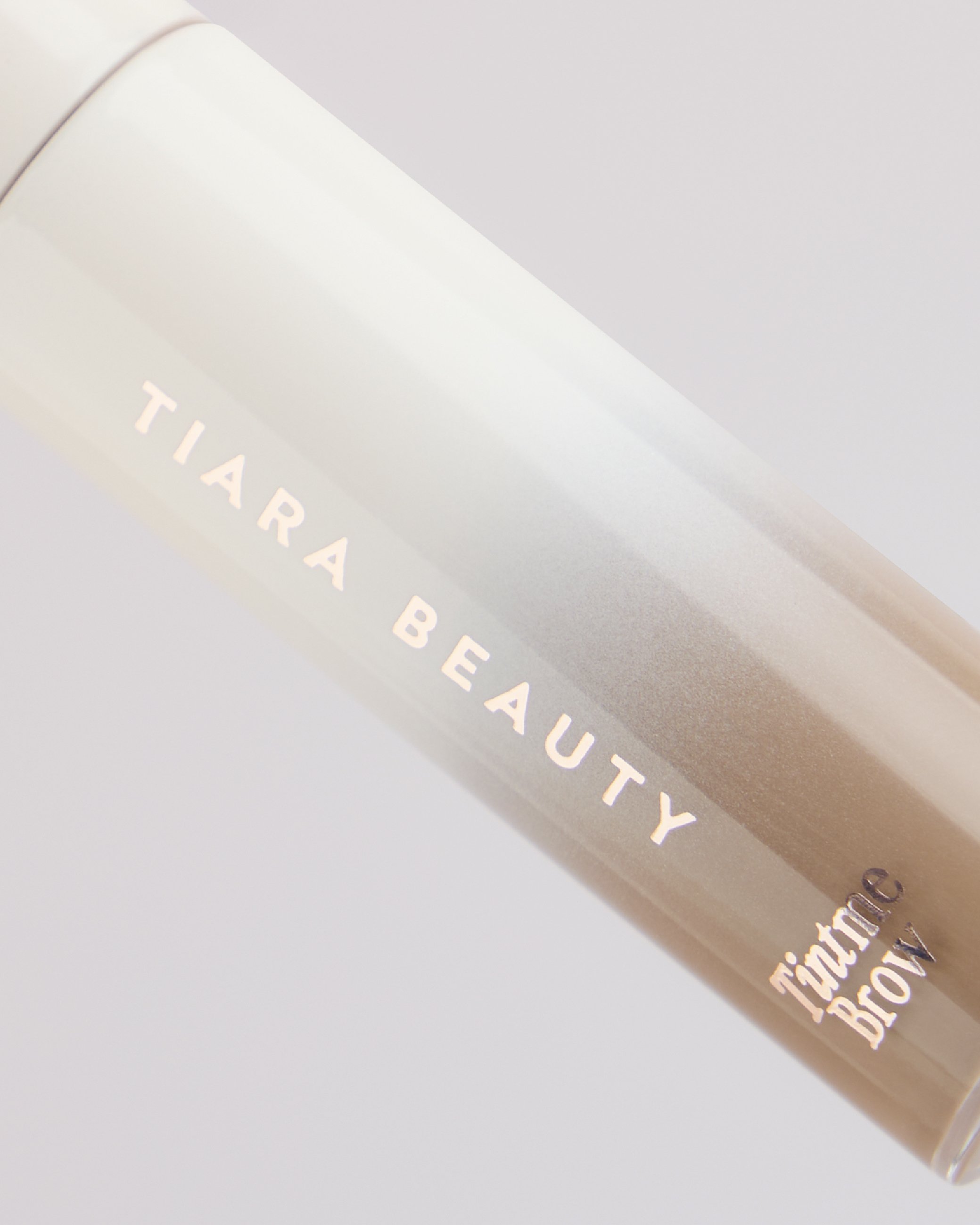
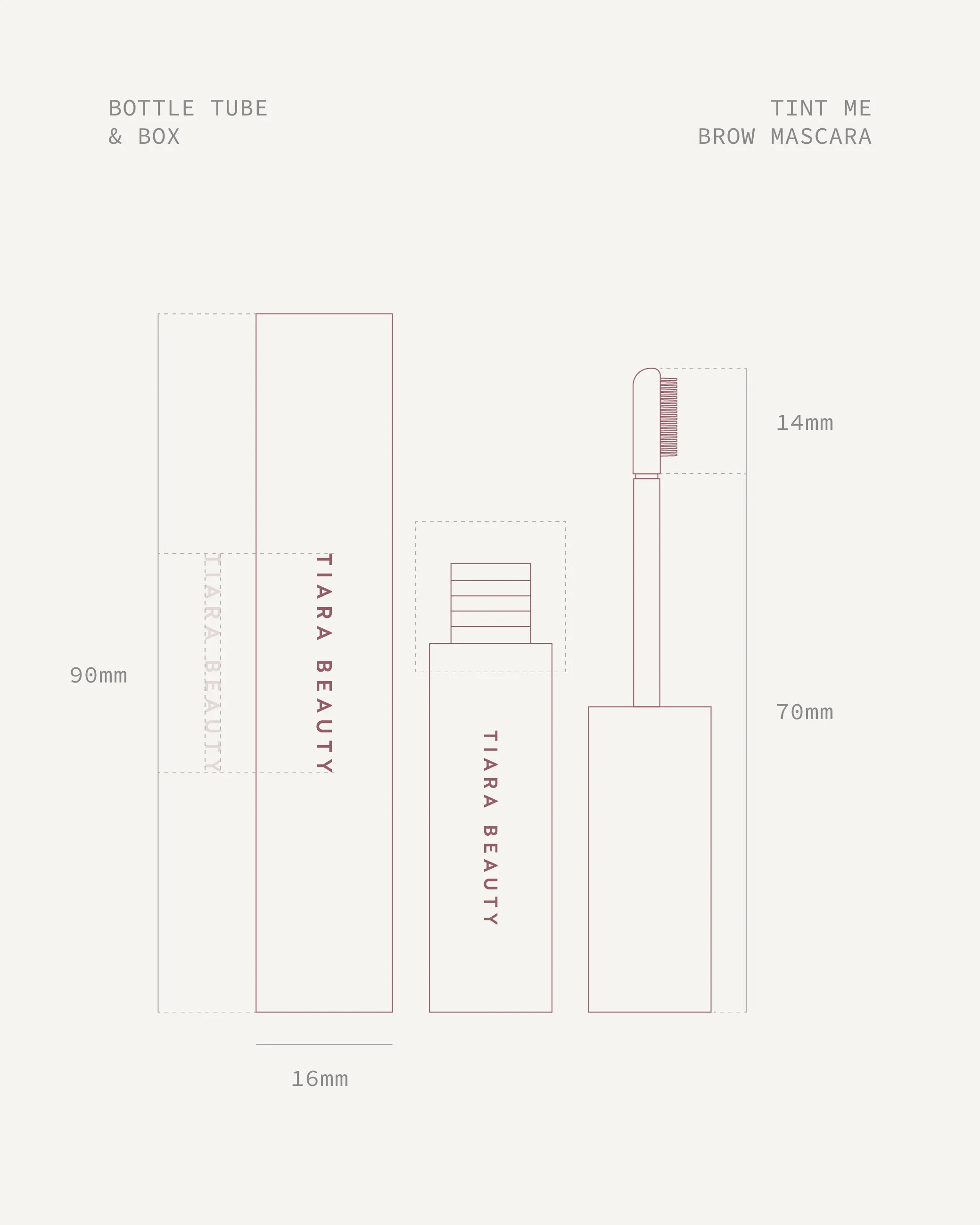
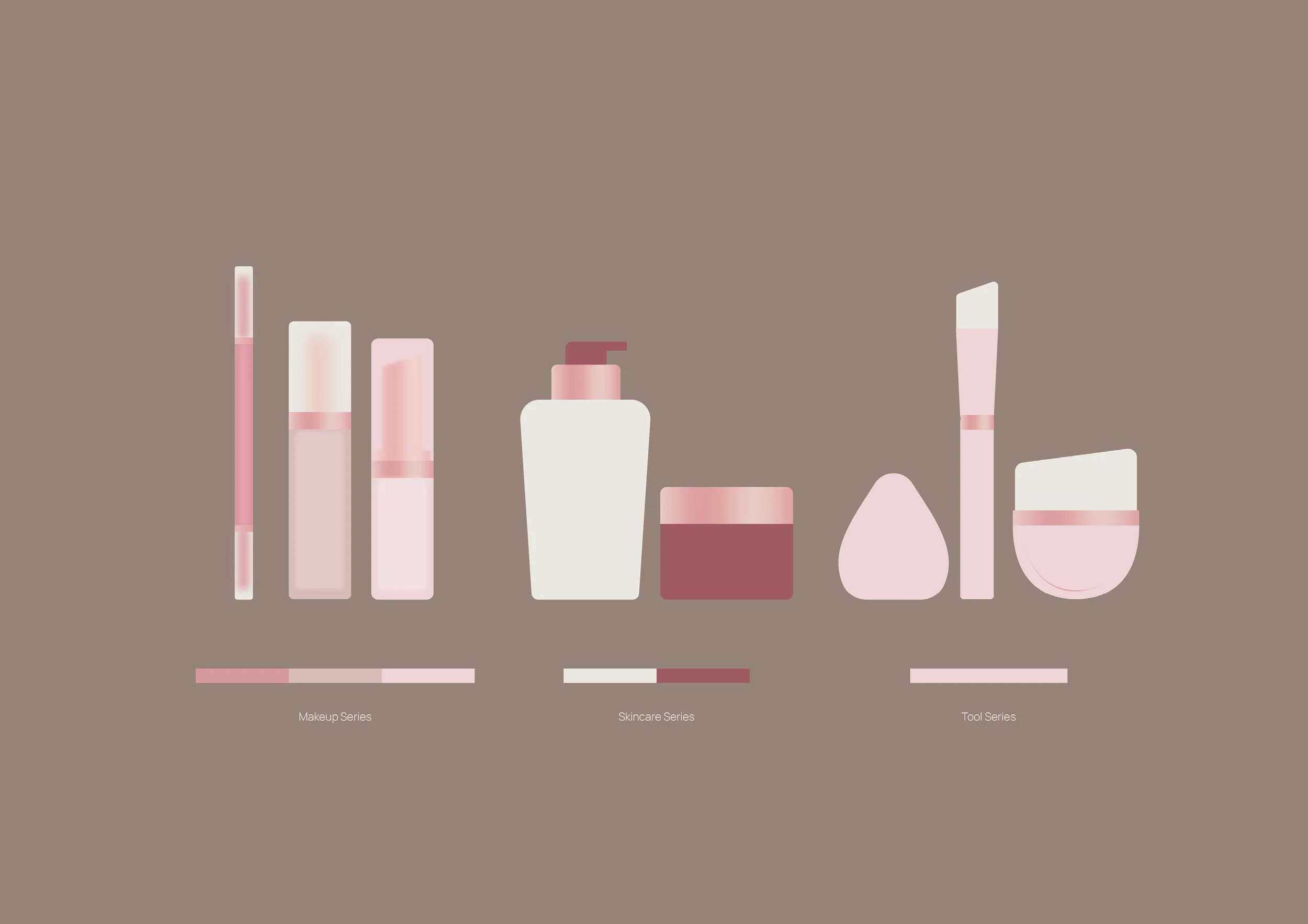
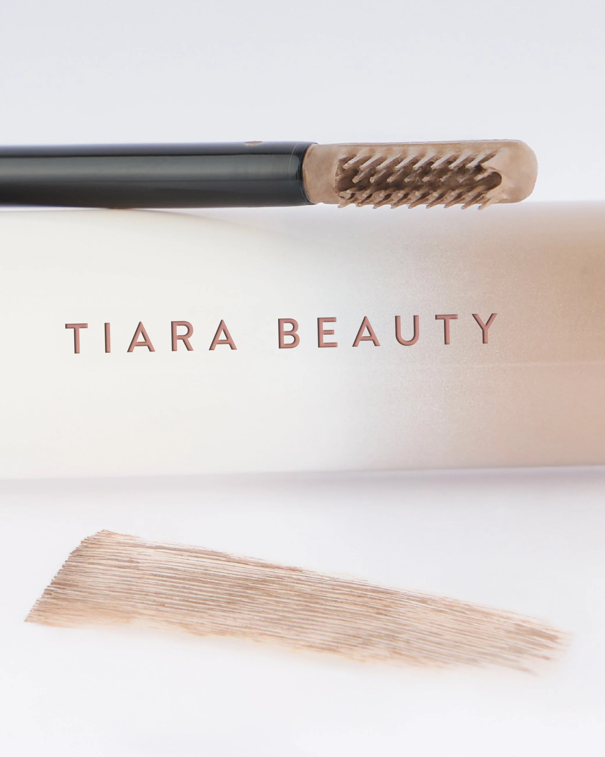
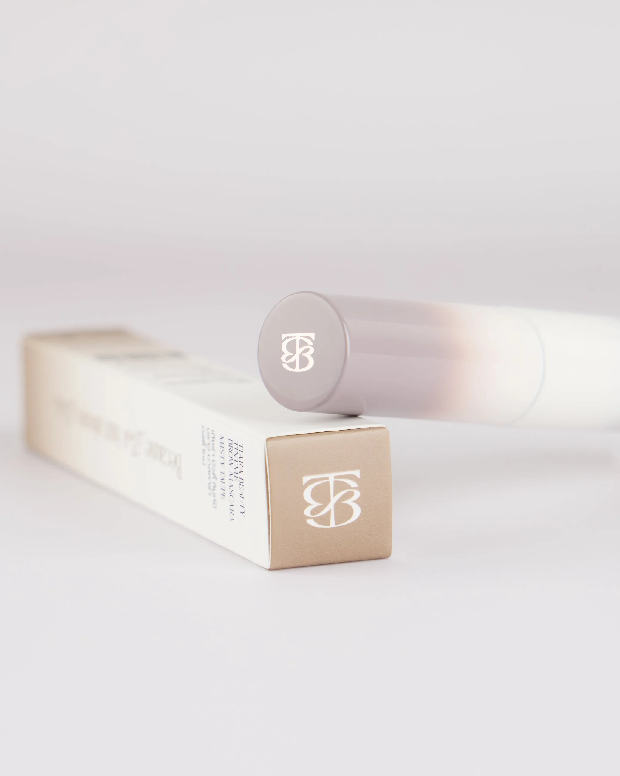
From Tiara Cosmetic to Tiara Beauty… We created a refined new logo and cohesive visual identity that brings consistency across every touchpoint. The new typography, color palette make Tiara Beauty feel modern, feminine and trustworthy, while communicating beauty with greater confidence and clarity.