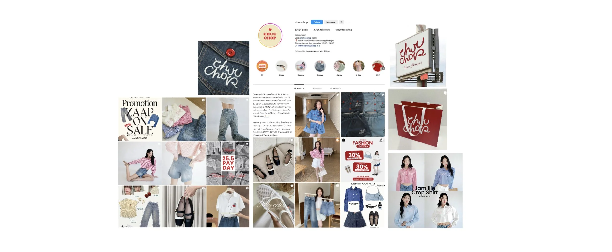
Although CHUUCHOP now produces most of its own collections, customers still associate it with its former image as a youthful Korean fashion importer. Its online content lacked clear categories and consistent art direction, while changing fonts, colours and campaign styles made the brand feel generic and difficult to recognise. This limited its appeal to the evolving 25–30-year-old audience and weakened the brand value customers could feel proud to wear and share.

The Problem

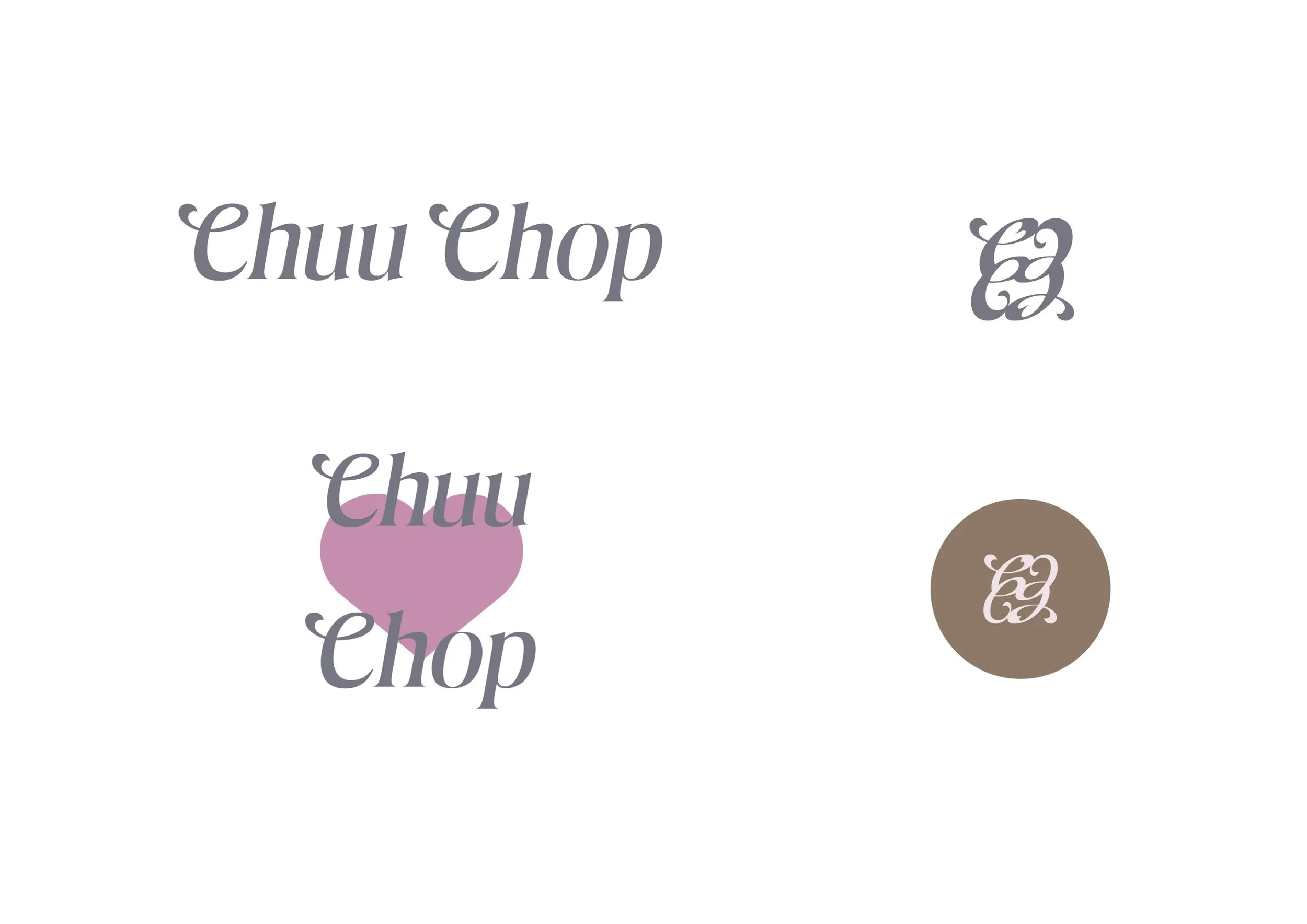
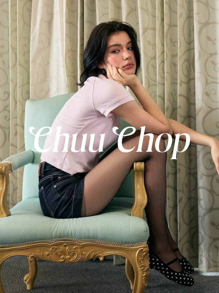
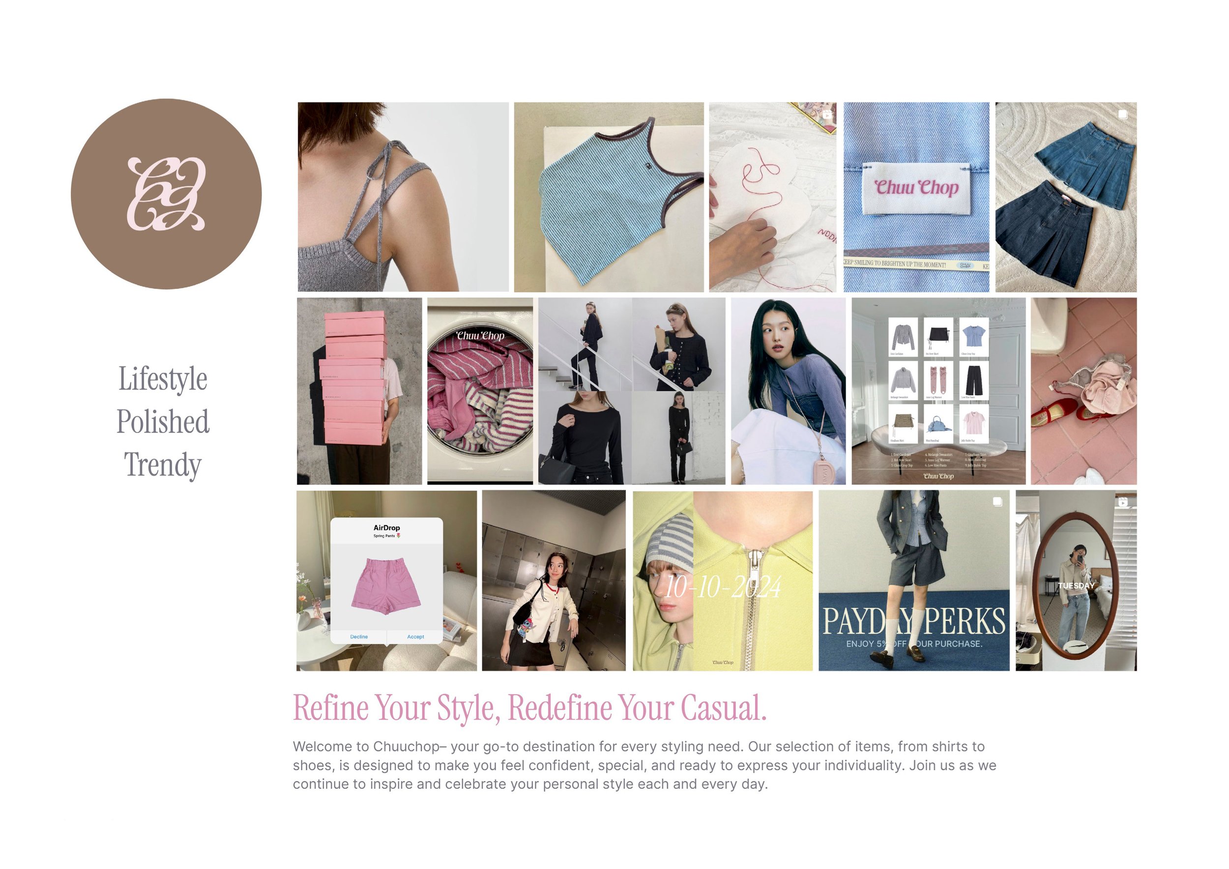
We repositioned CHUUCHOP as a contemporary fashion brand with its own distinctive point of view. A clearer brand identity, content structure, signature typography, refined pastel palette and cohesive art direction create greater consistency across its brand presence and campaigns.

The new identity balances youthful charm with mature confidence, making CHUUCHOP more recognisable, desirable and shareable.

The Solution

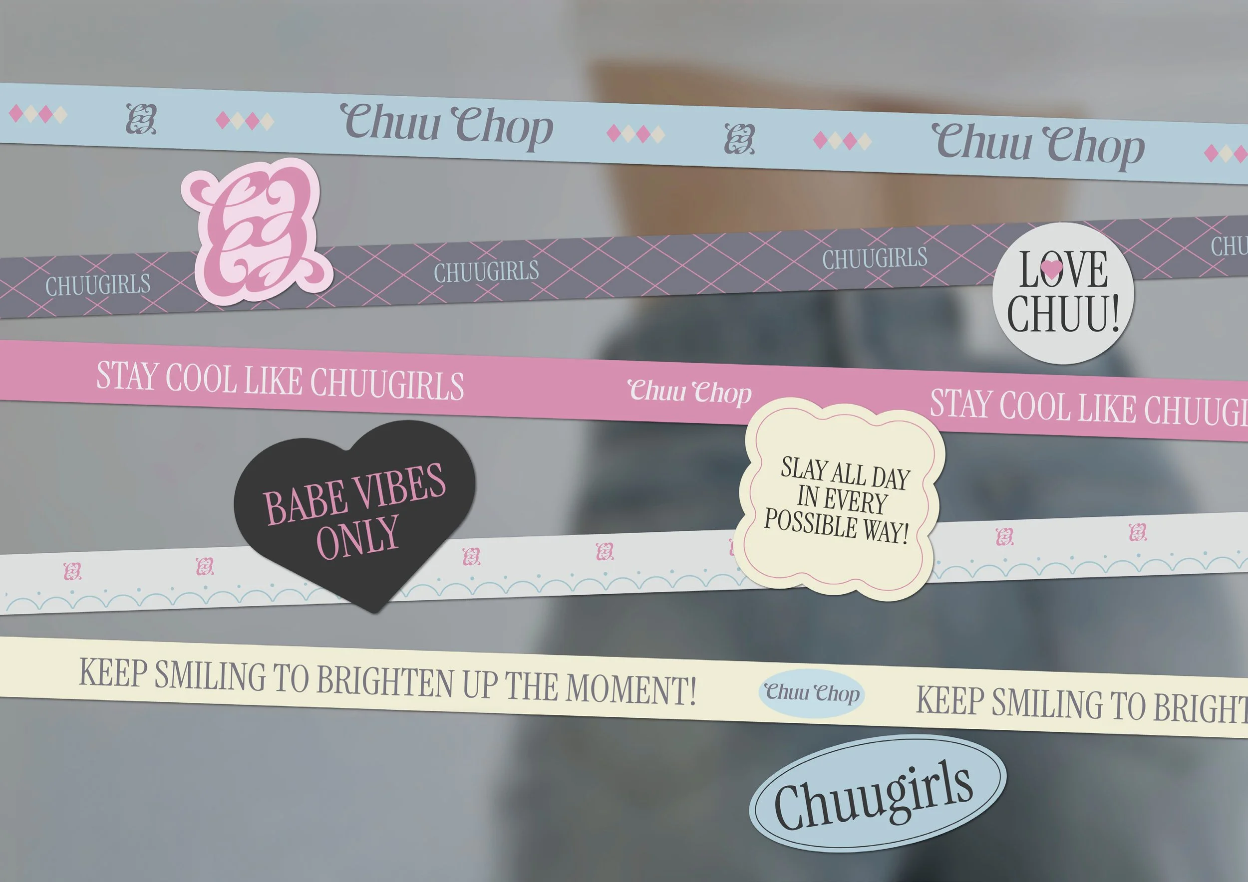
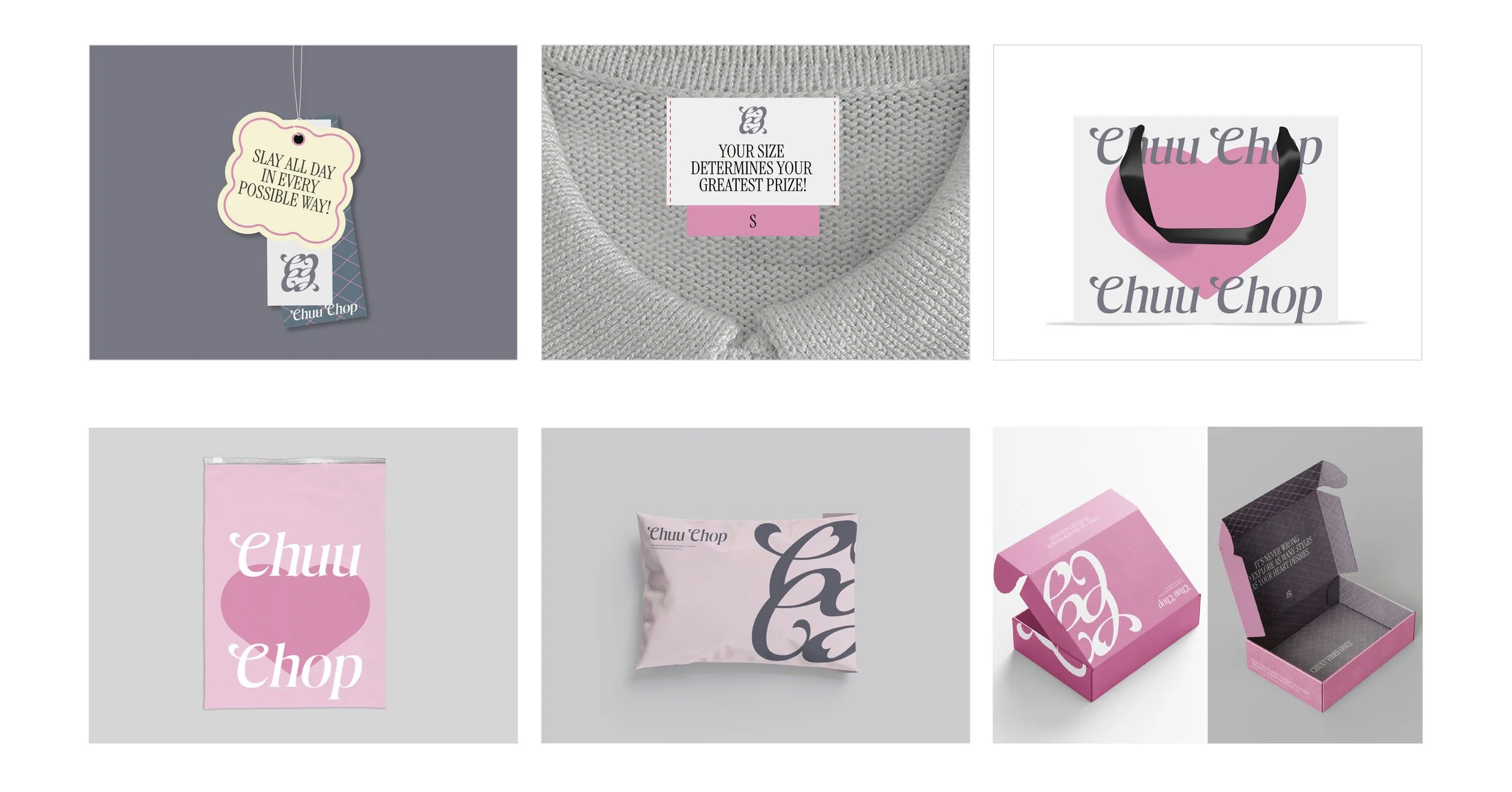
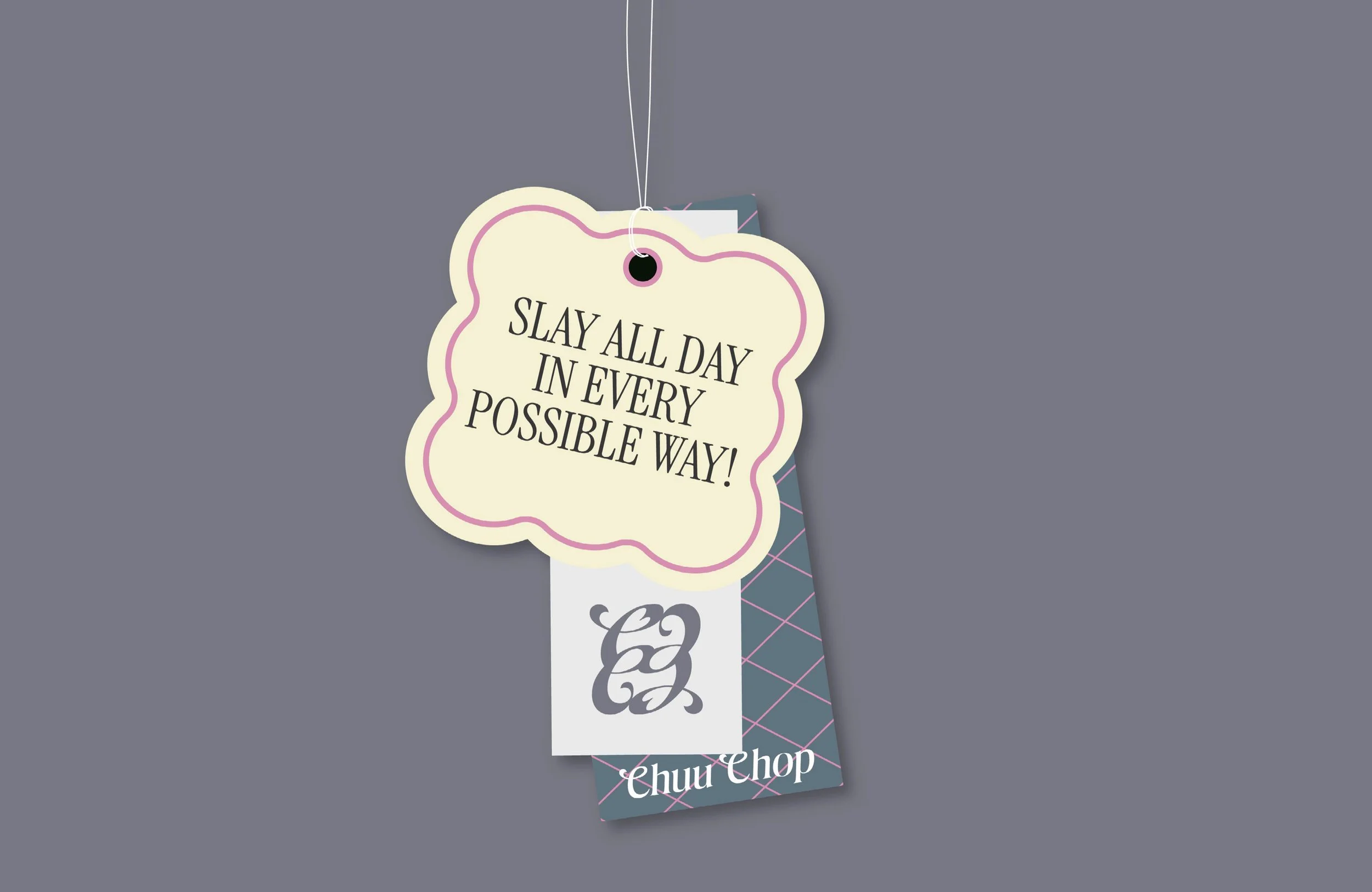
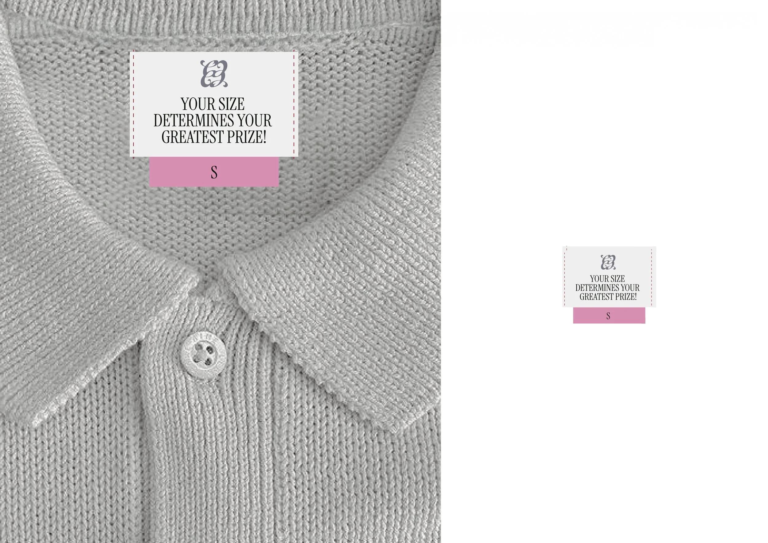
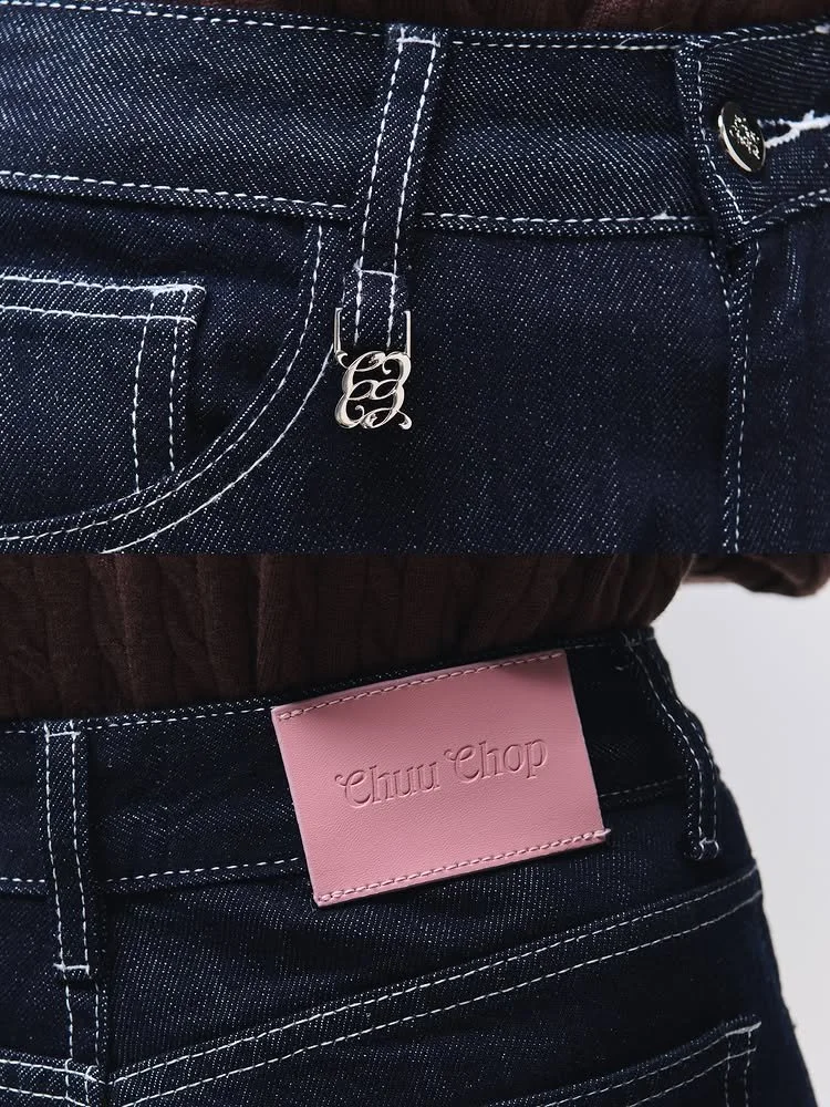
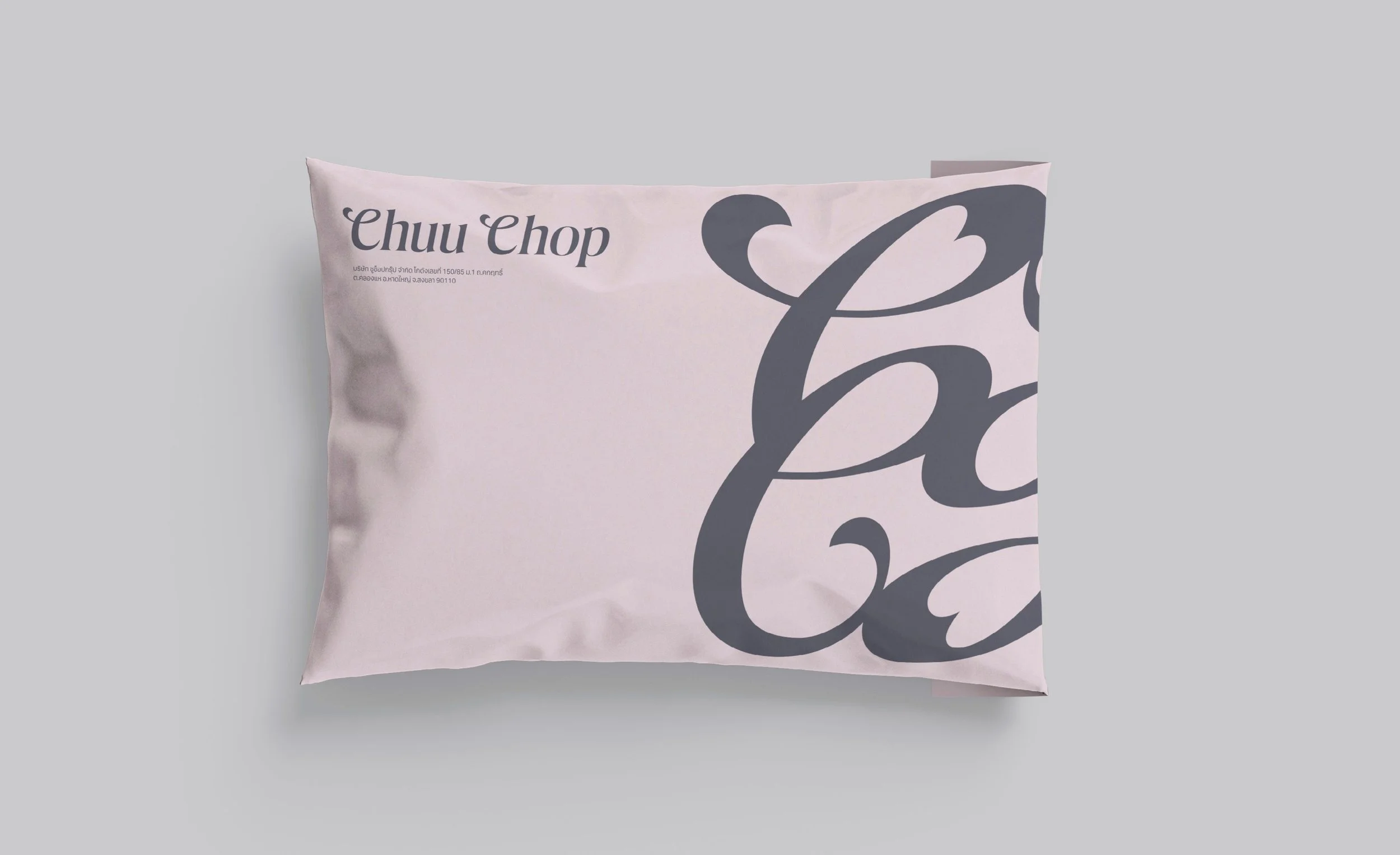
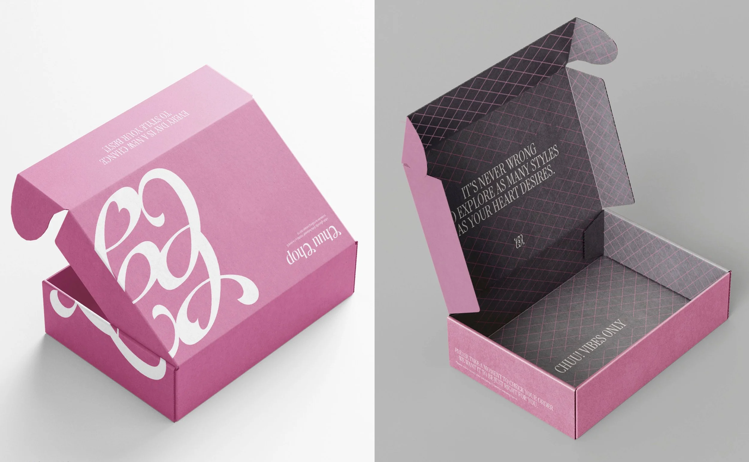
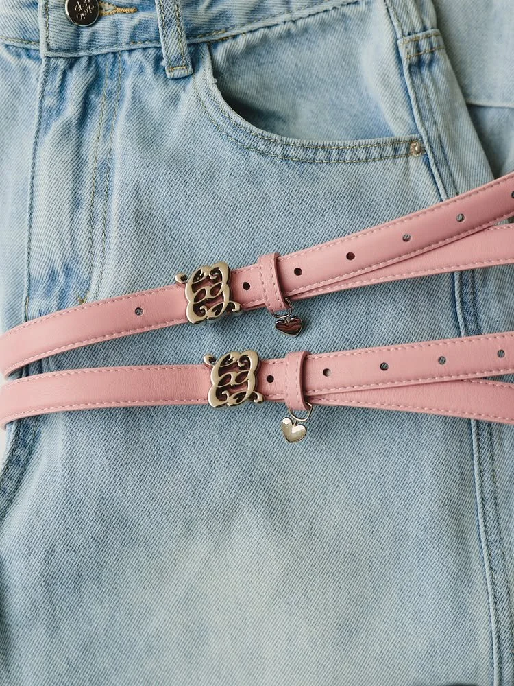
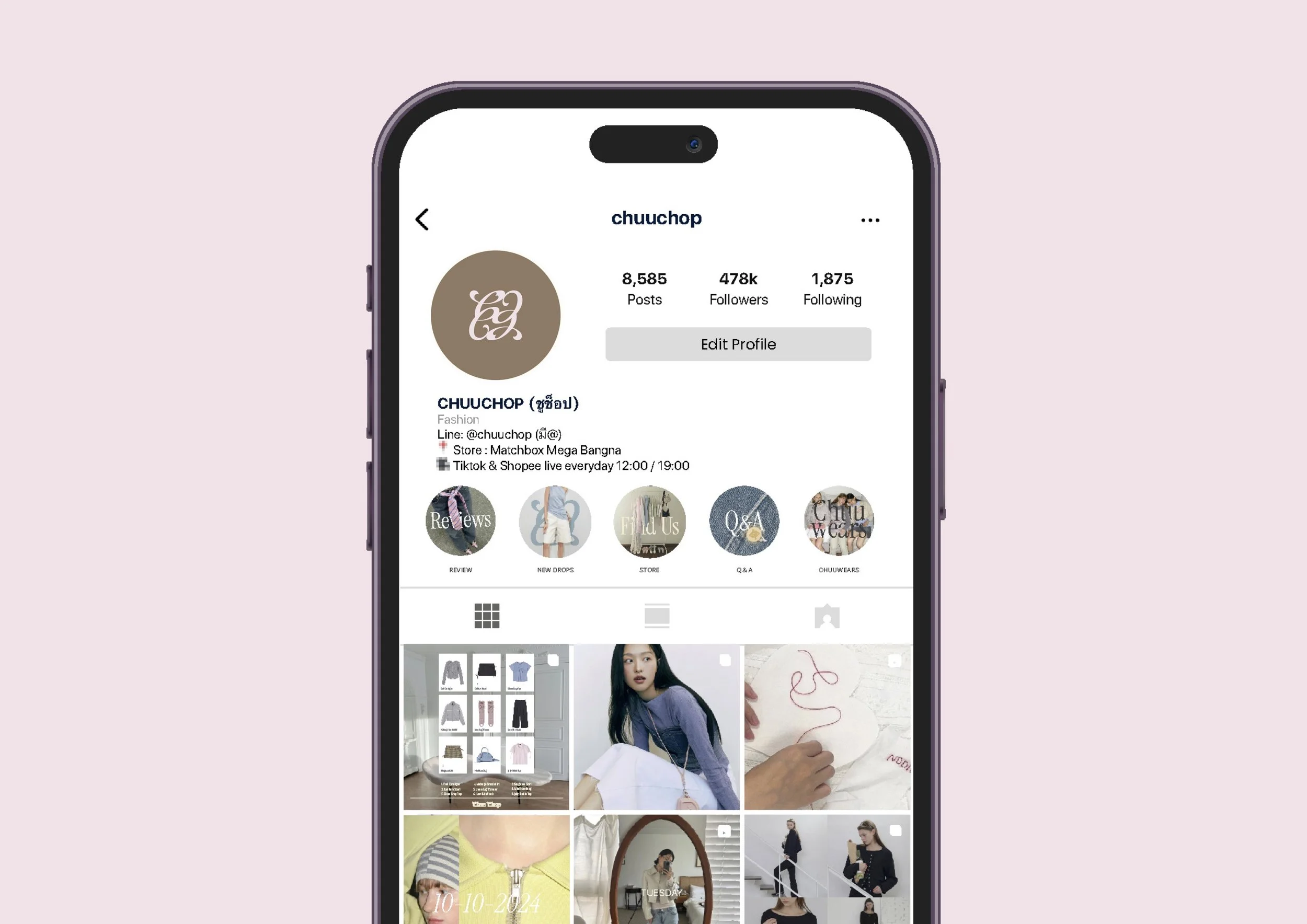
The new system brings together signature typography, a refined pastel colour palette, flexible graphic elements and cohesive campaign art direction. These elements were designed to work across social media templates, e-commerce visuals, product launches, packaging and other customer-facing materials.

Rather than relying on a different visual style for every campaign, CHUUCHOP can now build recognition through repeated brand cues while allowing each collection to have its own personality. The result is a fashion brand identity and online presence that feels youthful yet grown-up, distinctive yet practical, and more desirable for customers to wear, remember and share

Next
Next

Tiara Beauty