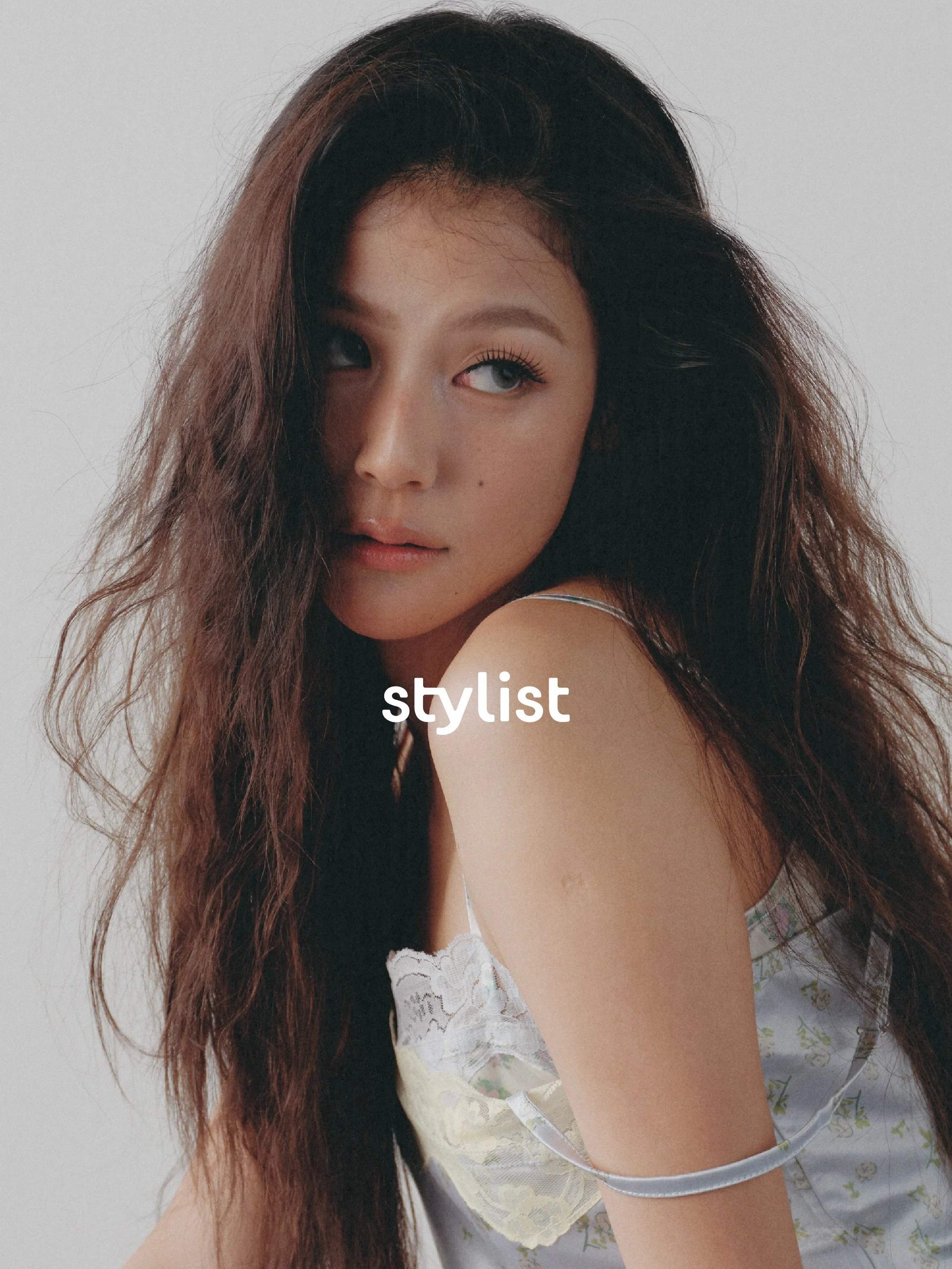
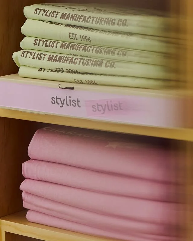
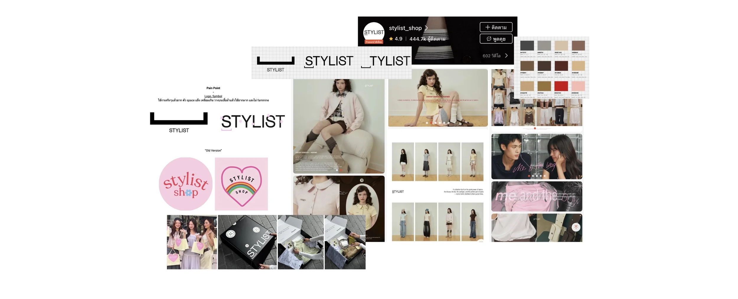
Stylist’s previous identity lacked personality. The rigid, angular logo was difficult to apply across clothing and graphics and did not reflect the brand’s playful, feminine character. Constantly changing colours, packaging and photoshoot concepts also weakened recognition and sometimes caused confusion with competitors.

The Problem

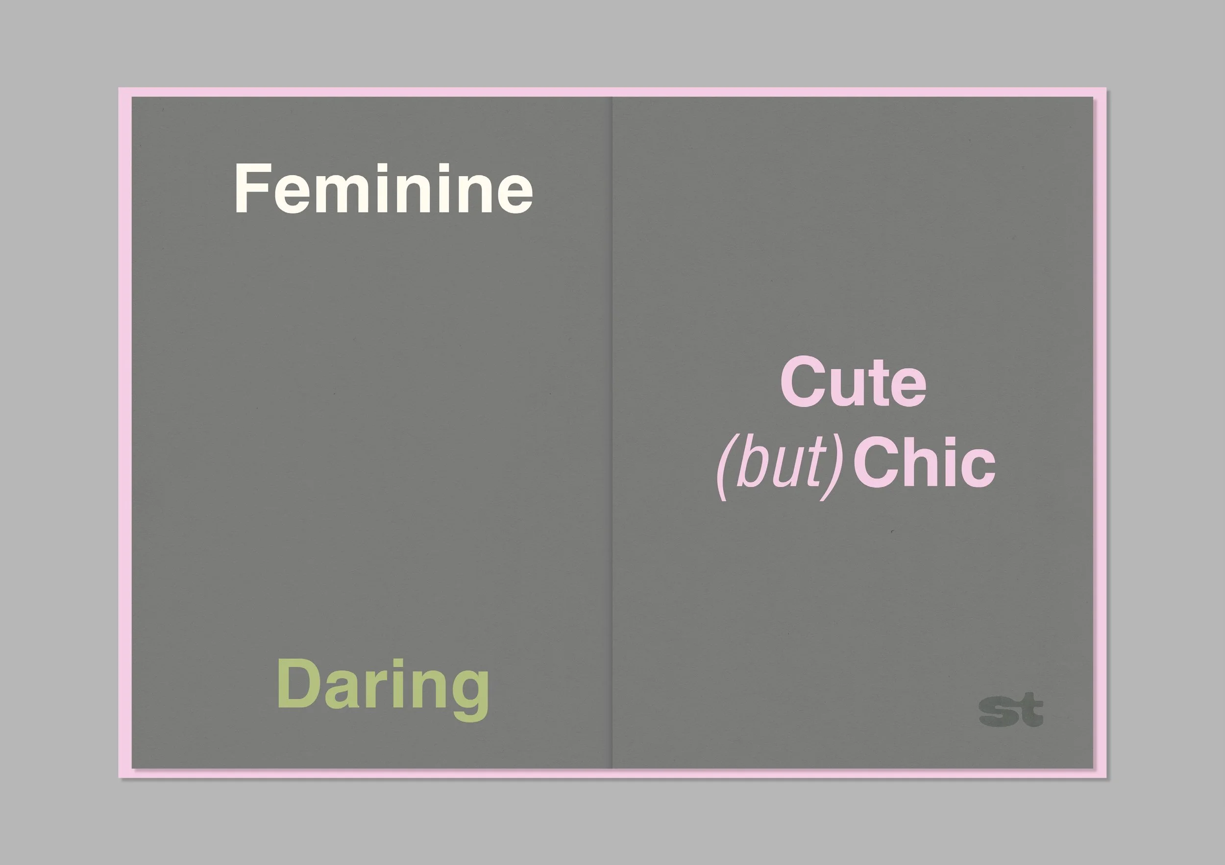
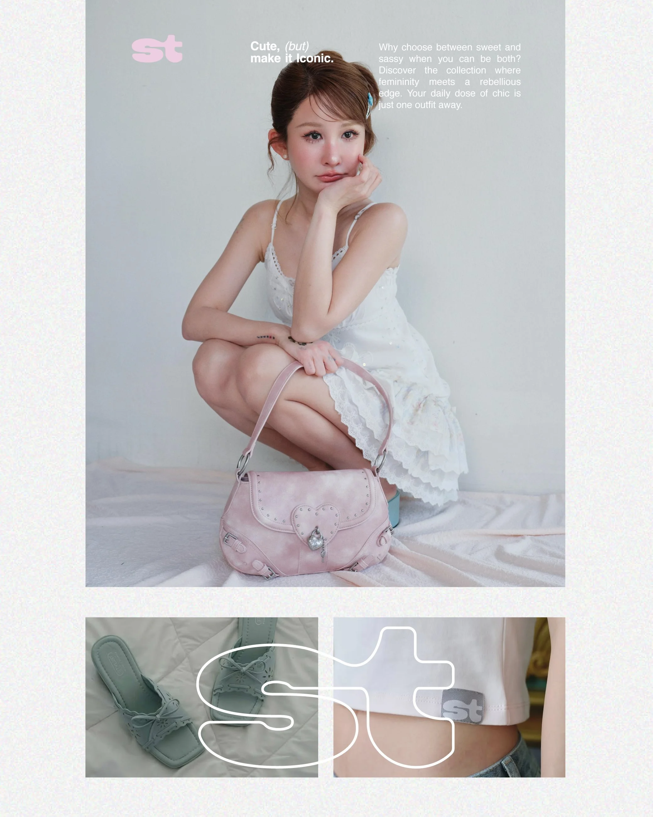
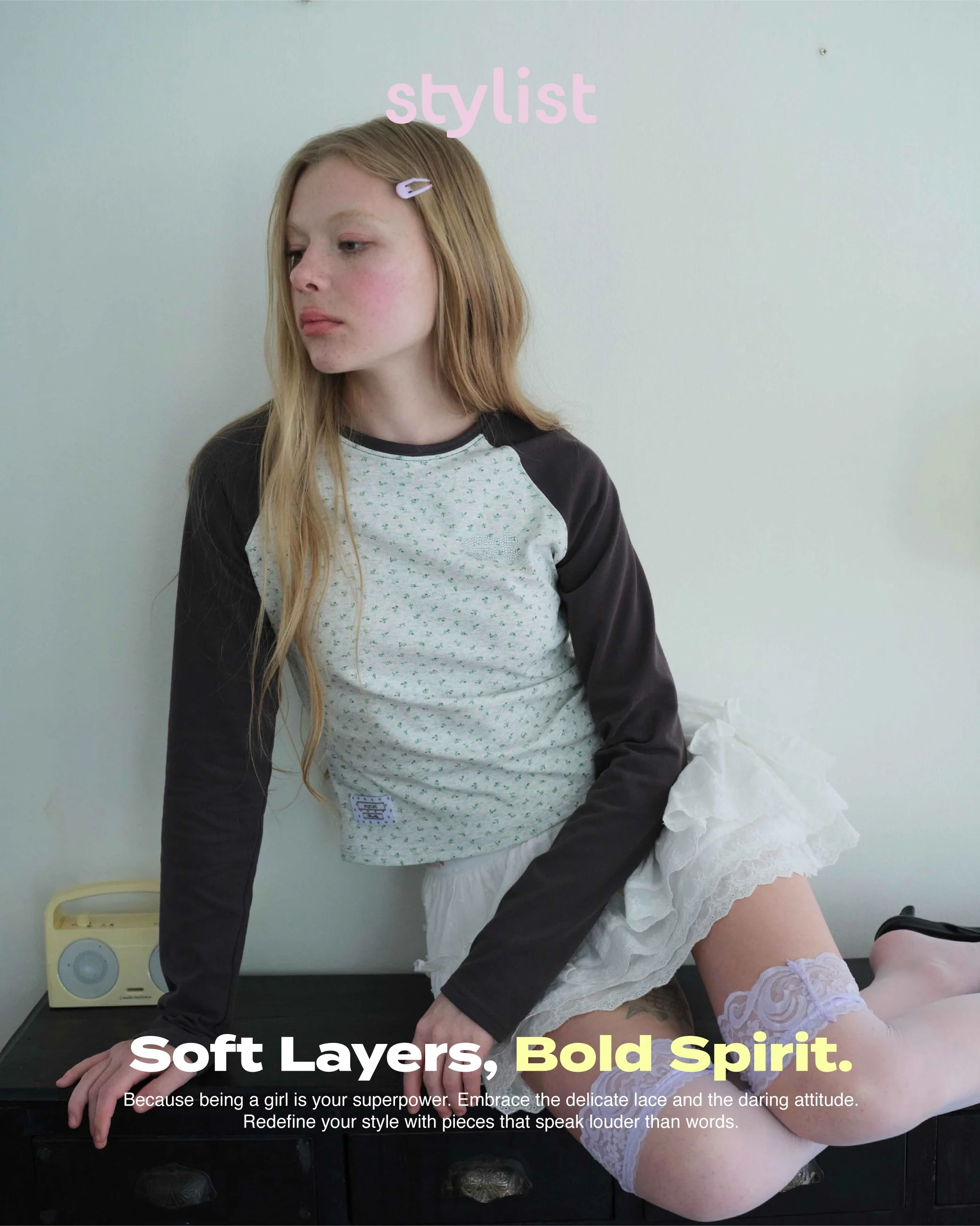
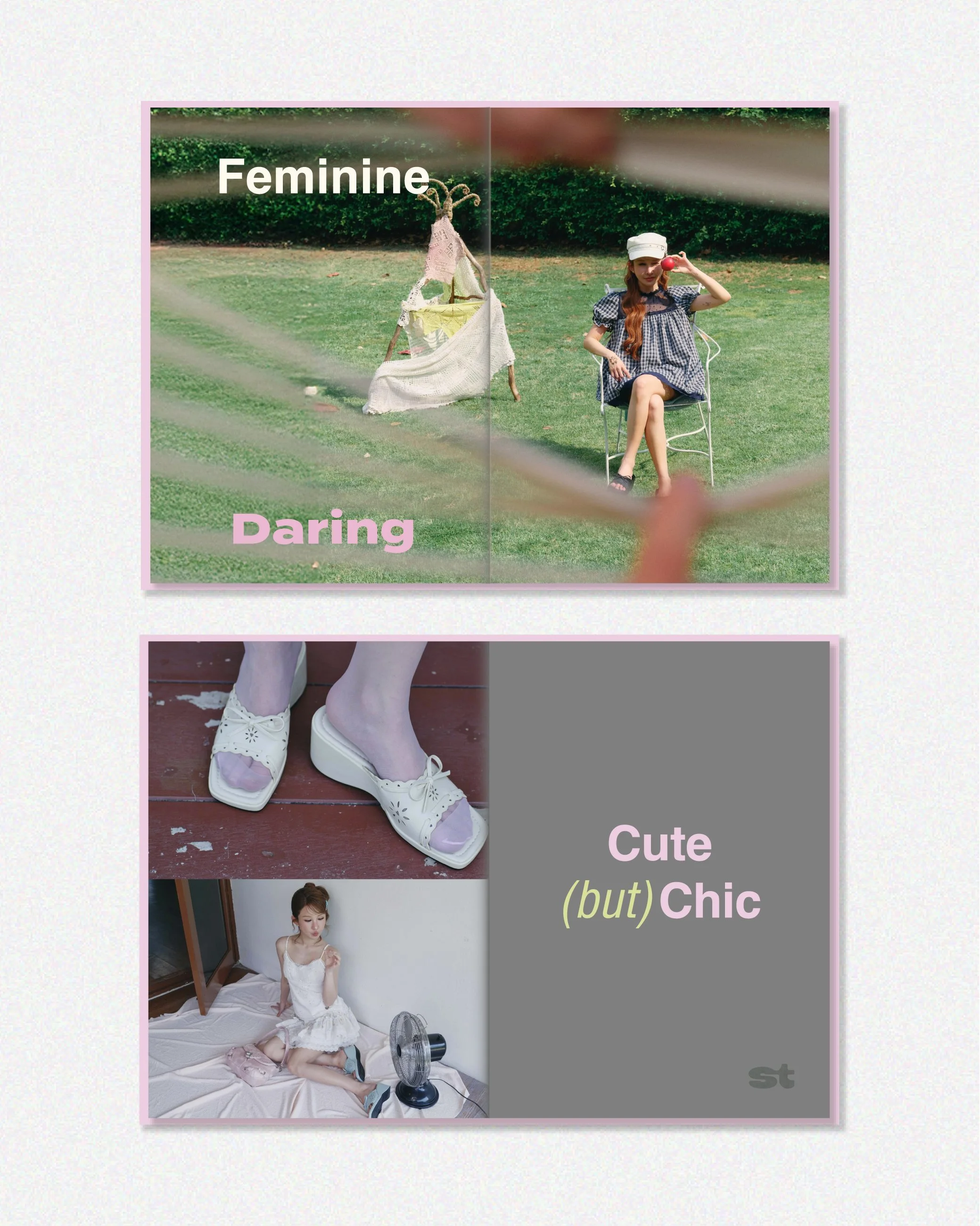
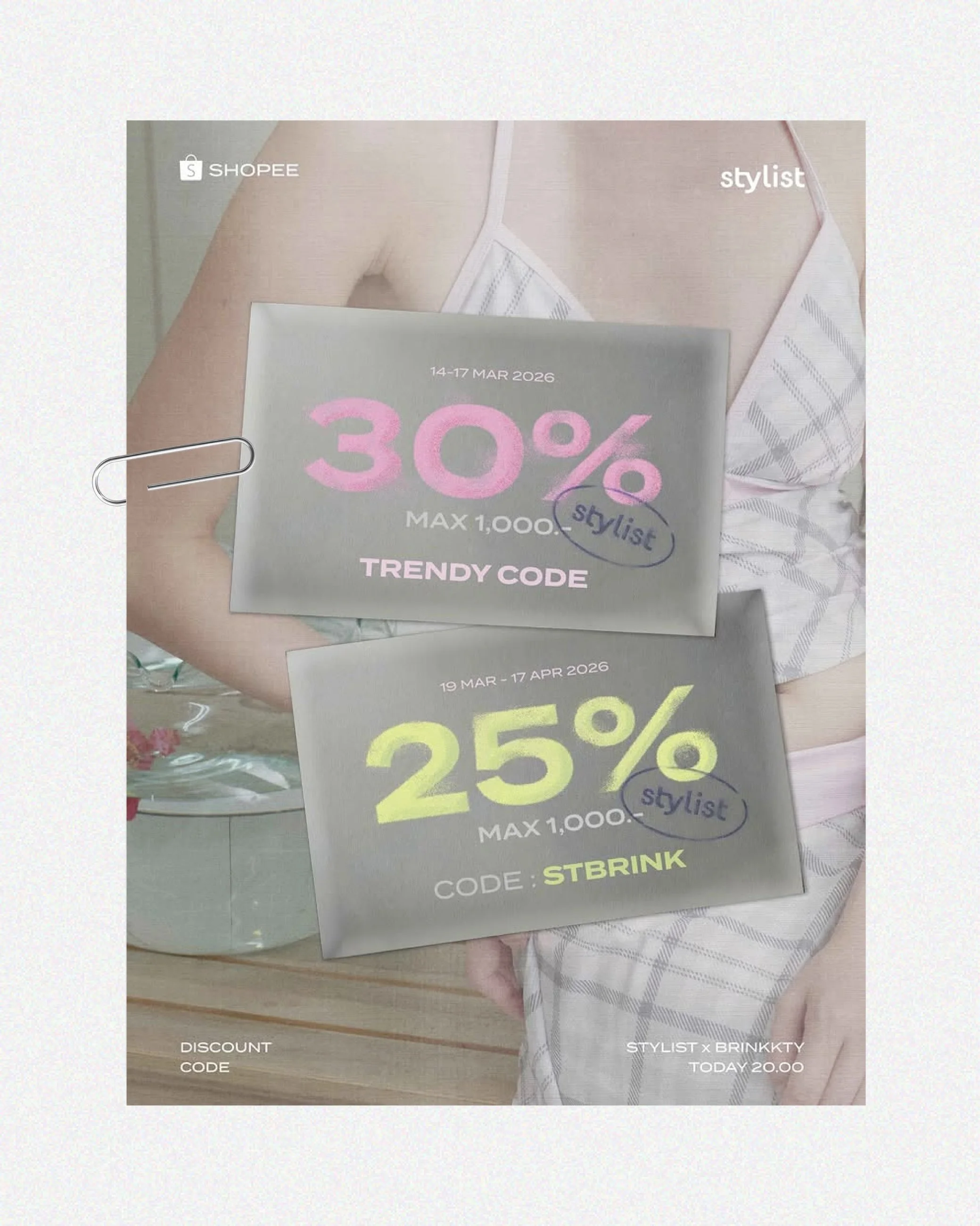
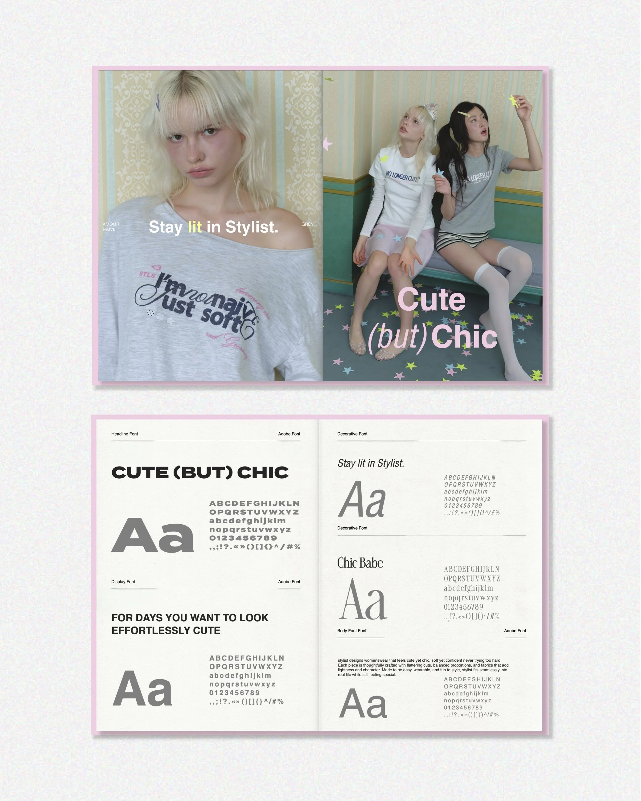
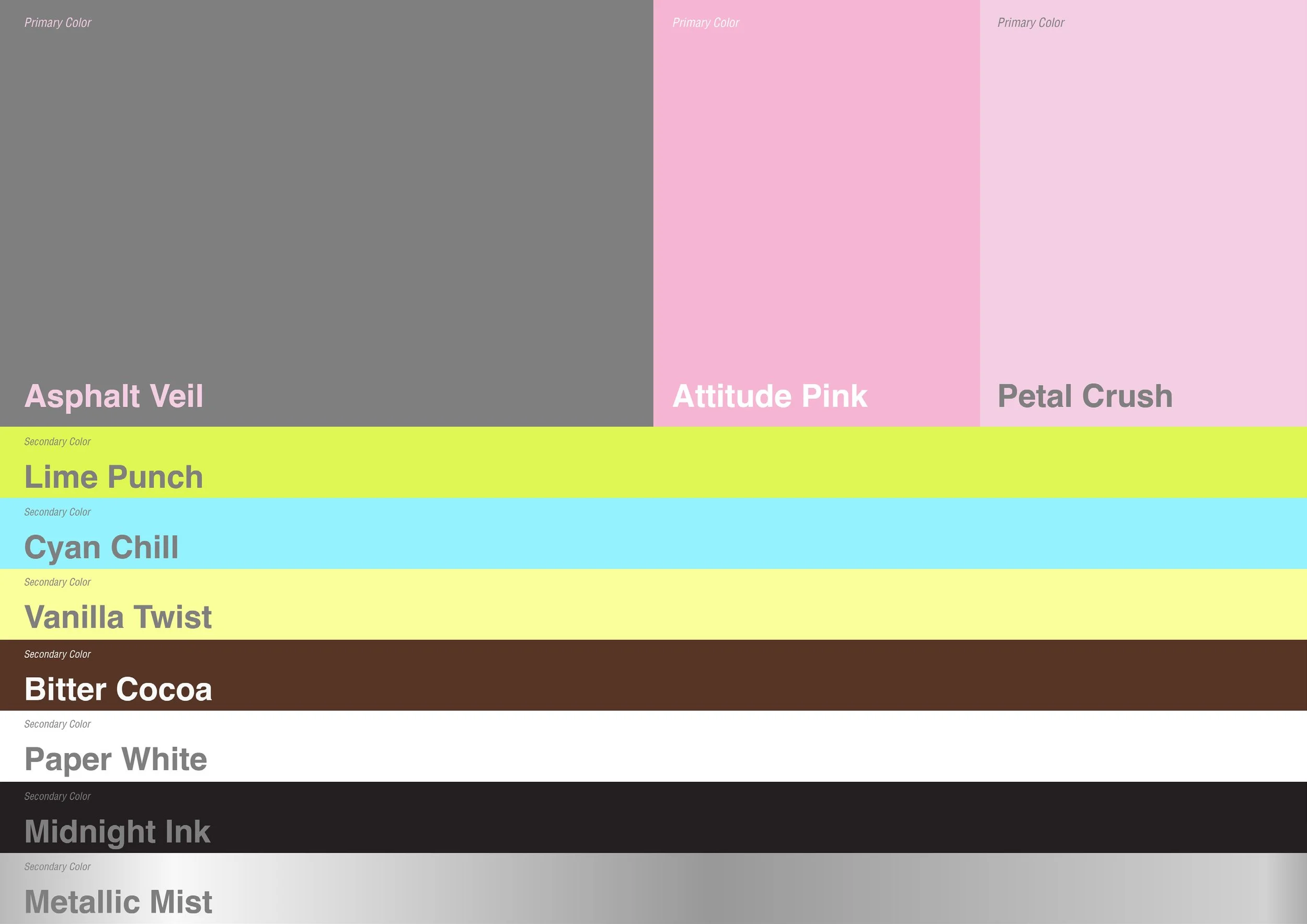
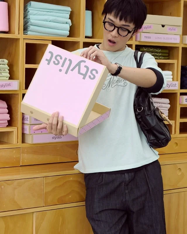
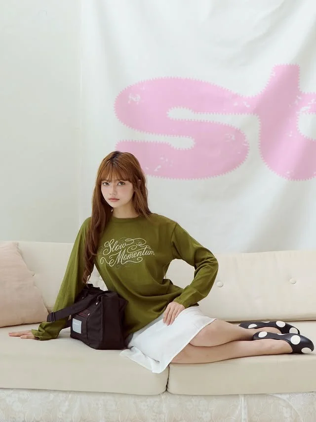
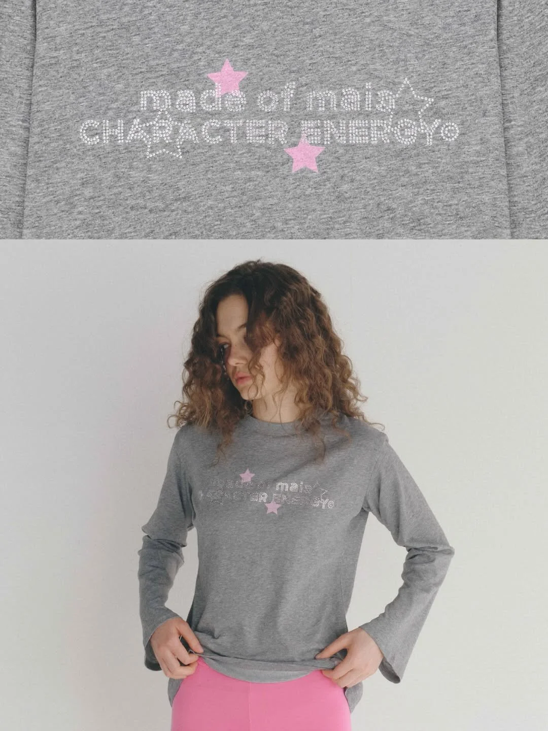
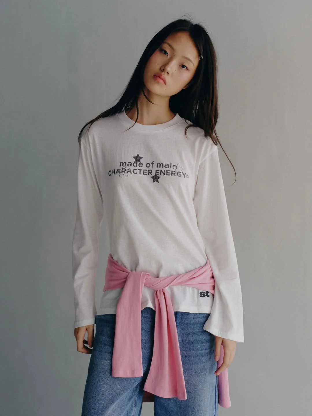
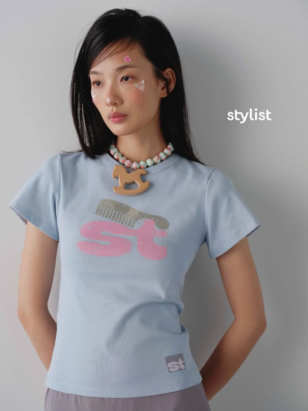
Guided by the concept “Cute but Chic,” we created a playful and distinctive new identity that brings Stylist’s character to life. The unique logo, expressive colour palette and flexible visual system balance fun with sophistication, making the brand more consistent, recognisable and intentional across every touchpoint.

The Solution

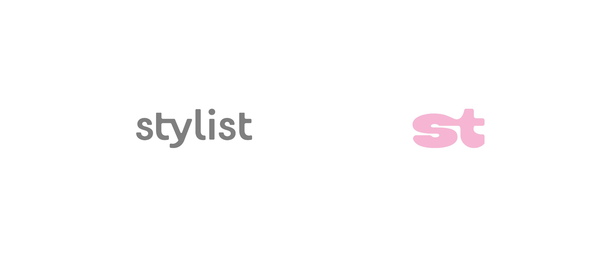
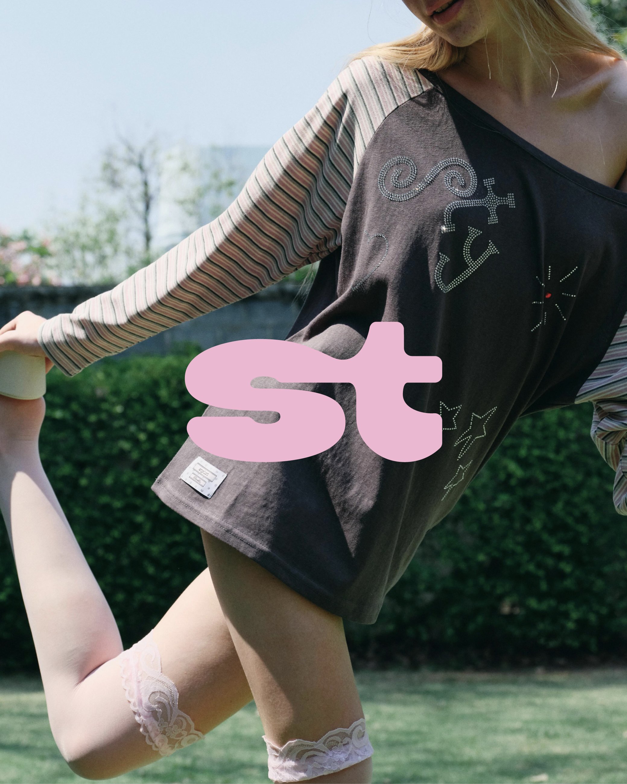
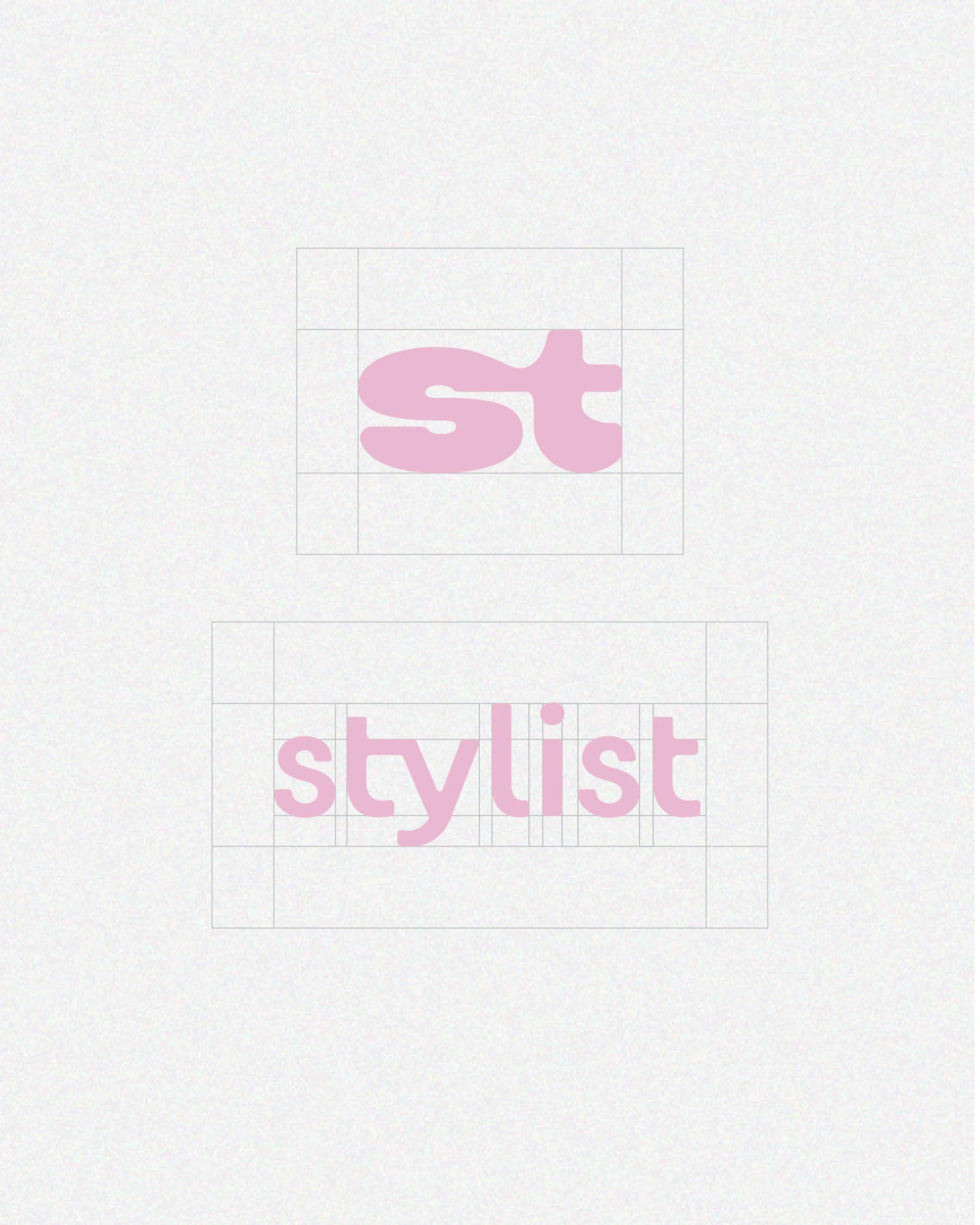
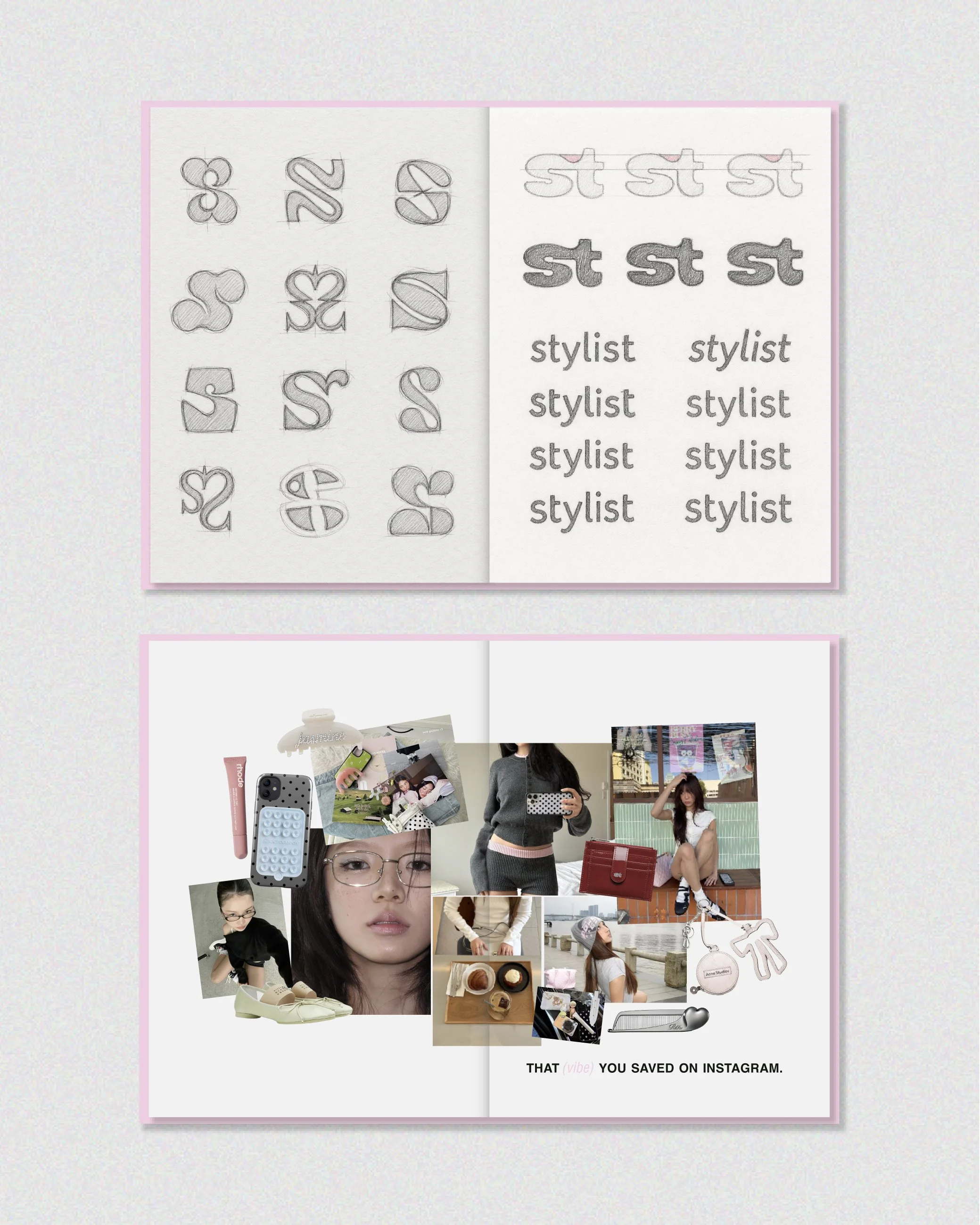
A custom wordmark was created to give the name a more ownable silhouette, supported by a monogram that can work in smaller spaces and as a recognisable fashion detail. The wider system includes a defined colour palette, typography hierarchy and graphic approach for packaging, hangtags, labels, social media and campaign imagery.

Each element was considered for practical use across physical and digital formats, helping the team maintain consistency without making every application look identical. The result is a contemporary fashion branding system that feels soft, bold and memorable, giving STYLIST SHOP a stronger presence from the garment itself to the complete customer experience.

Previous
Previous

twentywendy

Next
Next

BASIC SELECTED