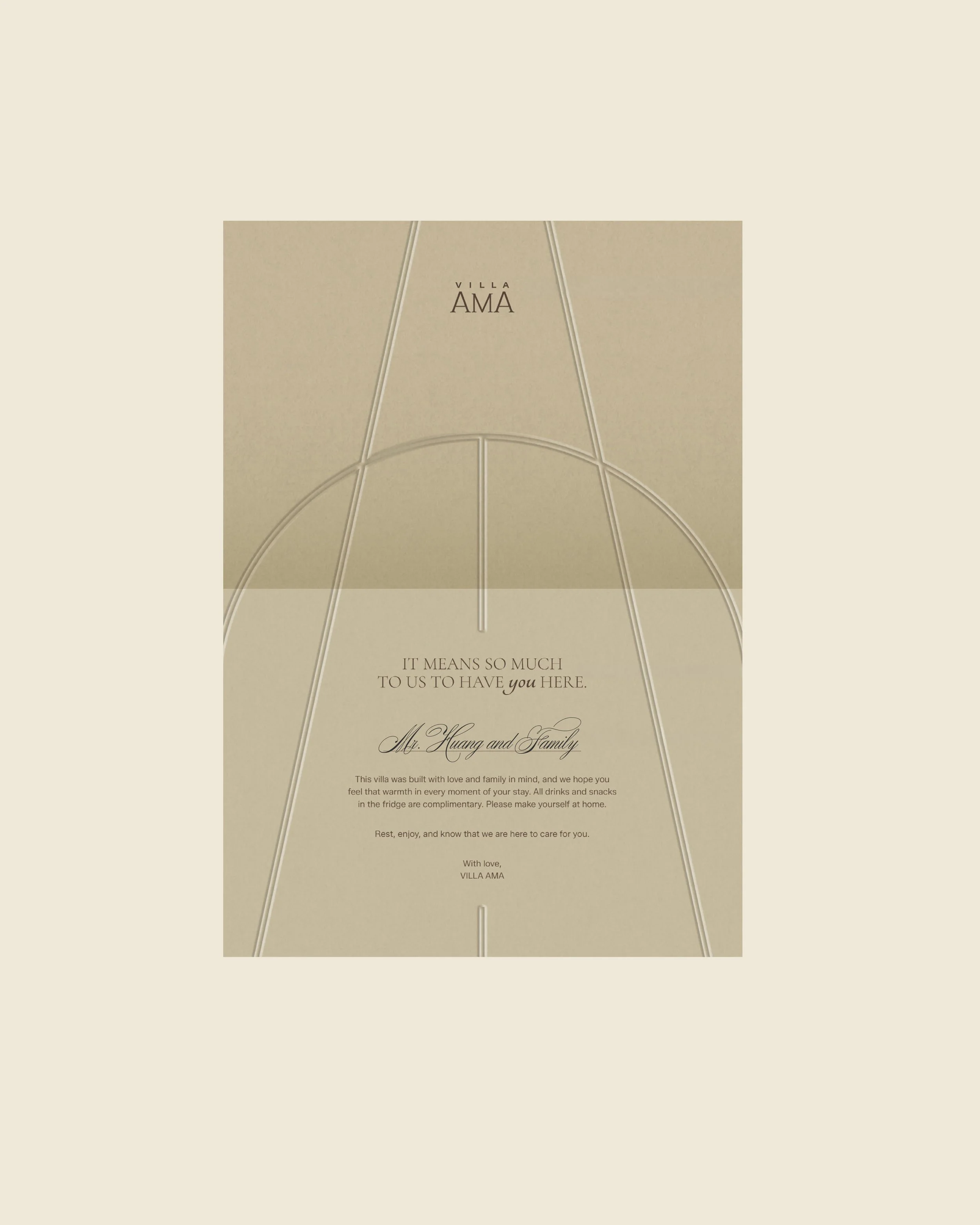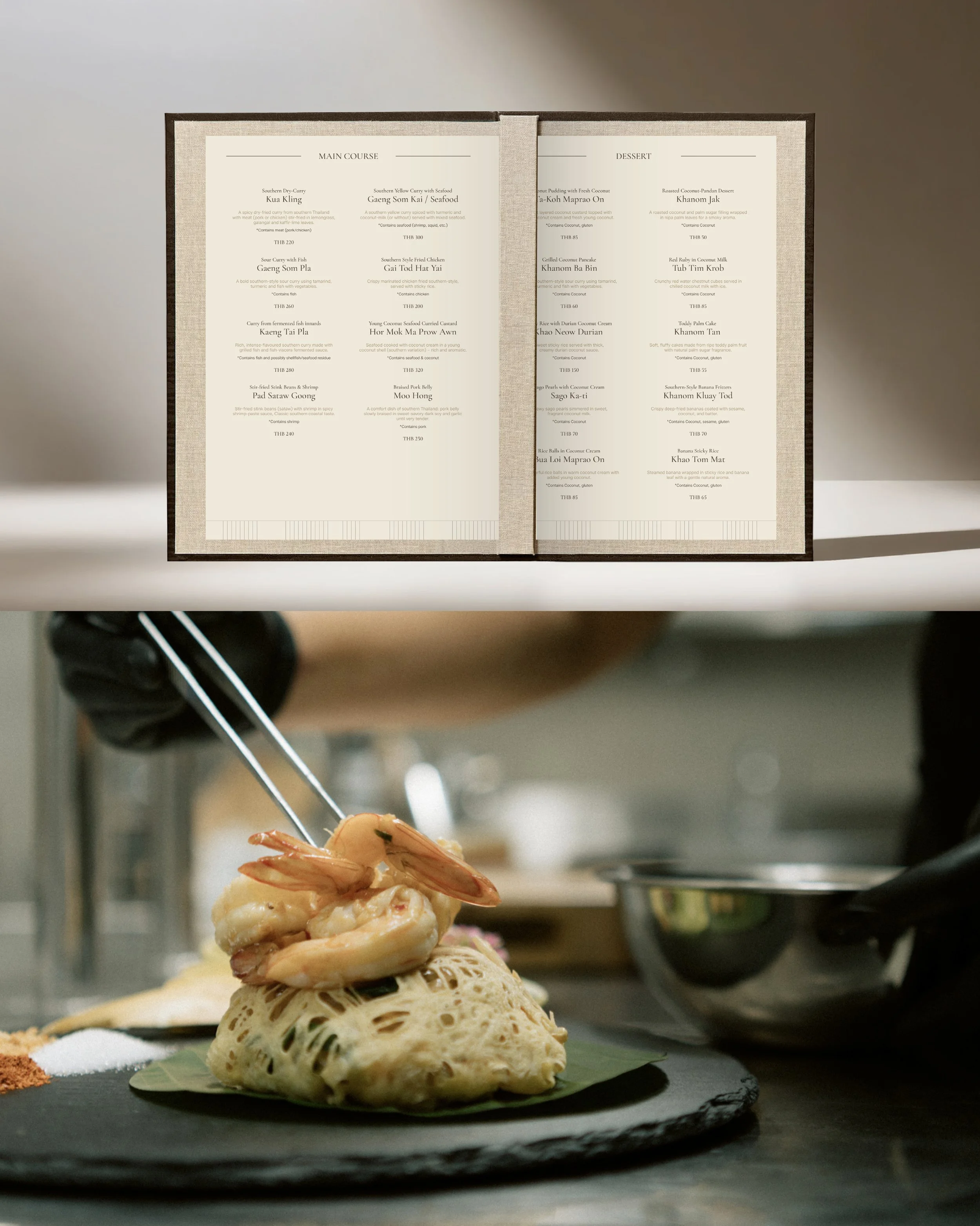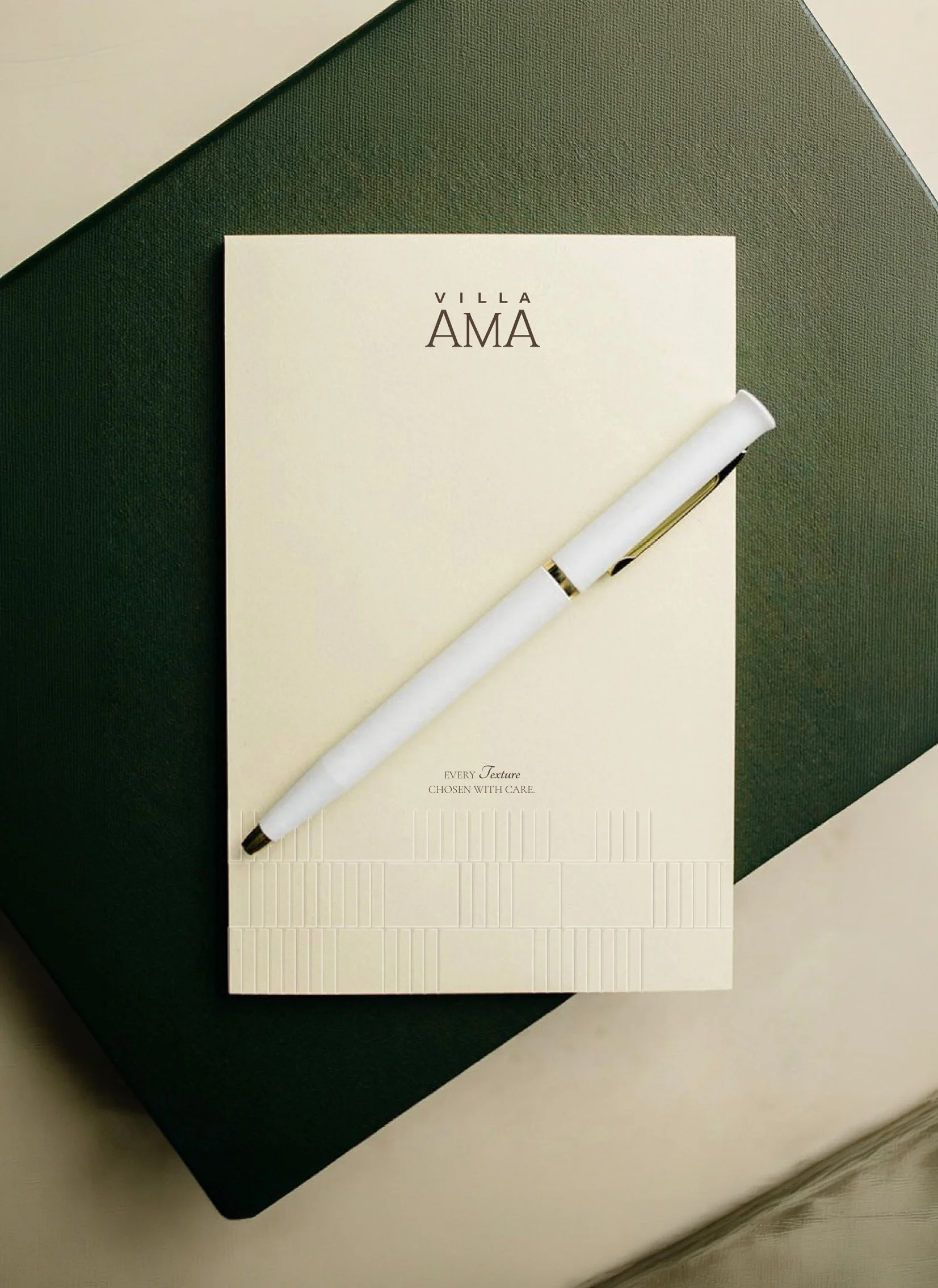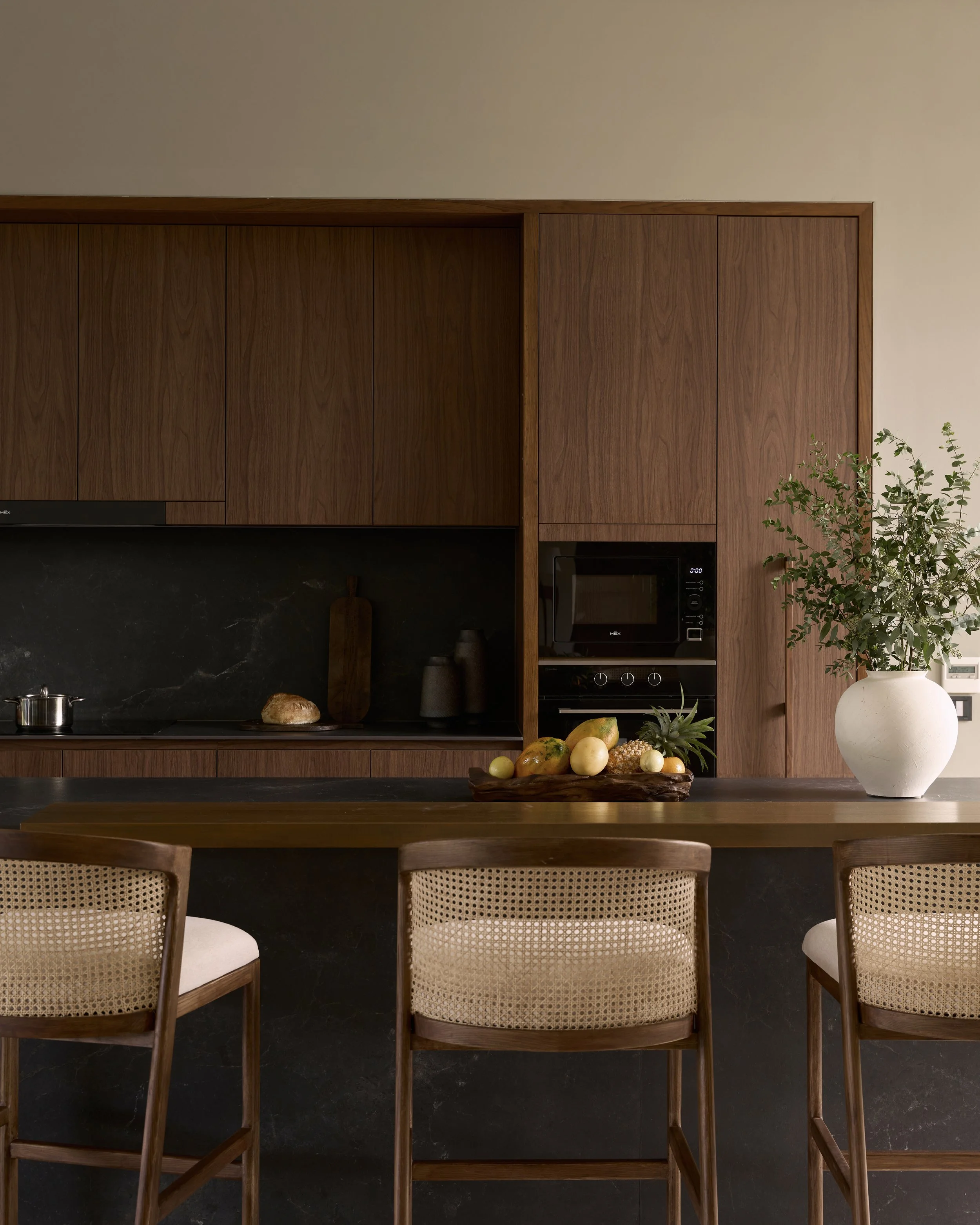
The identity was translated into a restrained and cohesive visual system. An elegant serif paired with a contemporary sans-serif creates a balance between timeless character and modern simplicity, supported by a soft, natural color palette.
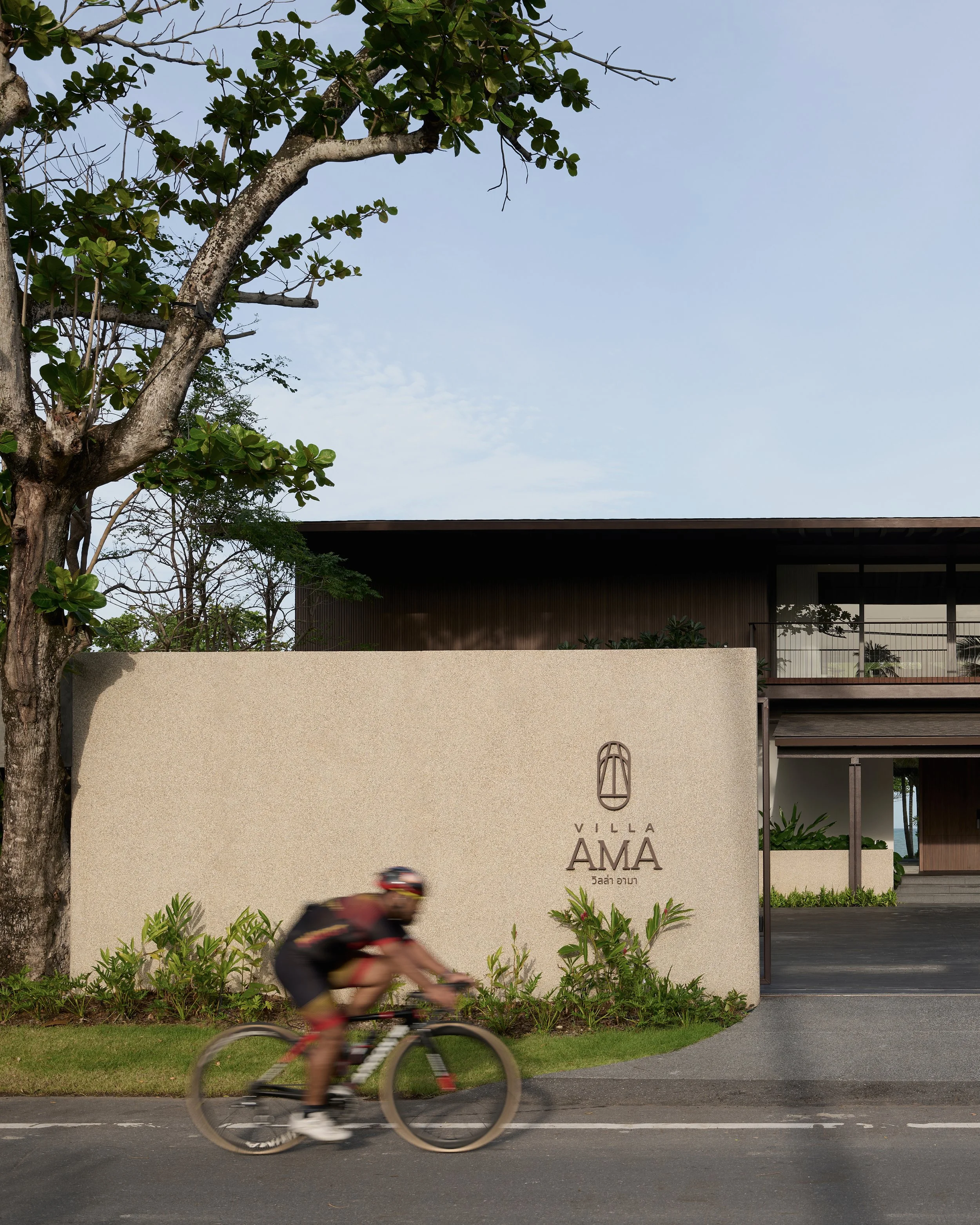
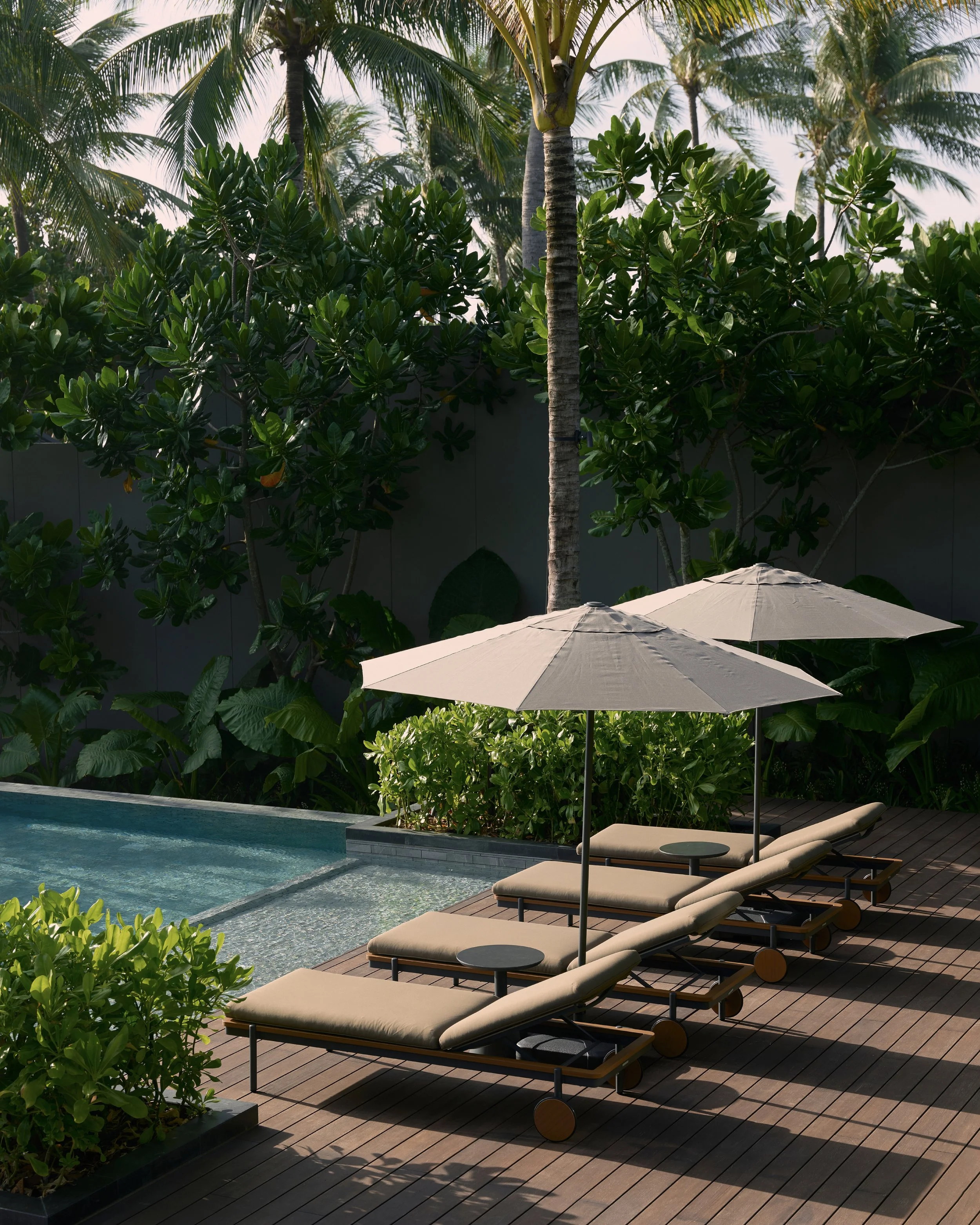
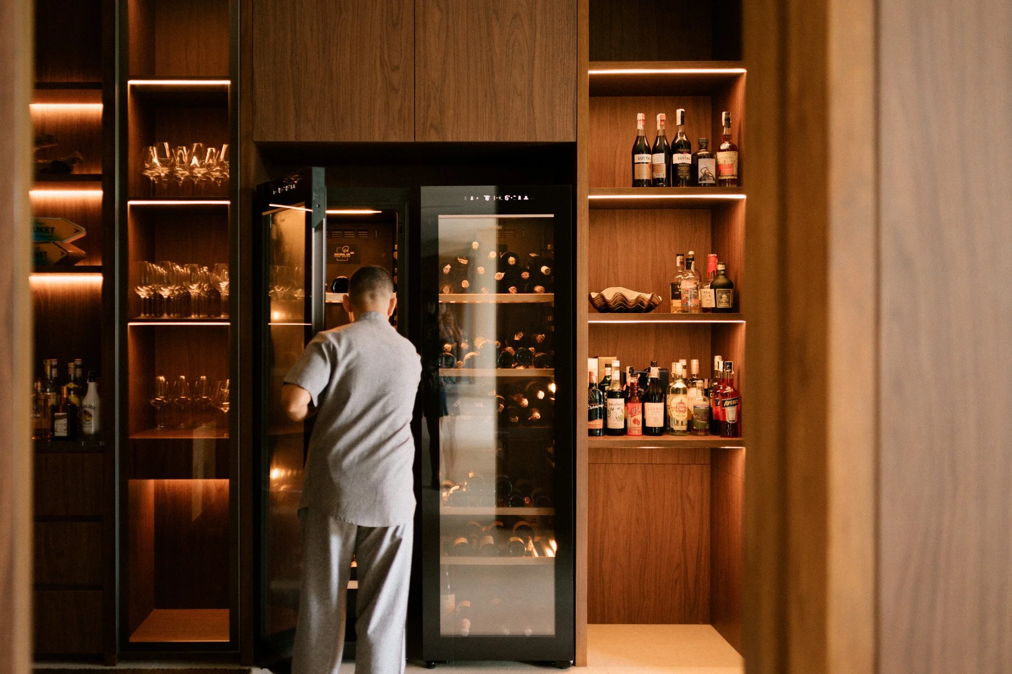
The system was then extended across stationery, welcome materials, signage, wayfinding, digital templates and the website homepage. Every application was designed to feel considered but understated, allowing the identity to support the experience of VILLA AMA without overpowering the space itself.