NINETIES
The Problem
The original branding lacked clarity and cohesion.
The brand name was overused across multiple collections and shirt designs, making it hard for customers to distinguish or remember.
The logo system wasn’t clearly defined, leading to inconsistent usage.
Collection messaging often felt disconnected from the overall brand tone and lacked impact.
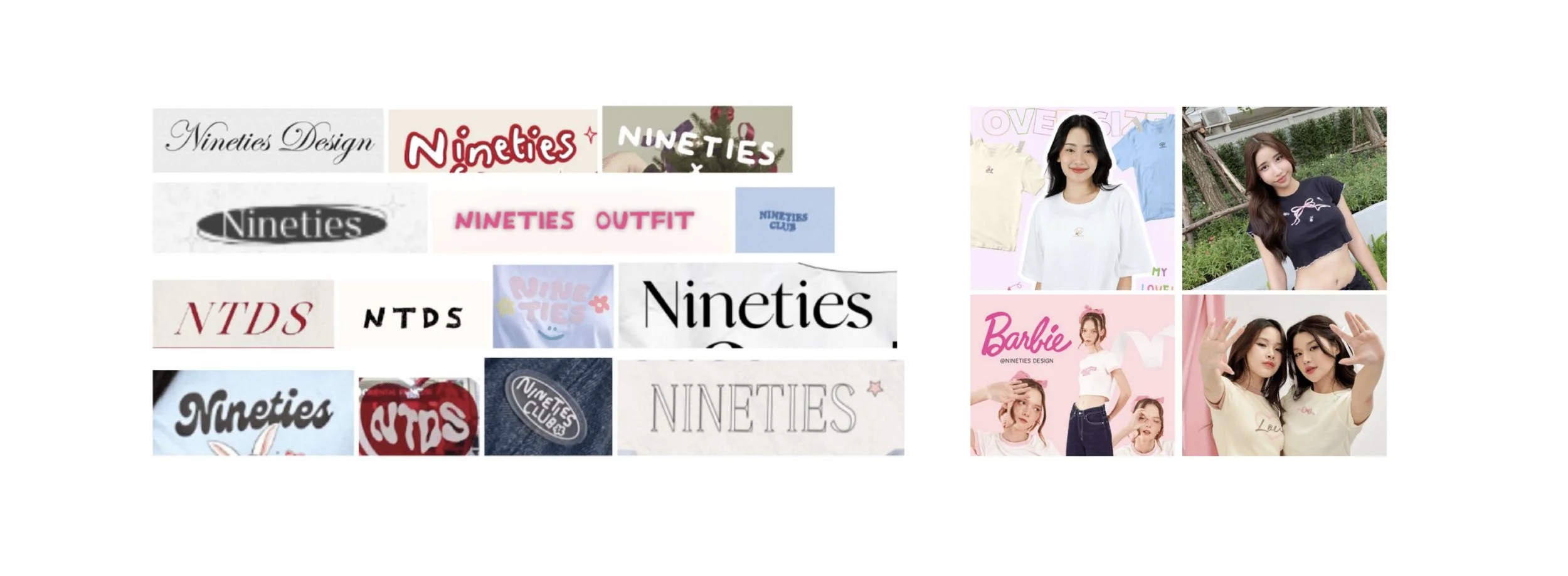
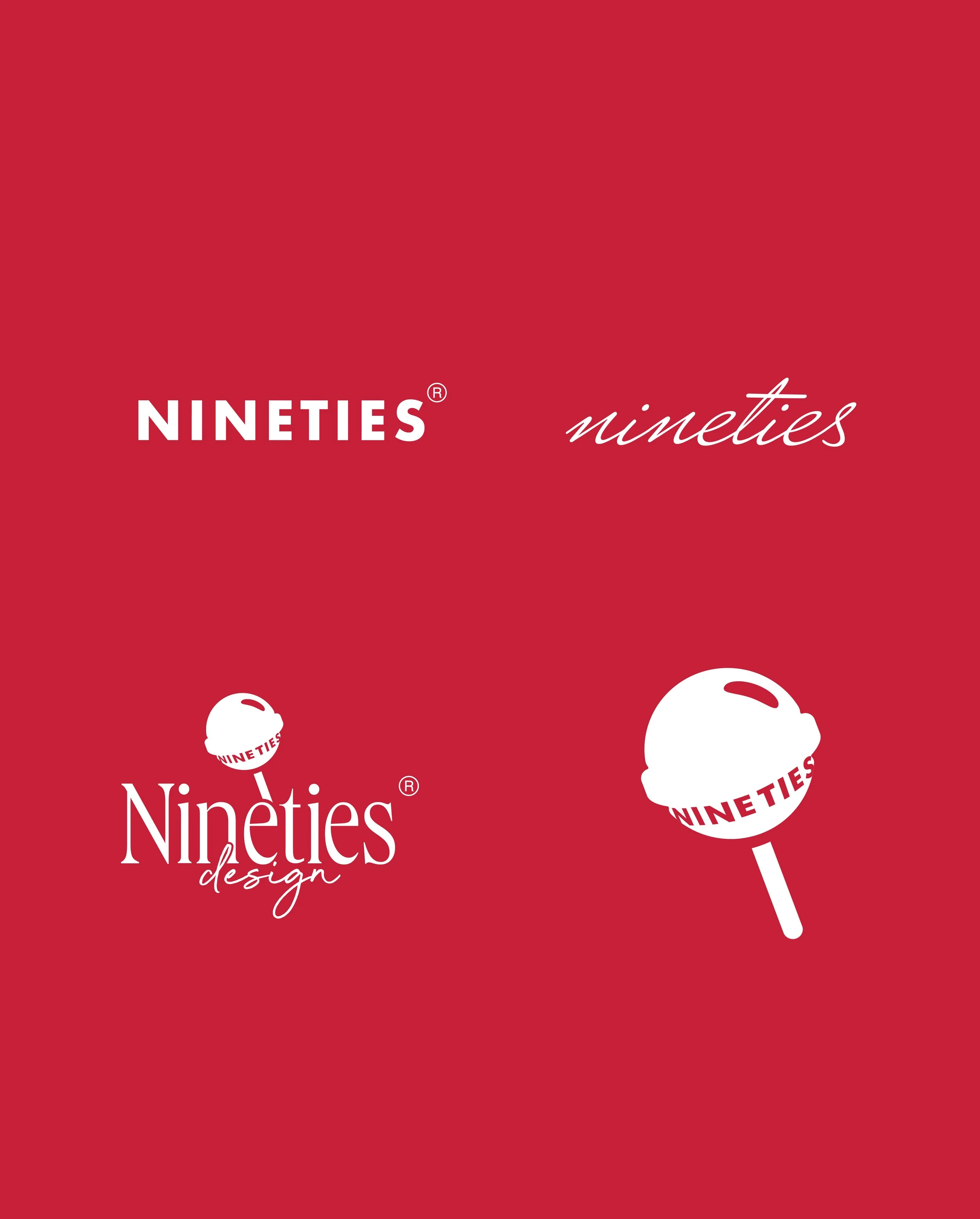
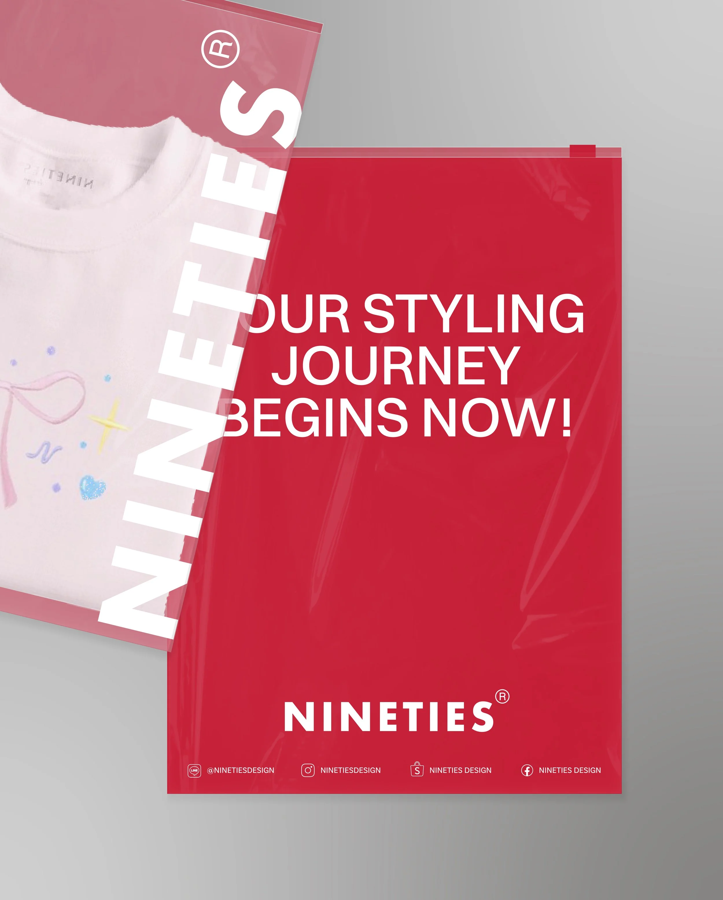
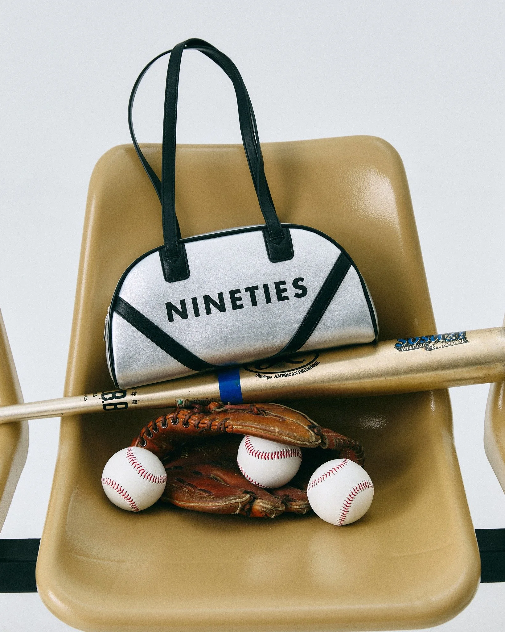
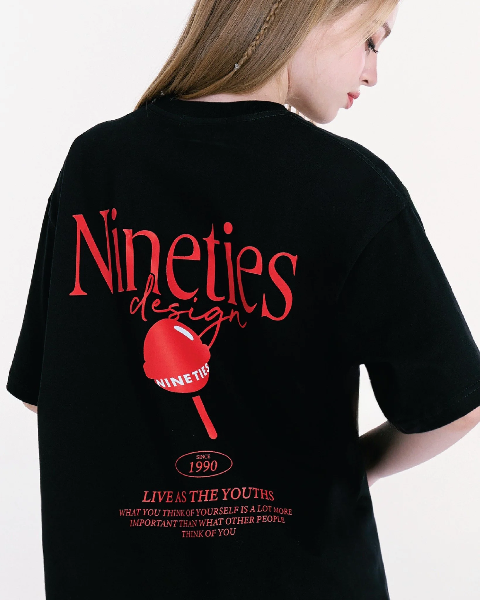
Before Re-design
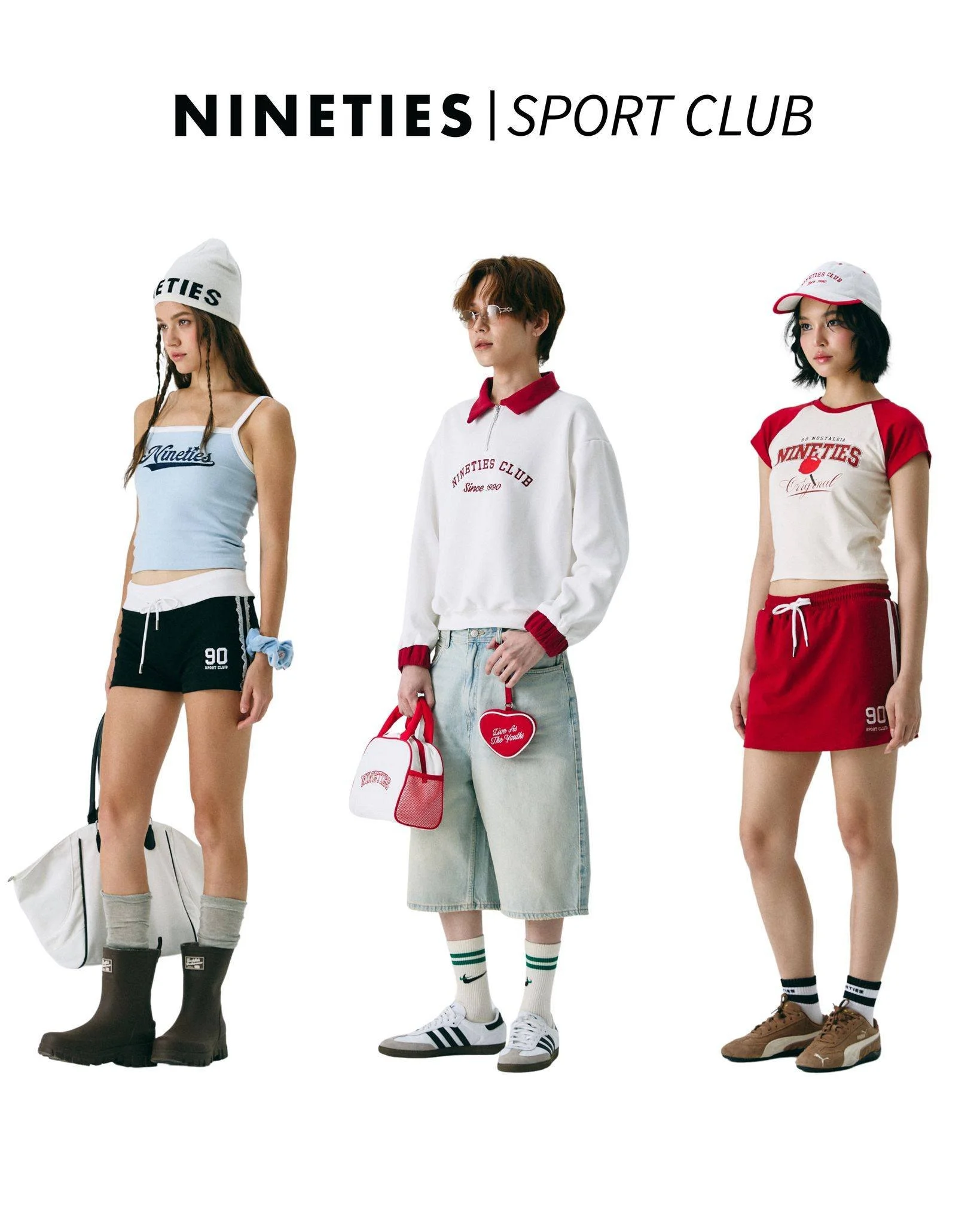
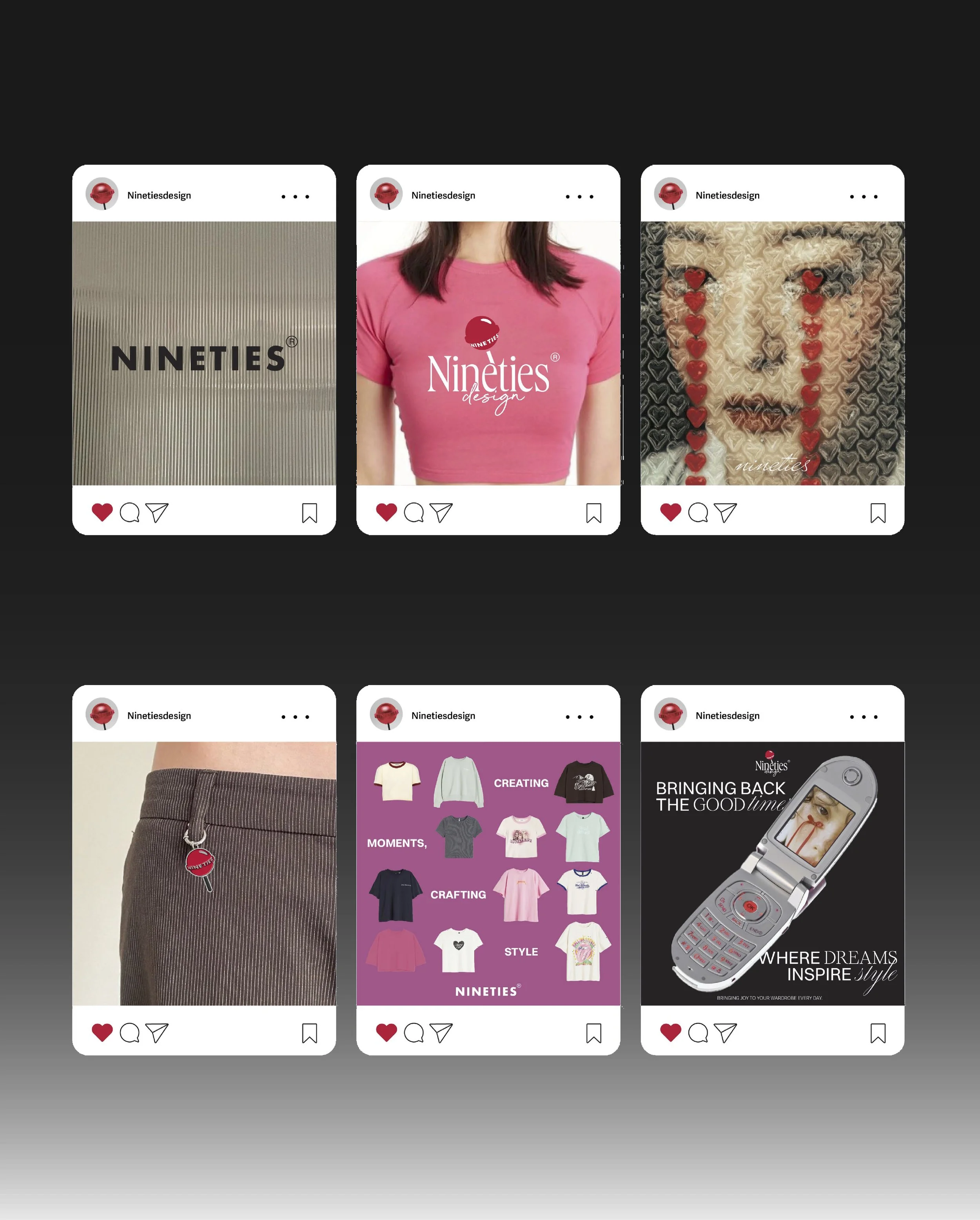
The Solution
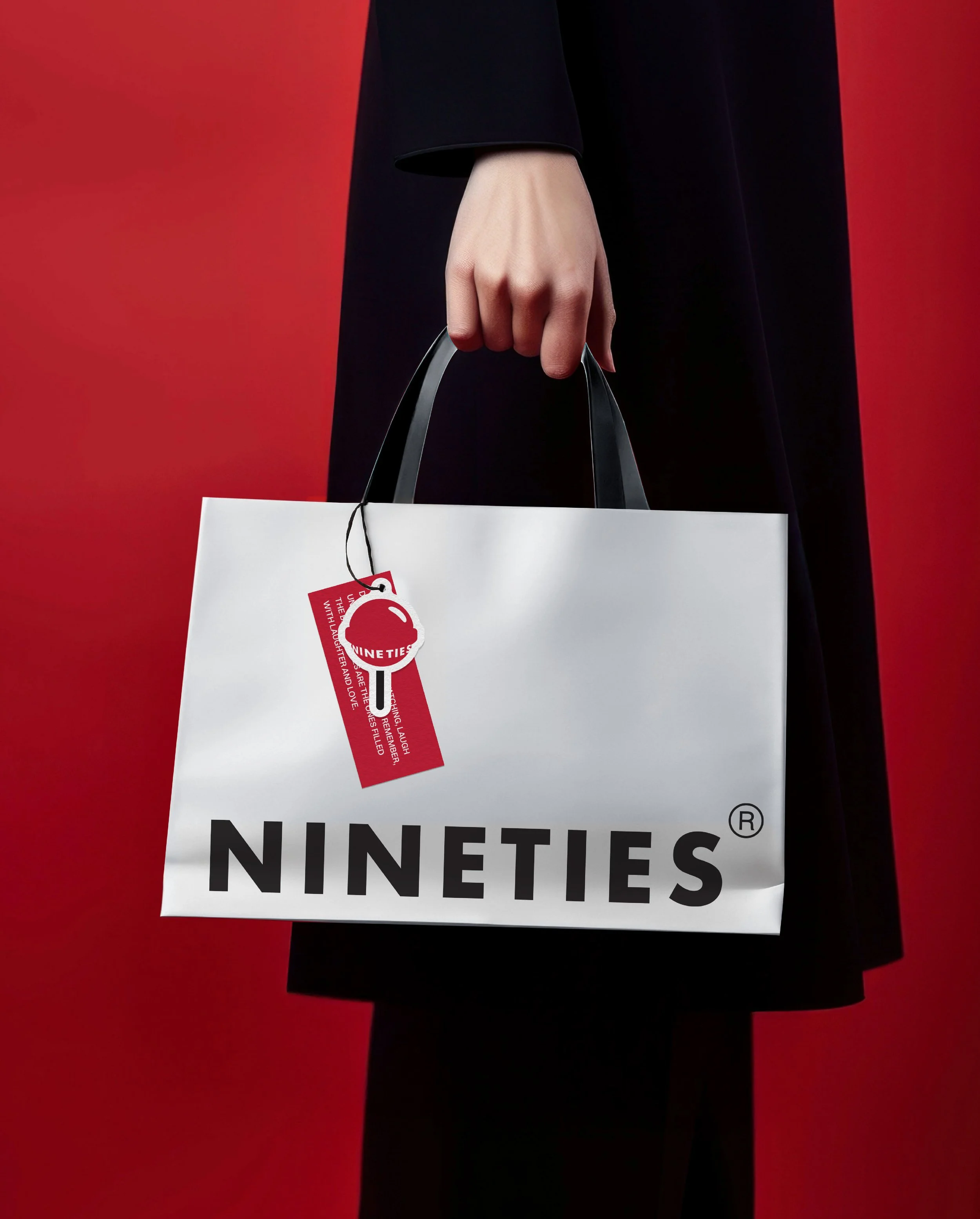
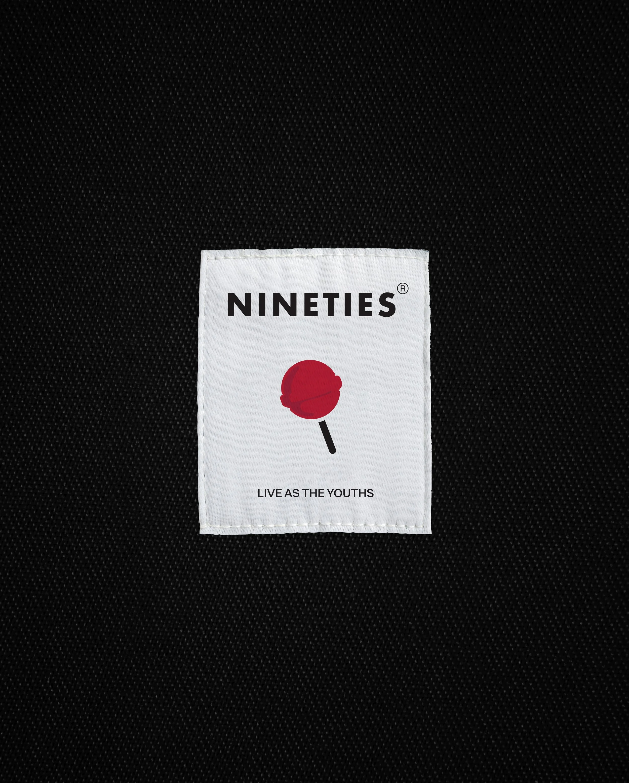
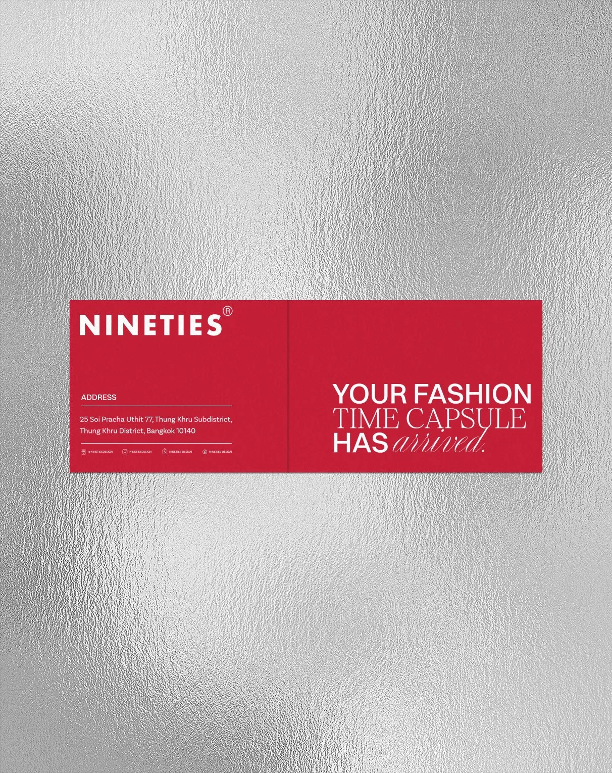
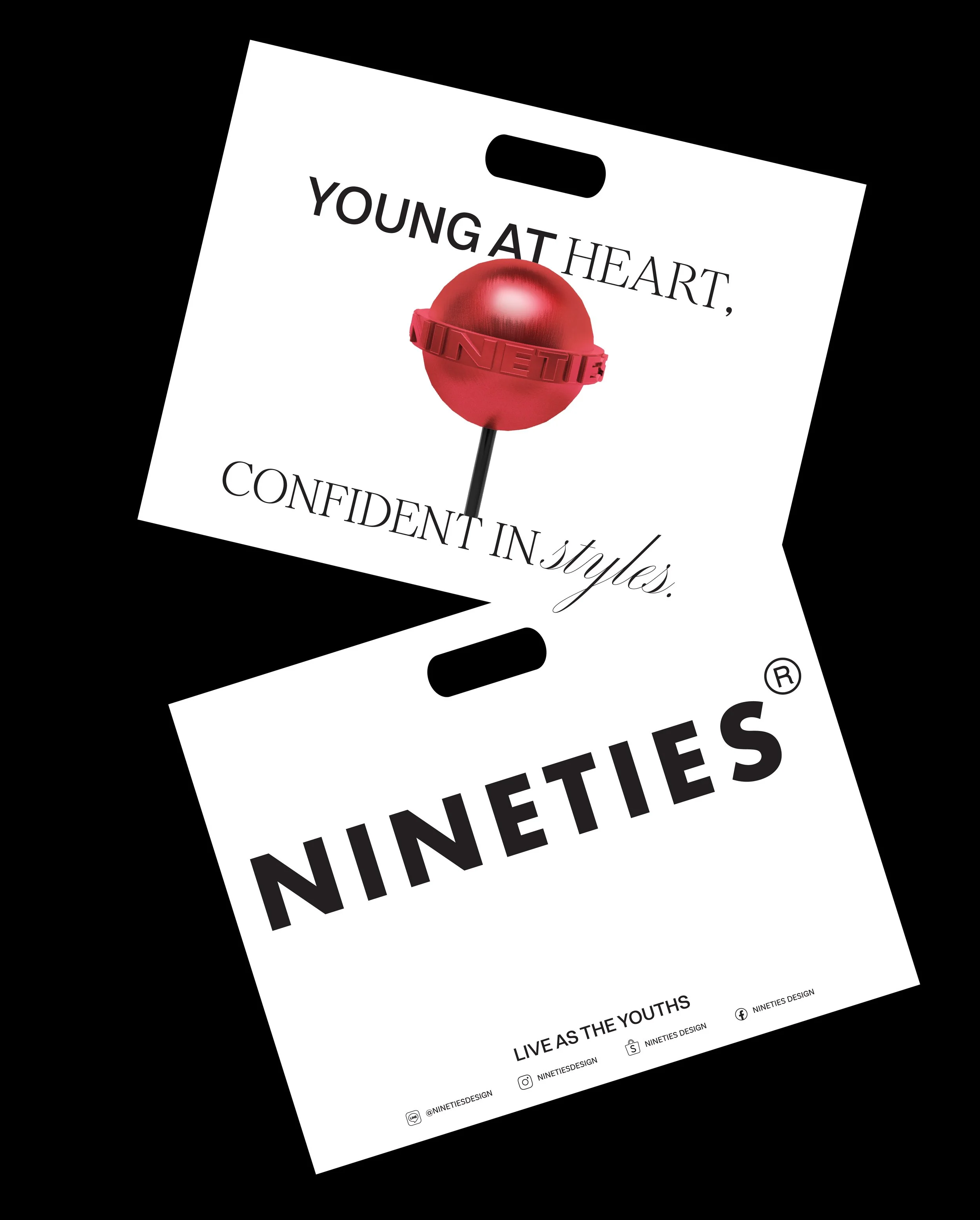
We refreshed the brand identity with a sharper, more memorable direction.
We redefined the logo system, establishing a clear primary logo and flexible sub-marks to ensure strong recognition.
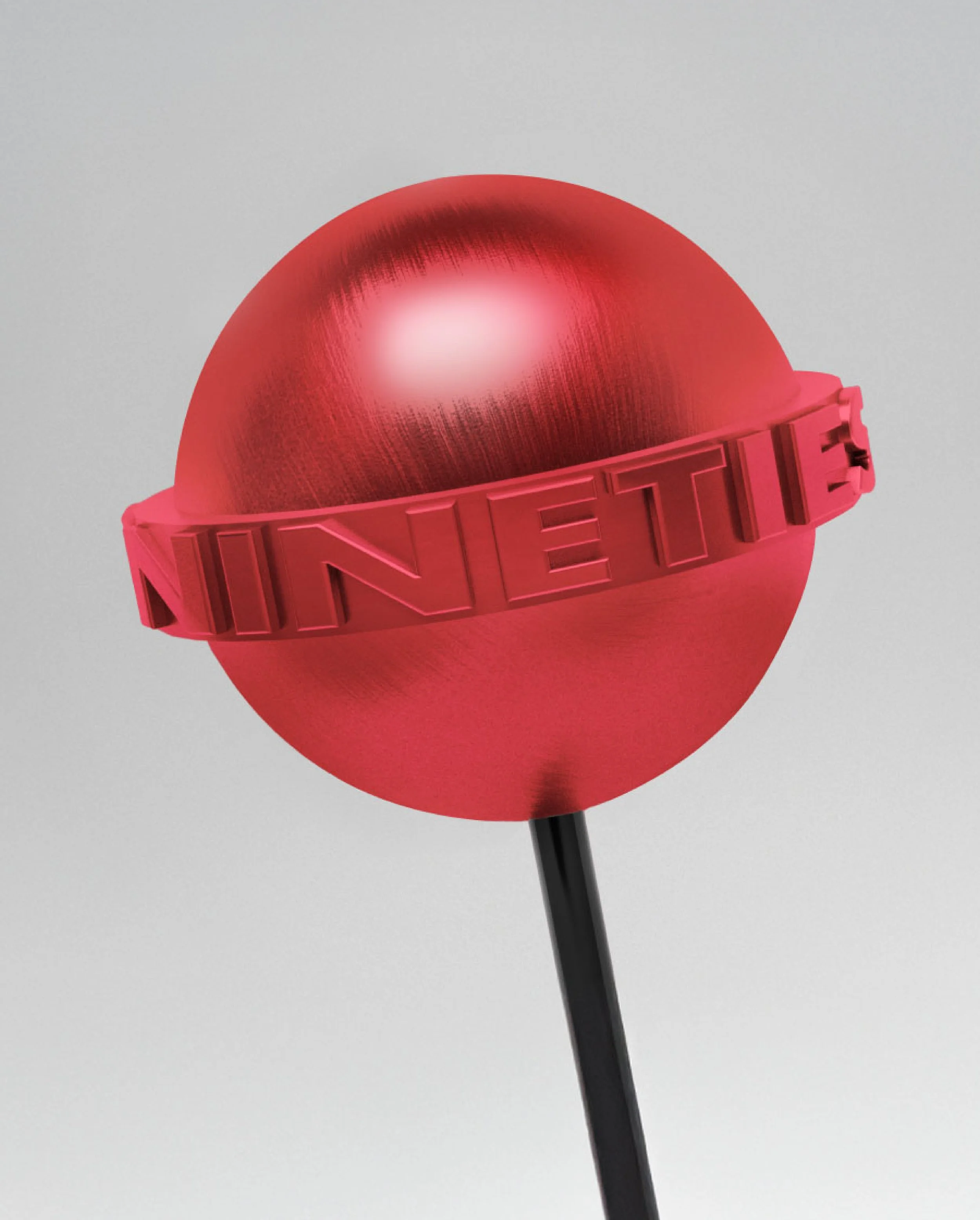
We introduced the lollipop icon and symbol to bring more personality to the brand, adding a playful twist while staying true to its original ‘90s vibe.