The Problem

By 2022, Nara Thai Cuisine’s identity no longer reflected the elegance and uniqueness of its dining experience. While the restaurant remained beloved, its visual language felt outdated and disconnected from its refined, modern audience.

The Solution

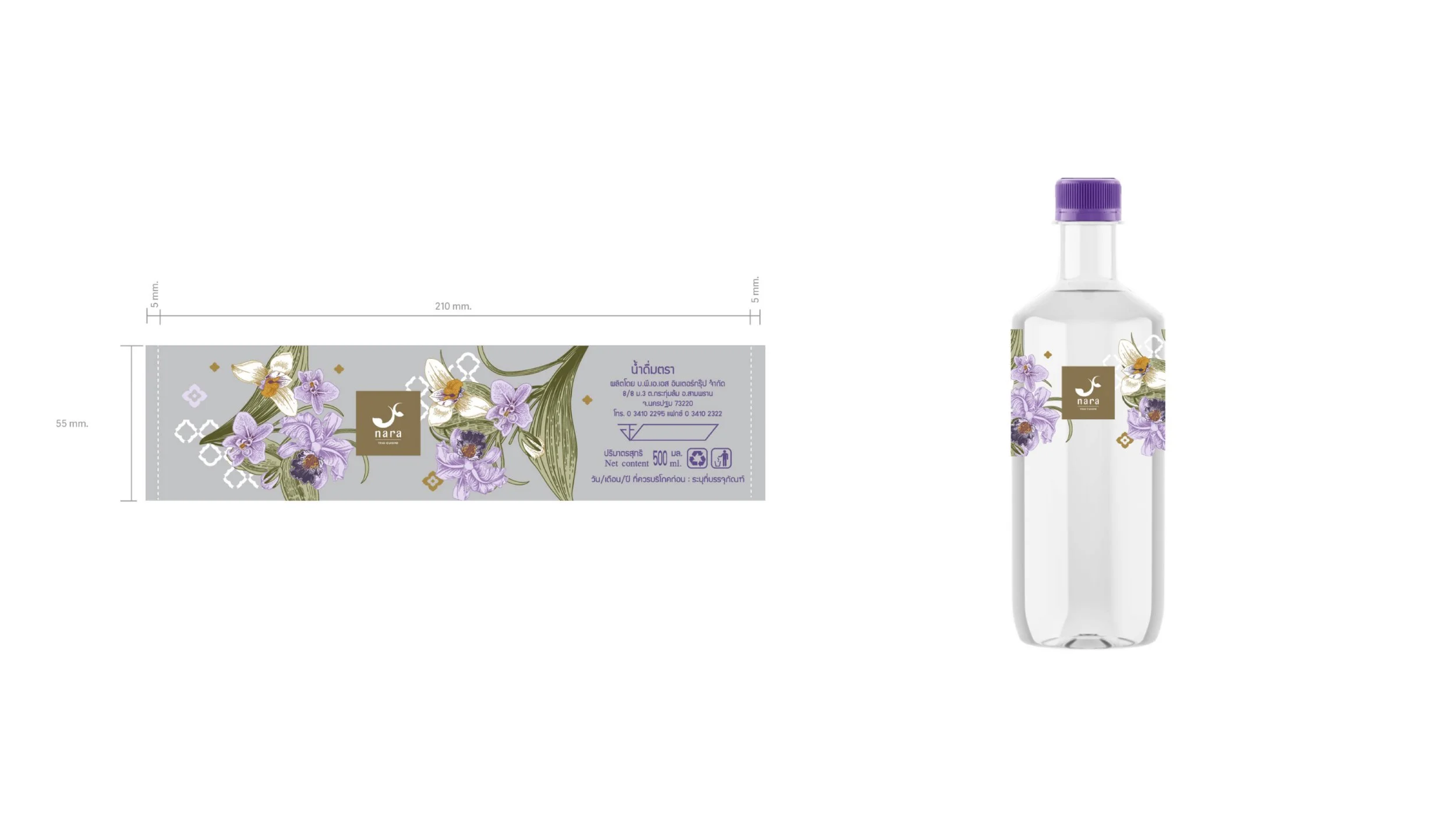
We looked to what made Nara stand out, the signature purple plating. This became the core of the refreshed identity. We refined the logo, introduced elegant Thai and English typefaces, and expanded a rich purple-led color palette. Custom floral illustrations added a touch of Thai artistry, making the brand feel both contemporary and rooted in tradition.

The logo was carefully modernized while preserving the essence of the original.

Previous
Previous

Subi

Next
Next

IKON