The Problem

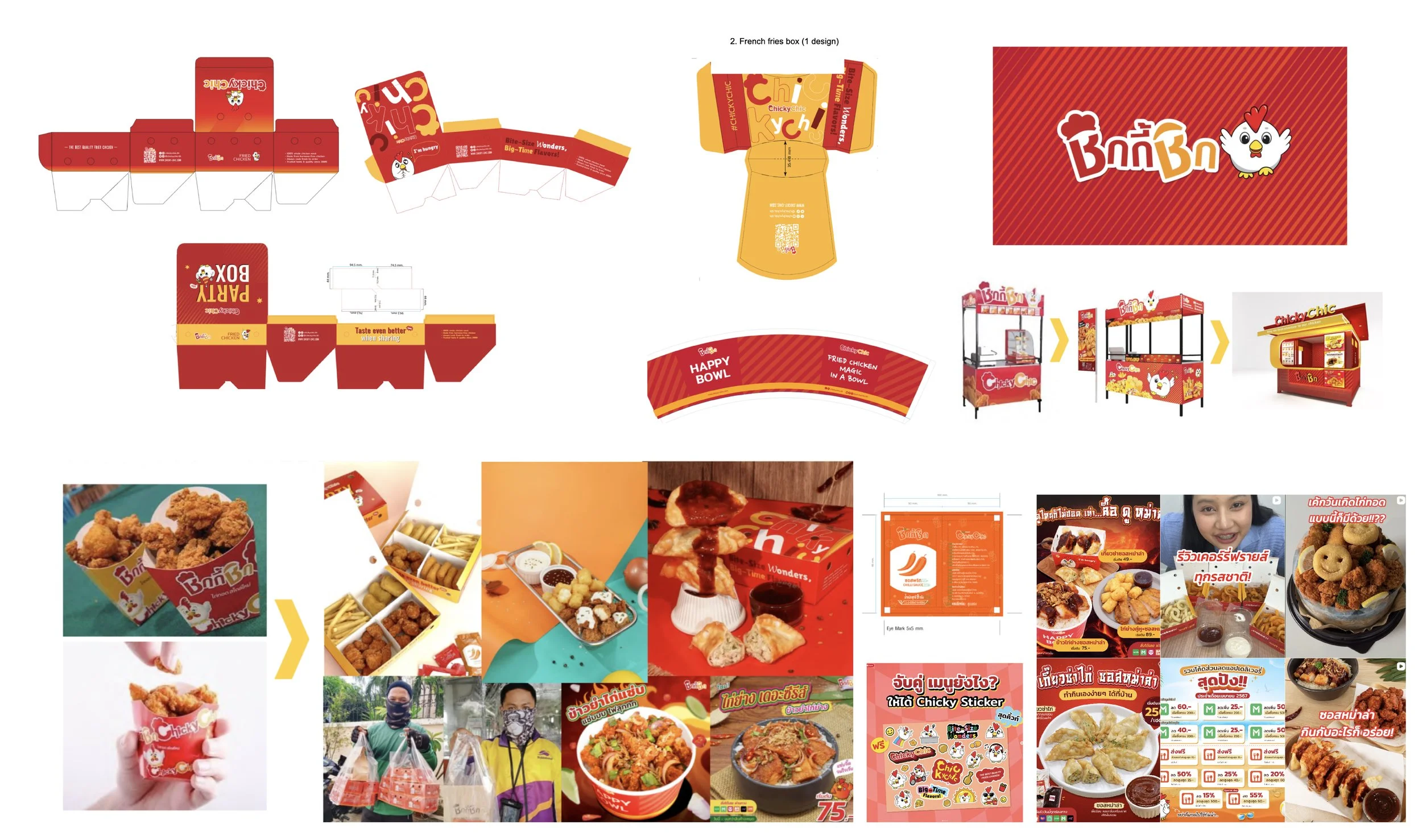
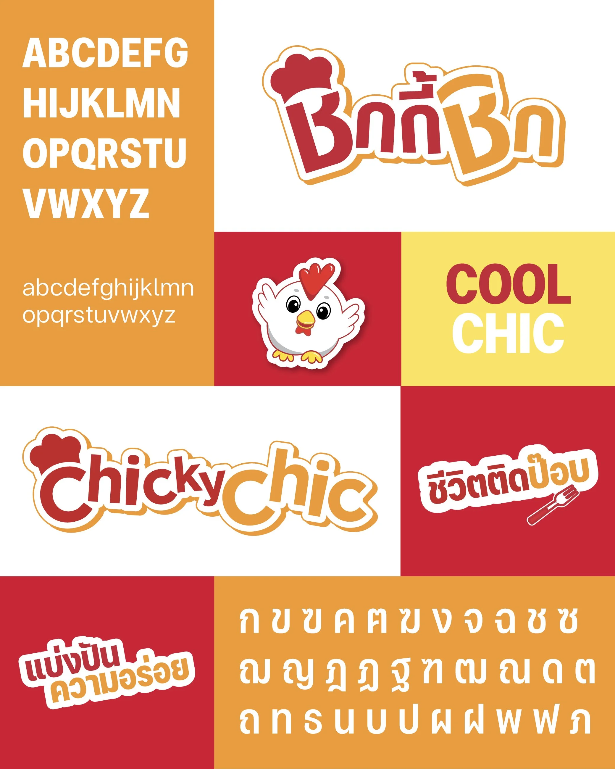
The old identity used many different logo styles, colors, illustrations, layouts, and typography directions, which made the brand look less unified. Even though the brand was fun and accessible, the overall visual system did not feel modern enough for today’s franchise market.

The Solution

We refined the logo into a more timeless and flexible logotype, updated the color palette, introduced a modern Thai font pairing and improved the Chicky Chic mascot so it feels fresher and easier to apply across different touchpoints.

The visual system was then extended across packaging, menus, social media templates, and photography direction; giving the brand a more consistent and ready-to-use identity for both customers and franchise growth.

Next
Next

BASIC SELECTED